4

I have an HTML element with a background image and want to create a mirror effect to the bottom, as if the image is reflected like this:

Image with mirror

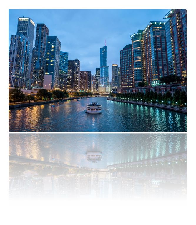
The optimal solution for me to create this reflection would be CSS only without using more elements than this single one and without using the image URL multiple times (due to maintenance reasons). I only found solutions like this with "complicated" HTML markup.

This is my code:

div {
  position: relative;
  background: url(https://i.stack.imgur.com/P56gr.jpg);
  width: 300px;
  height: 200px;
}
div:after {
  content: "";
  position: absolute;
  background: url(https://i.stack.imgur.com/P56gr.jpg);
  display: block;
  width: 300px;
  height: 200px;
  bottom: -210px;
}
<div></div>
andreas
  • 16,357
  • 12
  • 72
  • 76

2 Answers2

11

You can indeed use the pseudo-elements :after and :before to first mirror the image using transform: scaleY(-1); and second overlay the mirrored image with a linear gradient going from a semi-transparent white rgba(255, 255, 255, 0.5) to non-transparent white #fff.

To not being forced to notate the image URL twice, just use background: inherit;.

div {
  position: relative;
  background: url(https://i.stack.imgur.com/P56gr.jpg) bottom;
  width: 300px;
  height: 200px;
}
div:after,
div:before {
  content: "";
  position: absolute;
  display: block;
  width: inherit;
  height: 50%;
  bottom: -52%;
}
div:after {
  background: inherit;
  transform: scaleY(-1);
}
div:before {
  z-index: 1;
  background: linear-gradient(to bottom, rgba(255, 255, 255, 0.5), #fff);
}
<div></div>

Note: You have to use vendor prefixes for support in different browsers.

andreas
  • 16,357
  • 12
  • 72
  • 76
1

Just add

transform: rotate(180deg);
-webkit-mask-image:-webkit-gradient(linear, left 50%, left bottom, from(rgba(0,0,0,.7)), to(rgba(0,0,0,1)));

Obviously nothing will be cross-browser 100% when doing stuff like this in css

div {
  position: relative;
  background: url(https://i.stack.imgur.com/P56gr.jpg);
  width: 300px;
  height: 200px;
}
div:after {
  content: "";
  position: absolute;
  background: url(https://i.stack.imgur.com/P56gr.jpg);
  display: block;
  width: 300px;
  height: 200px;
  bottom: -210px;
  transform: rotate(180deg);
  -webkit-mask-image:-webkit-gradient(linear, left 50%, left bottom, from(rgba(0,0,0,0)), to(rgba(0,0,0,.5)));
}
<div></div>
Leeish
  • 5,203
  • 2
  • 17
  • 45
  • 2
    Andreas answer probably has more vendor support. mask-image is not widely supported, but when it is, you were 95% there. – Leeish Oct 21 '16 at 16:33
  • 2
    This doesn't add a mirror image along the horizontal axis. Note how the curve in the water goes the wrong way. You want to use rotateX(180deg) instead of rotate(180deg). – Rob Monhemius Oct 22 '16 at 12:42
  • Nice catch. I didn't even notice. – Leeish Oct 26 '16 at 19:53
  • Rotate 180 is not the same as a mirror operation ! it's a double mirror operation (see group theory eventually) – Soleil Feb 20 '22 at 21:45