2

So I am building a bootstrap grid of images. I thought it would be nice to have different sized images to make it look more interesting. The wider images are twice as wide as normal, and the taller images are twice as tall as normal, this it to avoid empty space inside the grid.

This is what I currently have: my grid 
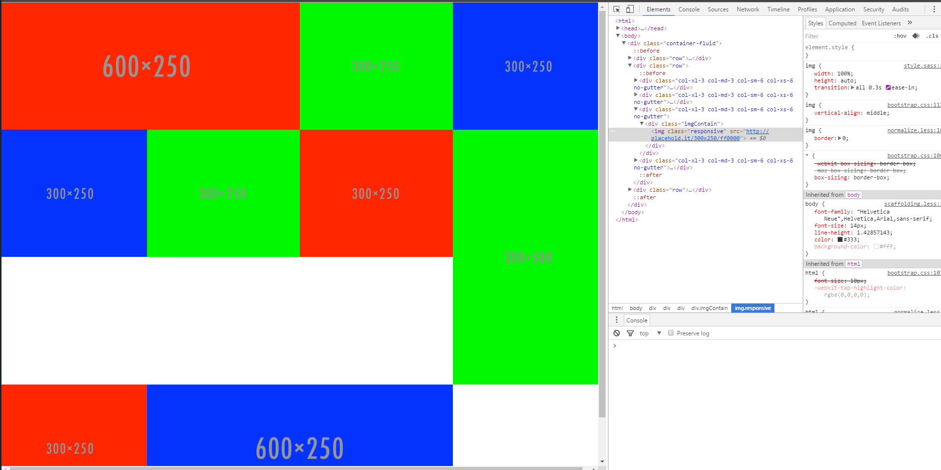
I want the bottom row to occupy the empty space above it, but I can't figure out how to do it without manually positioning it, which would be a nightmare to make lineup on all devices.

Here is a codepen as well with my code. And the pug(jade):

html
  head
    title Grid Test
    link(href="https://maxcdn.bootstrapcdn.com/bootstrap/3.3.7/css/bootstrap.min.css", rel="stylesheet", integrity="sha384-BVYiiSIFeK1dGmJRAkycuHAHRg32OmUcww7on3RYdg4Va+PmSTsz/K68vbdEjh4u", crossorigin="anonymous")
    link(rel="stylesheet" href="css/style.css" type="text/css")

  body

    div.container-fluid
      div.row
        div.col-xl-6.col-md-6.col-sm-12.col-xs-12.no-gutter
          div.imgContain
            img.responsive(src="http://placehold.it/600x250/ff0000")
        div.col-xl-3.col-md-3.col-sm-6.col-xs-6.no-gutter
          div.imgContain
            img.responsive(src="http://placehold.it/300x250/00ff00")
        div.col-xl-3.col-md-3.col-sm-6.col-xs-6.no-gutter
          div.imgContain
            img.responsive(src="http://placehold.it/300x250/0000ff")

      div.row
        div.col-xl-3.col-md-3.col-sm-6.col-xs-6.no-gutter
          div.imgContain
            img.responsive(src="http://placehold.it/300x250/0000ff")
        div.col-xl-3.col-md-3.col-sm-6.col-xs-6.no-gutter
          div.imgContain
            img.responsive(src="http://placehold.it/300x250/00ff00")
        div.col-xl-3.col-md-3.col-sm-6.col-xs-6.no-gutter
          div.imgContain
            img.responsive(src="http://placehold.it/300x250/ff0000")
        div.col-xl-3.col-md-3.col-sm-6.col-xs-6.no-gutter
          div.imgContain
            img.responsive(src="http://placehold.it/300x500/00ff00")

      div.row
        div.col-xl-3.col-md-3.col-sm-6.col-xs-6.no-gutter
          div.imgContain
            img.responsive(src="http://placehold.it/300x250/ff0000")
        div.col-xl-6.col-md-6.col-sm-12.col-xs-12.no-gutter
          div.imgContain
            img.responsive(src="http://placehold.it/600x250/0000ff")

Any help would be great! Cheers

mab3103
  • 87
  • 9
  • Dont use different rows.. just put all your columns into one `row` even if they dont add up to 12 and they will adjust.. however this method is not recomended. But still, i did this once for satisfying a client's requirement. OR Use the fixed columns if you want to avoid empty spaces in a column. – Jones Joseph Oct 22 '16 at 16:39
  • What is col-xl-3, and col-xl-6? I think it is misstyped it should be a col-lg-3 and col-lg-6. lg: large, md: medium, sm: small, xs: extra small, xl: ??? – Dániel Kis Oct 22 '16 at 17:31
  • I think one row is enought, but when you want to force break line, you must put a new row. – Dániel Kis Oct 22 '16 at 18:08
  • @DánielKis col-xl is for extra large screens, greater than 1200px. I did forget about col-lg though so thanks! – mab3103 Oct 22 '16 at 18:46
  • I see, xl is new for me, but I think we should skip it as we can skip lg because md setting will be applied. – Dániel Kis Oct 22 '16 at 19:12

1 Answers1

0

Try this, it may not the best solution, but it seems to be working for me

html
  head
    title Grid Test
    link(href="https://maxcdn.bootstrapcdn.com/bootstrap/3.3.7/css/bootstrap.min.css", rel="stylesheet", integrity="sha384-BVYiiSIFeK1dGmJRAkycuHAHRg32OmUcww7on3RYdg4Va+PmSTsz/K68vbdEjh4u", crossorigin="anonymous")
    link(rel="stylesheet" href="css/style.css" type="text/css")

  body

    div.container-fluid
      div.row
        div.col-lg-6.col-md-6.col-sm-12.col-xs-12.no-gutter
          div.imgContain
            img.responsive(src="http://placehold.it/600x250/ff0000")
        div.col-lg-3.col-md-3.col-sm-6.col-xs-6.no-gutter
          div.imgContain
            img.responsive(src="http://placehold.it/300x250/00ff00")
        div.col-lg-3.col-md-3.col-sm-6.col-xs-6.no-gutter
          div.imgContain
            img.responsive(src="http://placehold.it/300x250/0000ff")

      div.row.visible-lg.visible-md.hidden-sm.hidden-xs
       div.col-lg-9.col-md-9.no-gutter    
        div.col-lg-4.col-md-4.col-sm-6.col-xs-6.no-gutter
            div.imgContain
              img.responsive(src="http://placehold.it/300x250/0000ff")
        div.col-lg-4.col-md-4.col-sm-6.col-xs-6.no-gutter
          div.imgContain
            img.responsive(src="http://placehold.it/300x250/00ff00")

        div.col-lg-4.col-md-4.col-sm-6.col-xs-6.no-gutter
          div.imgContain
            img.responsive(src="http://placehold.it/300x250/ff0000")
        div.col-lg-4.col-md-4.col-sm-6.col-xs-6.no-gutter
          div.imgContain
            img.responsive(src="http://placehold.it/300x250/ff0000")
        div.col-lg-8.col-md-8.col-sm-12.col-xs-12.no-gutter
          div.imgContain
            img.responsive(src="http://placehold.it/600x250/0000ff")

       div.col-lg-3.col-md-3.col-sm-6.col-xs-6.no-gutter
          div.imgContain
            img.responsive(src="http://placehold.it/300x500/00ff00")
      div.row.hidden-lg.hidden-md.visible-sm.visible-xs
       div.col-sm-12.col-sm-12.no-gutter    
        div.col-sm-6.col-xs-6.no-gutter
            div.imgContain
              img.responsive(src="http://placehold.it/300x250/0000ff")
        div.col-sm-6.col-xs-6.no-gutter
          div.imgContain
            img.responsive(src="http://placehold.it/300x250/00ff00")
        div.col-sm-12.col-xs-12.no-gutter
          div.col-sm-6.col-xs-6.no-gutter
            div.imgContain
              img.responsive(src="http://placehold.it/300x500/00ff00")
          div.col-sm-6.col-xs-6.no-gutter
            div.col-sm-12.col-xs-12.no-gutter
              div.imgContain
                img.responsive(src="http://placehold.it/300x250/ff0000")
            div.col-sm-12.col-xs-12.no-gutter
              div.imgContain
                img.responsive(src="http://placehold.it/300x250/ff0000")
        div.col-sm-12.col-xs-12.no-gutter
          div.imgContain
            img.responsive(src="http://placehold.it/600x250/0000ff")
Dániel Kis
  • 2,341
  • 5
  • 28
  • 51