I'm trying to place two images on top of each other, with both of the images horizontally and vertically centered inside their container.
One of the images will be have its opacity animated to reveal the image underneath.
The images are both the same size, but I don't know the size of the images beforehand. I also would like to do this in just pure CSS and HTML.
Here is what I ended up with.
.data-box{
border: 2px solid #d4d4d4;
border-radius: 3px;
display: flex;
height: 120px;
margin: 5px;
margin-bottom: 10px;
margin-right: 10px;
padding: 0;
position: relative;
width: 120px;
}
.logo {
align-items: center;
display: flex;
justify-content: center;
margin: auto;
position: relative;
}
.data-name {
position: absolute;
width: 100%;
height: 23px;
bottom: 0px;
right: 0px;
background: rgba(200, 200, 200, 0.3);
}
span {
position: absolute;
width: 100%;
bottom: 2px;
text-align: center;
}
img {
position: absolute;
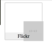
}<div class="data-box">
<div class="logo">
<img class="grayscale-image" src="https://placeholdit.imgix.net/~text?txtsize=8&txt=65%C3%9765&w=65&h=65" alt="">
<img class="color-image" src="https://placeholdit.imgix.net/~text?txtsize=8&txt=65%C3%9765&w=65&h=65" alt="">
</div>
<div class="data-name"><span>Flickr</span></div>
</div>I made the images position: absolute so they would leave the normal flow of the browser and render directly on top of each other instead of next to each other.
This works correctly in Chrome, but in Firefox and Safari the image's top left corner is horizontally and vertically centered:
How can I horizontally and vertically center these images while still having them render directly on top of each other?