This issue is well-known: it's called the collapsing float. When you float an element, it is effectively taken out of the document flow and therefore does not contribute to the final computed dimensions of the parent element. In this case, the height of .about_me is set to 300px and therefore content will exceed the bounds due to insufficient height. The following solutions can remedy your issue:
1. Use the overflow: hidden trick
Hiding overflows seem to force floats to clear, therefore allowing the parents to encapsulate floated children. With that in mind, you do not need to define height anymore... unless it is a deliberate design choice.
.about_me {
text-align: center;
overflow: hidden;
}
You may also use any other values for overflow as long as it is not the default value of visible. The exact explanation behind this behaviour is explained in another SO question.
Note: A major drawback of this solution is that there are some use cases where overflow: visible is the desired property. In this case, you will have to rely on an alternative solution known as the clearfix hack (see point #2).
See how it works in the code snippet below:
.about_me {
overflow: hidden; /* Clearfix */
text-align: center;
}
.about_me h2 {
margin-top: 90px;
font-family: 'Open Sans', sans-serif;
}
.brief_desc {
text-align: right;
font-family: 'Open Sans', sans-serif;
float: left;
width: 50%;
margin-top: 30px;
font-size: 30px;
}
.brief_desc p {
padding-left: 300px;
padding-right: 15px;
color: #505050;
}
.detailed_desc {
float: right;
text-align: left;
margin-top: 55px;
width: 50%;
}
.detailed_desc p {
font-family: 'Open Sans', sans-serif;
margin-left: 15px;
padding-right: 270px;
color: #909090;
}
.work_flow {
background-color: #f5f4f0;
height: 400px;
text-align: center;
font-family: 'Open Sans', sans-serif;
}
<div class="about_me">
<h2>ABOUT ME</h2>
<div class="icons">
<img src="black1.svg" class="icon" />
<img src="black2.svg" class="icon" />
<img src="black3.svg" class="icon" />
<img src="black4.svg" class="icon" />
<img src="black5.svg" class="icon" />
</div>
<div class="brief_desc">
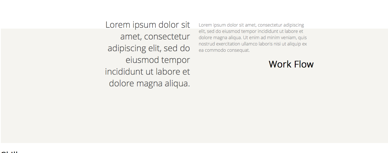
<p>Lorem ipsum dolor sit amet, consectetur adipiscing elit, sed do eiusmod tempor incididunt ut labore et dolore magna aliqua.</p>
</div>
<div class="detailed_desc">
<p>
Lorem ipsum dolor sit amet, consectetur adipiscing elit, sed do eiusmod tempor incididunt ut labore et dolore magna aliqua. Ut enim ad minim veniam, quis nostrud exercitation ullamco laboris nisi ut aliquip ex ea commodo consequat.
</p>
</div>
</div>
<div class="work_flow">
<h1 class="blah">Work Flow</h1>
</div>
2. Use the clearfix hack.
Alternatively, you can create a pseudo-element that clears floated elements for you, known as the clearfix hack. A surprisingly large proportion of browsers in use today actually support pseudo-elements, so don't knock it just because the use of pseudo-elements sounds foreign or unfamiliar ;) heck, even IE8 supports it (but you will have to use the single-colon nomenclature, i.e. :after instead of ::after).
.about_me::after {
visibility: hidden;
display: block;
font-size: 0;
content: " ";
clear: both;
height: 0;
}
See the code snippet for a proof-of-concept example:
.about_me::after { /* Use ::after pseudoelement as imaginary element to clear floats */
visibility: hidden;
display: block;
font-size: 0;
content: " ";
clear: both;
height: 0;
}
.about_me h2 {
margin-top: 90px;
font-family: 'Open Sans', sans-serif;
}
.brief_desc {
text-align: right;
font-family: 'Open Sans', sans-serif;
float: left;
width: 50%;
margin-top: 30px;
font-size: 30px;
}
.brief_desc p {
padding-left: 300px;
padding-right: 15px;
color: #505050;
}
.detailed_desc {
float: right;
text-align: left;
margin-top: 55px;
width: 50%;
}
.detailed_desc p {
font-family: 'Open Sans', sans-serif;
margin-left: 15px;
padding-right: 270px;
color: #909090;
}
.work_flow {
background-color: #f5f4f0;
height: 400px;
text-align: center;
font-family: 'Open Sans', sans-serif;
}
<div class="about_me">
    <h2>ABOUT ME</h2>

    <div class="icons">
        <img src="black1.svg" class="icon" />
        <img src="black2.svg" class="icon" />
        <img src="black3.svg" class="icon" />
        <img src="black4.svg" class="icon" />
        <img src="black5.svg" class="icon" />
     </div>

     <div class="brief_desc">
        <p>Lorem ipsum dolor sit amet, consectetur adipiscing elit, sed do eiusmod tempor incididunt ut labore et dolore magna aliqua.</p>
     </div>

     <div class="detailed_desc">
         <p>
         Lorem ipsum dolor sit amet, consectetur adipiscing elit, sed do eiusmod tempor incididunt ut labore et dolore magna aliqua. Ut enim ad minim veniam, quis nostrud exercitation ullamco laboris nisi ut aliquip ex ea commodo consequat.
         </p>
      </div>
</div>

<div class="work_flow">
    <h1 class="blah">Work Flow</h1>
</div>