1

There is a table on my page and when I screen size my table is jamming and which is why I want to change order of my table I hope I explain what I mean

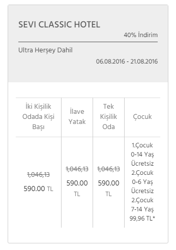
this is my table on wide screen

my table on wide screen

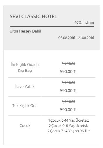
but on responsive it must be like this

and I want like this on responsive to be

and I don't know how to do that any idea any example ?

HTML

<table class="table">
    <tr>
        <th>İki Kişilik Odada Kişi Başı</th>
        <th>İlave Yatak</th>
        <th>Tek Kişilik Oda</th>
        <th>Çocuk</th>
    </tr>
    <tr>
        <td>
            <p>
                <span>1,046,13</span>
                <span>590.00 <i>TL</i></span>
            </p>
        </td>
        <td>
            <p>
                <span>1,046,13</span>
                <span>590.00 <i>TL</i></span>
            </p>
        </td>
        <td>
            <p>
                <span>1,046,13</span>
                <span>590.00 <i>TL</i></span>
            </p>
        </td>
        <td>
            <p>1.Çocuk 0-14 Yaş Ücretsiz</p>
            <p>2.Çocuk 0-6 Yaş Ücretsiz</p>
            <p>2.Çocuk 7-14 Yaş 99,96 TL*</p>
        </td>
    </tr>
</table>

CSS

table {
    border-collapse: collapse;
    border-spacing: 0;
}
th,td{
      border-right: 1px solid #ccc;
    border-bottom: 1px solid #ccc;
    border-top: none;
    padding: 8px;
}

see example on codepen

Taha Paksu
  • 15,371
  • 2
  • 44
  • 78
ani_css
  • 2,118
  • 3
  • 30
  • 73

4 Answers4

1

I found a function which can do this for you you have to pass your table id or table class to this funciton.

function TransposeTable(tableId)
{        
    var tbl = $('#' + tableId);
    var tbody = tbl.find('tbody');
    var oldWidth = tbody.find('tr:first td').length;
    var oldHeight = tbody.find('tr').length;
    var newWidth = oldHeight;
    var newHeight = oldWidth;

    var jqOldCells = tbody.find('td');        

    var newTbody = $("<tbody></tbody>");
    for(var y=0; y<newHeight; y++)
    {
        var newRow = $("<tr></tr>");
        for(var x=0; x<newWidth; x++)
        {
            newRow.append(jqOldCells.eq((oldWidth*x)+y));
        }
        newTbody.append(newRow);
    }

    tbody.replaceWith(newTbody);        
}
danish farhaj
  • 1,316
  • 10
  • 20
1

You can use below code hope it will help you.

<table class="table">
    <tr>
        <td>
            <table class="table-inner">
                <tr>
                    <th>İki Kişilik Odada Kişi Başı</th>
                </tr>
                <tr>
                    <td>
                        <p> <span>1,046,13</span> <span>590.00 <i>TL</i></span> </p>
                    </td>
                </tr>
            </table>
        </td>
    </tr>
</table>

CSS

table {
    border-collapse: collapse;
    border-spacing: 0;
}
th,td{
      border-right: 1px solid #ccc;
    border-bottom: 1px solid #ccc;
    border-top: none;
    padding: 0;
}
.table-inner th , .table-inner td{
  border: 0;
  padding: 8px;
}
.table-inner th{
  border-bottom:  1px solid #ccc;
}

@media only screen and (min-width: 320px) and (max-width: 767px) {
  .table td , .table th{
    display: block;
  }
}
Hira Majid
  • 534
  • 2
  • 7
  • 22
1

This is the version I wrote, but you need to do something before that:

  1. If you have the chance to add a class based on mobile/desktop, use that class
  2. If you don't, check the window width & height before running this function.

The code:

function rotateTable() {
  var newTable = [];
  var newTableStruct = "<tr>";

  $("table.table").find("th, td").each(function() {
    var trIndex = $(this).closest("table").find("tr").index($(this).closest("tr"));
    var tdIndex = $(this).closest("tr").find("td, th").index($(this))
    newTable[tdIndex] = newTable[tdIndex] || [];
    newTable[tdIndex][trIndex] = $(this).html();
  });

  for (i = 0; i < newTable.length; i++) {
    for (j = 0; j < newTable[0].length; j++) {
      newTableStruct += "<td>" + newTable[i][j] + "</td>";
    }
    newTableStruct += "</tr><tr>";
  }
  newTableStruct += "</tr>";
  $("table.table").empty().append(newTableStruct);
}

rotateTable();
table {
  border-collapse: collapse;
  border-spacing: 0;
}
th,
td {
  border-right: 1px solid #ccc;
  border-bottom: 1px solid #ccc;
  border-top: none;
  padding: 8px;
}
<script src="https://ajax.googleapis.com/ajax/libs/jquery/2.1.1/jquery.min.js"></script>
<table class="table">
  <tr>
    <th>İki Kişilik Odada Kişi Başı</th>
    <th>İlave Yatak</th>
    <th>Tek Kişilik Oda</th>
    <th>Çocuk</th>
  </tr>
  <tr>
    <td>
      <p>
        <span>1,046,13</span>
        <span>590.00 <i>TL</i></span>
      </p>
    </td>
    <td>
      <p>
        <span>1,046,13</span>
        <span>590.00 <i>TL</i></span>
      </p>
    </td>
    <td>
      <p>
        <span>1,046,13</span>
        <span>590.00 <i>TL</i></span>
      </p>
    </td>
    <td>
      <p>1.Çocuk 0-14 Yaş Ücretsiz</p>
      <p>2.Çocuk 0-6 Yaş Ücretsiz</p>
      <p>2.Çocuk 7-14 Yaş 99,96 TL*</p>
    </td>
  </tr>
</table>

Edit:

If you want to use it based on width, you'll need to add this:

$(document).ready(function(){
   if(window.screen.width < 768)
   {
      rotateTable();
   }
});
Taha Paksu
  • 15,371
  • 2
  • 44
  • 78
1

Just try it you will achieve what you want.

@media only screen and (min-width: 320px) and (max-width: 767px) {
      .table tr{
        width:50%;
        float:left;
        display:block;
        box-sizing:border-box;
      }
      .table td , .table th{
        display: block;
      }
      .table tr:first-child{
        border-right:1px solid #e5e5e5;
      }
      .table tr th{    
        border-bottom:0
      }
    }
Arun
  • 257
  • 1
  • 5
  • 22