2

I am pretty new to Bootstrap and read this tutorial which explains about bootstrap grid system. I am trying to make a layout that looks like this

enter image description here

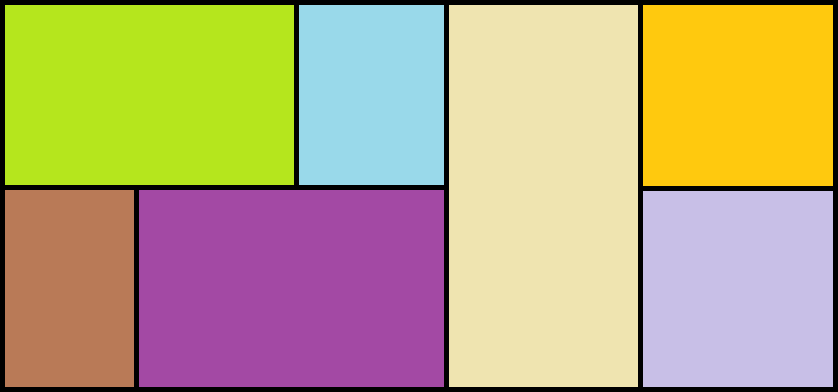
Each colored block represents a web component whose height is not specified, the web components are supposed to occupy the height of its parent. The problem is that the parent divs are not taking 100% height to occupy the entire viewport height.

I have added 50px height for all the divs so that I could show the output correctly. The original code does not have it.

div {
  height: 50px;
  border: 1px solid black;
}
<link rel="stylesheet" type="text/css" href="./assets/libs/bootstrap/css/bootstrap.min.css"></link>


<div class="container">
  <div class="row">
    <div class="col-lg-7">
      <div class="row">
        <div class="col-lg-8"></div>
        <div class="col-lg-4"></div>
        <div class="clearfix visible-lg-block"></div>
        <div class="col-lg-4"></div>
        <div class="col-lg-8"></div>
      </div>
    </div>
    <div class="col-lg-5">
      <div class="row">
        <div class="col-lg-6"></div>
        <div class="col-lg-6">
          <div class="row">
            <div class="col-lg-12"></div>
            <div class="clearfix visible-lg-block"></div>
            <div class="col-lg-12"></div>
          </div>
        </div>
      </div>
    </div>
  </div>
</div>

<!-- Load scripts here-->
<script src="../bower_components/jquery/dist/jquery.js"></script>
<script src="../bower_components/angular/angular.js"></script>
<script src="../bower_components/angular-bootstrap/ui-bootstrap.min.js"></script>
<script src="./assets/libs/bootstrap/js/bootstrap.min.js"></script>
<script src="../bower_components/angular-animate/angular-animate.min.js"></script>
<script src="../bower_components/angular-route/angular-route.js"></script>
<script src="../bower_components/angular-sanitize/angular-sanitize.js"></script>
<script src="../bower_components/angular-mocks/angular-mocks.js"></script>
<script src="../bower_components/restangular/dist/restangular.js"></script>
<script src="../bower_components/underscore/underscore.js"></script>
<script src="../bower_components/chart.js/dist/Chart.bundle.min.js"></script>
<script src="app.js"></script>

This is how it looks after nesting the grid layout

enter image description here

I am clueless at this point, what am I missing here ?

mmativ
  • 1,414
  • 14
  • 25
Flying Gambit
  • 1,238
  • 1
  • 15
  • 32

3 Answers3

2

LIVE LINK

YOU can make This way div && col-md-*/col-lg-*. Height is not a matter Because If you want You can also use height=100vh or 50vh which are 100% height to occupy the entire viewport height .

When height:100vh live Link or also by height:auto

when you keep some content in those div.

BY DIV EX:

body 
{
margin: 0; 
padding: 0; 
font-size: 100%; 
font-family: Arial, Helvetica, sans-serif;
}
.bborder{
 border: 1px solid #000;
}
.cborder {
 border: 1px solid #000;
 height: 150px;
}
.border {
 border: 1px solid #000;
 height: 300px;
}
.color {
 background: #B5E61D;
}
.color_1 {
 background: #99D9EA;
}
.color_2 {
 background: #B97A57;
}
.color_3 {
 background: #A349A4;
}
.color_4 {
 background: #EFE4B0;
}
.color_5 {
 background: #FFC90E;
}
.color_6 {
 background: #C8BFE7;
}
<link href="https://maxcdn.bootstrapcdn.com/bootstrap/3.3.7/css/bootstrap.min.css" rel="stylesheet"/>

  <div class="">
  <div class="">
   
   <div class="col-md-7 col-lg-7">
   <div class="row">
    <div class="col-md-12 col-lg-12">
    <div class="row">
     <div class="col-md-8 col-lg-8 cborder color">
     
     </div>
     <div class="col-md-4 col-lg-4 cborder color_1">
     
     </div>
    </div>
    </div>
    
    <div class="col-md-12 col-lg-12">
    <div class="row">
     <div class="col-md-4 col-lg-4 cborder color_2">
     
     </div>
     <div class="col-md-8 col-lg-8 cborder color_3">
     
     </div>
    </div>
    </div>
   </div>
   </div>
   <div class="col-md-5 col-lg-5">
   <div class="row">
    <div class="col-md-6 col-lg-6 border color_4">
    <div class="row">
    
    </div>
    </div>
    <div class="col-md-6 col-lg-6">
    <div class="row">
     <div class="col-md-12 col-lg-12 cborder color_5">
     <div class="row">
     
     </div>
     </div>
     
     
     <div class="col-md-12 col-lg-12 cborder color_6">
     <div class="row">
     </div>
     </div>
     
    </div>
    </div>
   </div>
   </div>
   
  </div>
  </div>
MD Ashik
  • 9,117
  • 10
  • 52
  • 59
  • Why wrapping rows inside 12 column wide div `
    ` ?
    – Flying Gambit Nov 03 '16 at 11:27
  • This is not mandatory, So I can remove it. @FlyingGambit But It arrange the code perfectly. – MD Ashik Nov 03 '16 at 11:31
  • check without it wrapping rows right now @FlyingGambit – MD Ashik Nov 03 '16 at 11:33
  • _"Height is not a matter Because If you want You can also use height=100vh or 50vh"_ Where should I apply this ? is it to the parent div or all divs ? – Flying Gambit Nov 03 '16 at 11:37
  • [Here code by 100vh and 50vh](http://codepen.io/ashikjs/full/vyBbWM/) 100vh Means 100% of window height. – MD Ashik Nov 03 '16 at 11:44
  • You can't make it with all "div" Because it make div height 100% of device window height You can learn more about 100vh from those link [link_1](http://stackoverflow.com/questions/21624014/css-are-view-height-vh-and-view-width-vw-units-widely-supported) [link 2](https://css-tricks.com/forums/topic/viewport-height-for-full-screen-div/) [link 3](https://www.google.com.bd/webhp?sourceid=chrome-instant&ion=1&espv=2&ie=UTF-8#q=100vh+css+means+) – MD Ashik Nov 03 '16 at 11:48
1

I was able to achieve what you are trying to do : Here is the https://plnkr.co/edit/zhGMXoFmLgogwCMKQz6t?p=preview Check the code. It might help you:

<!DOCTYPE html>
<html>

  <head>
    <link data-require="bootstrap-css@3.3.6" data-semver="3.3.6" rel="stylesheet" href="https://maxcdn.bootstrapcdn.com/bootstrap/3.3.6/css/bootstrap.css" />
    <link data-require="bootstrap@3.3.6" data-semver="3.3.6" rel="stylesheet" href="bootstrap" />
    <script data-require="bootstrap@3.3.6" data-semver="3.3.6" src="//maxcdn.bootstrapcdn.com/bootstrap/3.3.6/js/bootstrap.min.js"></script>
    <link rel="stylesheet" href="style.css" />
    <script src="script.js"></script>
    <style type="text/css">
        div.box{
           height: 50px;
           border: 1px solid black; 
        }
        #double{
          height:100px;

        }
    </style>
  </head>

  <body>
    <div class="container">
      <div class="row">
        <div class="col-lg-7">
          <div class="row">
            <div class="col-lg-8 box"></div>
            <div class="col-lg-4 box"></div>
            <div class="clearfix visible-lg-block"></div>
            <div class="col-lg-4 box"></div>
            <div class="col-lg-8 box" ></div>
          </div>
        </div>
        <div class="col-lg-5">
          <div class="row">
            <div class="col-lg-6 box" id="double"></div>
            <div class="col-lg-6">
              <div class="row">
                <div class="col-lg-12 box"></div>
                <div class="clearfix visible-lg-block"></div>
                <div class="col-lg-12 box"></div>
              </div>
            </div>
          </div>
        </div>
      </div>
    </div>
  </body>

</html>
heman123
  • 3,009
  • 4
  • 24
  • 37
-1

Hope this satisfies your question..

<div class="container-fluid">
        <div class="row">
            <div class="col-lg-6 col">
                <div class="row">
                    <div class="col-lg-8 well"></div>
                    <div class="col-lg-4 well"></div>
                </div>
                <div class="row">
                    <div class="col-lg-4 well"></div>
                    <div class="col-lg- well"></div>
                </div>  
            </div>
            <div class="col-lg-3 col">
                <div class="row well">

                    </div>
                </div>
            <div class="col-lg-3 col">
                        <div class="row well"></div>
                        <div class="row well"></div>
            </div>
        </div>
    </div>

Here is the code pen link...try viewing it in debug mode

http://codepen.io/AnanthAkr/pen/oYvQrz