5

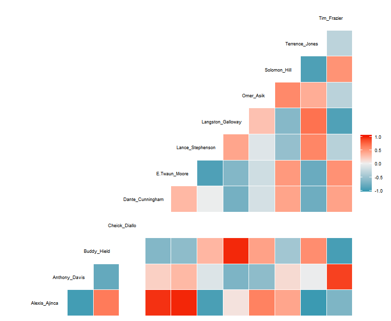
I'm attempting to use the ggcorr() function within library(GGally) to create a correlation matrix. The package is working as it is supposed to, but I'm running into an issue where I would like to edit how the axis labels appear on the plot.

Currently, they will automatically add a _ or . to separate names with spaces or other characters between them. Ideally, I would like to create a line break (\n) between spaces in names so that long names and short names can be easily read and don't extend much further beyond the appropriate column and row.

I have found solutions that others have used on SO, including using str_wrap(), but it was within a ggplot() call, not this specific package. I have inspected the R code for the package, but couldn't find where to edit these labels specifically. Whenever I attempt to edit X or Y axis text, it adds an entirely new axis and set of labels.

I currently dcast() a data frame into the resulting data frame and even when I gsub() "\n" into the player names column, they get lost in the dcast() transition.

Here is an example of what I am working with. I would like to be able to automatically create line breaks between first and last name of the labels.

library(GGally)
library(ggplot2)

test <- structure(list(Date = structure(c(17100, 17102, 17103, 17106, 
17107), class = "Date"), `Alexis Ajinca` = c(1.2, NA, 9.2, 6.4, 
NA), `Anthony Davis` = c(95.7, 76.9, 29, 67, 24.9), `Buddy Hield` = c(9.7, 
4.7, 17, 8, 28.3), `Cheick Diallo` = c(NA, NA, 3.2, NA, NA), 
    `Dante Cunningham` = c(0.5, 27.6, 14, 13.5, -1), `E'Twaun Moore` = c(19.2, 
    16.1, 22, 20.5, 10.1), `Lance Stephenson` = c(16.1, 31.6, 
    8, 8.1, 34.8), `Langston Galloway` = c(10.9, 2, 13.8, 2.2, 
    29.4), `Omer Asik` = c(4.7, 6.6, 9.9, 15.9, 14.2), `Solomon Hill` = c(4.7, 
    13.2, 12.8, 35.2, 4.4), `Terrence Jones` = c(17.1, 12.4, 
    9.8, NA, 20.8), `Tim Frazier` = c(40.5, 40.2, 18.3, 44.1, 
    7.2)), .Names = c("Date", "Alexis Ajinca", "Anthony Davis", 
"Buddy Hield", "Cheick Diallo", "Dante Cunningham", "E'Twaun Moore", 
"Lance Stephenson", "Langston Galloway", "Omer Asik", "Solomon Hill", 
"Terrence Jones", "Tim Frazier"), row.names = c(NA, -5L), class = "data.frame")

ggc <- ggcorr(test[,-1], method = c("pairwise","pearson"), 
       hjust = .85, size = 3,
       layout.exp=2)
ggc

enter image description here

Thank you for any and all help and please, let me know if you have any questions or need any clarification!

user20650
  • 24,654
  • 5
  • 56
  • 91
medavis6
  • 843
  • 10
  • 32
  • 1
    In the function, it looks like line 45 is one spot you could control the names (maybe use `\n` instead of an underscore in `gsub`) and you'd need to add `check.names = FALSE` to line 46. I ended up needing reshape2 instead of reshape on line 49. Making a new function with those changes seems to give your desired output. – aosmith Nov 03 '16 at 18:25
  • @aosmith - Thanks for the suggestion. The `gsub` recommendation is definitely a place that I missed looking through the code. However, correct me if I'm wrong, but it looks as though the only call made is for `reshape2`. I don't see where you are changing from `reshape` to `reshape2`. Also, my line numbers must be off from yours so I don't understand where you're placing `check.names = FALSE`. – medavis6 Nov 03 '16 at 18:39
  • 1
    `check.names` is an argument to `data.frame`, so use it when making "m" into a `data.frame`. If the function you see uses reshape2 on "m" then no changes needed. – aosmith Nov 03 '16 at 20:13

1 Answers1

3

A couple of approaches

You can edit the object returned by ggcorr

g = ggplot_build(ggc)
g$data[[2]]$label = gsub("_", "\n", g$data[[2]]$label )
grid::grid.draw(ggplot_gtable(g))

Or you can create a new data frame and add the labels manually using geom_text. This probably gives a bit more control over the text justification and placement.

# I dont see how to suppress the labels so just set the size to zero
ggc <- ggcorr(test[,-1], method = c("pairwise","pearson"), 
       hjust = .85, 
       size = 0, # set this to zero
       layout.exp=2)

# Create labels and plot
dat <- data.frame(x = seq(test[-1]), y = seq(test[-1]), 
                  lbs = gsub(" ", "\n", names(test[-1]) ))
ggc + geom_text(data=dat, aes(x, y, label=lbs), nudge_x = 2, hjust=1)
user20650
  • 24,654
  • 5
  • 56
  • 91
  • Great answer. I especially like the second suggestion that allows for more control using `geom_text()`. I am having one issue where [there are lines being drawn between the name breaks](https://i.gyazo.com/f7918e9b47b3a392b66581e4876de257.png) now. Do you have this same issue on your end? – medavis6 Nov 03 '16 at 20:55
  • @medavis6 ; no I dont see this effect. my system. R3.3.2, GGally_1.0.1 , ggplot2_2.1.0.9000, – user20650 Nov 03 '16 at 21:07
  • Thanks for checking. FWIW, I'm using GGally_1.2.0 , ggplot2_2.1.0.9001 , R3.3.1. To remove the lines, I simply changed your `size = 0, #set this to zero` to `size = NA`. Thanks again for all of the help today! – medavis6 Nov 03 '16 at 21:13
  • Is it possible to move the labels to the right? – Adel Aug 12 '21 at 15:49
  • 1
    @Adel ; not quite sure where you want to move it, but you can get a bit of control by changing the values of nudge_x and hjust – user20650 Aug 13 '21 at 11:08