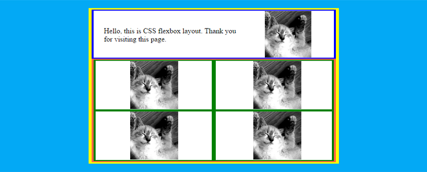
I've developed the following layout using the Flexbox CSS model:
html {
  box-sizing: border-box;
  overflow-y: none;
}
*,
*:before,
*:after {
  margin: 0;
  padding: 0;
  box-sizing: inherit;
}
#all {
  display: flex;
  flex-direction: column;
  justify-content: center;
  align-items: center;
  height: 100vh;
  background: #03a9f4;
}
#app {
  width: 500px;
  background: #ffffff;
  border: solid 6px yellow;
}
header {
  display: flex;
  justify-content: center;
  align-items: center;
  border: solid 4px blue;
}
#header-para-container {
  flex: 1;
}
#header-image-container {
  flex: 0.6;
  background: #888;
}
#header-image-container > img {
  display: block;
  width: 100%;
  height: auto;
}
section {
  display: flex;
  flex-wrap: wrap;
  border: solid 4px tomato;
}
figure {
  display: flex;
  justify-content: center;
  align-items: center;
  flex-basis: 50%;
  border: solid 4px green;
}
figure > img {
  max-width: 80%;
  height: auto;
}
<div id="all">
<div id="app-container">
<div id="app">
<header>
<div id="header-para-container">
<p>Hello, this is CSS flexbox layout. Thank you for visiting this page.</p>
</div>
<div id="header-image-container">
<img src="http://placekitten.com/g/300/300" />
</div>
</header>
<section id="grid-images">
<figure>
<img src="http://placekitten.com/g/300/300" />
</figure>
<figure>
<img src="http://placekitten.com/g/300/300" />
</figure>
<figure>
<img src="http://placekitten.com/g/300/300" />
</figure>
<figure>
<img src="http://placekitten.com/g/300/300" />
</figure>
</section>
</div>
</div>
</div>https://jsfiddle.net/petebere/fsLpw1vb/.
Would you know how to reduce responsively the height of the images and the main display element (in yellow frame) as the viewport height decreases?
The idea is that the element in yellow frame should be always fully visible and there should be no need for vertical scrolling.
At the moment when the viewport height drops, the height of the yellow container stays constant. This is probably because the browser wants to keep the sizes that I've applied to the container of the header image:
#header-image-container {
  ...
  flex: 0.6;
  ...
}
and to the containers of the grid images:
figure {
  ...
  flex-basis: 50%;
  ...
}
I've produced this graphic to show what I'm trying to achieve when the window height is reduced: