2

I am exploring Flexbox and am trying to align some items. The following code works and shows what I want to achieve (successful codepen here):

.labelinput {
  display: flex;
  flex-flow: row;
  margin: 1px;
}
.labelinput > *:first-child {
  flex-basis: 10em;
  flex-grow: 0;
  flex-shrink: 0;
}
.labelinput > *:nth-child(2) {
  flex-grow: 1;
  flex-shrink: 1;
  border: 3px solid purple;
}
<div class='labelinput'>
  <div>1st input</div>
  <div>this is just a div</div>
</div>
<div class='labelinput'>
  <div>2nd:</div>
  <input type="text" name="foo" value="this is an input box" />
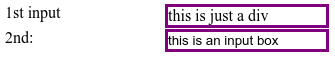
</div>

The above code produces the nicely align output shown below:

enter image description here

My reading of the above code is that it works because the first child in every div has a determined size (10em) and is totally inflexible (flex-grow and flex-shrink set to 0) whereas the second child has no determined size and will grow and shrink as appropriately.

What breaks though is when I try to embed the two top-level div elements (of class labelinput) into yet another container (failing codepen here):

#container {
  display: flex;
  flex-direction: column;
  justify-content: flex-start;
  align-items: flex-start;
  margin: 5px;
  border: 1px solid grey;
}
.labelinput {
  display: flex;
  flex-flow: row;
  margin: 1px;
}
.labelinput > *:first-child {
  flex-basis: 7em;
  flex-grow: 0;
  flex-shrink: 0;
}
.labelinput > *:nth-child(2) {
  flex-grow: 1;
  flex-shrink: 1;
  border: 3px solid purple;
}
<div id='container'>
  <div class='labelinput'>
    <div>1st input</div>
    <div>this is just a div</div>
  </div>
  <div class='labelinput'>
    <div>2nd:</div>
    <input type="text" name="foo" value="this is the input box" />
  </div>

</div>

The above produces the following unsatisfactory output:

enter image description here

I can't explain why this fails as I am just inserting the content of the successful case into a container that simply performs the default vertical stacking (flex-direction: column;).

By experimentation I have discovered that removing the align-items property from the outer level container (#container) fixes the problem but I can't explain that either.

I understand that the outermost container (#container) is asked to layout two other containers (of class labelinput) so whatever property I set for align-items in the outermost container should apply to the inner containers as a whole, not change the layout of their internal items.

Moreover I can't explain why the layout is changed based on the element type when there's nothing in my CSS that differentiates between items of element div versus items of element input.

Michael Benjamin
  • 346,931
  • 104
  • 581
  • 701
Marcus Junius Brutus
  • 26,087
  • 41
  • 189
  • 331

1 Answers1

1

I can't explain why this fails as I am just inserting the content of the successful case into a container that simply performs the default vertical stacking (flex-direction: column).

The difference is that this new primary container has align-items: flex-start.

By experimentation I have discovered that removing the align-items property from the outer level container (#container) fixes the problem but I can't explain that either.

When you nest the .labelinput flex containers in the larger container (#container), then the .labelinput elements become flex items, in addition to flex containers.

Since the #container flex container is set to flex-direction: column, the main axis is vertical and the cross axis is horizontal1.

The align-items property works only along the cross axis. It's default setting is align-items: stretch2, which causes flex items to expand the full width of the container.

But when you override the default with align-items: flex-start, like in your code, you pack the two labelinput items to the start of the container, as illustrated in your problem image:

enter image description here

Because stretch is the default value for align-items, when you omit this property altogether, you get the behavior you want:

enter image description here

I understand that the outermost container (#container) is asked to layout two other containers (of class labelinput) so whatever property I set for align-items in the outermost container should apply to the inner containers as a whole, not change the layout of their internal items.

The outermost container is not changing the layout of the inner container's children. At least not directly.

The align-items: flex-start rule on the outermost container is applying directly to the inner containers. The internal items of the inner containers are just responding to the sizing adjustment of their parent.

Here's an illustration of align-items: flex-start impacting .labelinput (red borders added).

#container {
  display: flex;
  flex-direction: column;
  justify-content: flex-start;
  align-items: flex-start;
  margin: 5px;
  border: 1px solid grey;
}
.labelinput {
  display: flex;
  flex-flow: row;
  margin: 1px;
  border: 2px dashed red;
}
.labelinput > *:first-child {
  flex-basis: 7em;
  flex-grow: 0;
  flex-shrink: 0;
}
.labelinput > *:nth-child(2) {
  flex-grow: 1;
  flex-shrink: 1;
  border: 3px solid purple;
}
<div id='container'>
  <div class='labelinput'>
    <div>1st input</div>
    <div>this is just a div</div>
  </div>
  <div class='labelinput'>
    <div>2nd:</div>
    <input type="text" name="foo" value="this is the input box" />
  </div>
</div>

Moreover I can't explain why the layout is changed based on the element type when there's nothing in my CSS that differentiates between items of element div versus items of element input.

There may be no difference between div and input in your code, but there are intrinsic differences.

Unlike a div, an input element has a minimum width set by the browser (maybe to always allow for character entry).

You may be able to reduce the input width by applying min-width: 0 or overflow: hidden3.


Footnotes

1. Learn more about flex layout's main axis and cross axis here: In CSS Flexbox, why are there no "justify-items" and "justify-self" properties?

2. Learn more about the align-items property in the spec: 8.3. Cross-axis Alignment: the align-items and align-self properties

3. Why doesn't flex item shrink past content size?

Community
  • 1
  • 1
Michael Benjamin
  • 346,931
  • 104
  • 581
  • 701
  • I sort of see your point but by that rationale and given that `align-items` is for the cross axis what `justify-content` is for the main axis, I should have been able to get the same stacking effect by setting `justify-content: flex-start` in the `.labelinput` container. Yet I don't. – Marcus Junius Brutus Nov 08 '16 at 01:09
  • `justify-content: flex-start` doesn't work in your `labelinput` containers because you also set `flex-grow: 1` on the nth(2) children. This tells those items to consume all available space. As a result, `justify-content` has no space to use. See this [**codepen**](http://codepen.io/anon/pen/bBdqGR?editors=1100) – Michael Benjamin Nov 08 '16 at 01:15
  • 1
    @MarcusJuniusBrutus As to why they render different, it is because an `input` is expected to be one line height and always tries to show the widest possible value. Somewhat like if you set `display: inline-table;` to your `div` element. If you want to prevent said `input` overflow you can use `min-width: 0;`. Michael_B surely knows more about this behavior in replaced elements. As a note, they render completely different in Edge. – Ricky Ruiz Nov 08 '16 at 02:39