4

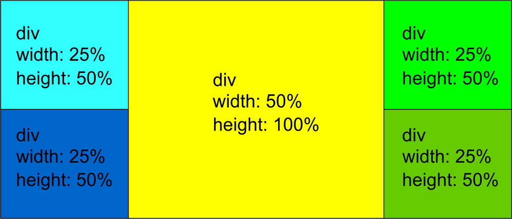
I'm trying to make page with 5 DIVs.
Plan is to put one picture in central DIV, and a link in each of other 4, using Bootstrap 3.

Wanted result:

image

Code so far:

.container-fluid2 {
  min-height: 100%;
  overflow: hidden;
  background-color: black;
}
.levogore5 {
  height: 50%;
  min-height: 50%;
  margin-bottom: -22%;
  padding-bottom: 22%;
  min-width: 25%;
  max-width: 100%;
  background-color: lime;
  vertical-align: top;
}
.levodole5 {
  height: 50%;
  min-height: 50%;
  margin-bottom: -25%;
  padding-bottom: 25%;
  min-width: 25%;
  max-width: 100%;
  background-color: green;
  vertical-align: baseline;
  margin-top: 22%;
}
.centar5 {
  height: 100%;
  min-height: 100%;
  min-width: 50%;
  max-width: 100%;
  background-color: red;
  margin-bottom: -50%;
  padding-bottom: 50%;
  overflow: hidden;
}
.desnogore5 {
  height: 50%;
  min-height: 50%;
  margin-bottom: -22%;
  padding-bottom: 22%;
  min-width: 25%;
  max-width: 100%;
  background-color: aqua;
  vertical-align: top;
}
.desnodole5 {
  height: 50%;
  min-height: 50%;
  margin-bottom: -25%;
  padding-bottom: 25%;
  min-width: 25%;
  max-width: 100%;
  background-color: blue;
  vertical-align: baseline;
  float: right;
  margin-top: 22%;
}
<div class="container-fluid2">
  <div class="row">
    <div class="col-sm-3 levogore5">levo gore</div>
    <div class="col-sm-5 col-sm-5 span2 centar5">centralni</div>
    <div class="col-sm-3 desnogore5">desno gore</div>
  </div>
  <div class="row">
    <div class="col-sm-3 levodole5">levo dole</div>
    <div class="col-sm-3 desnodole5">desno dole</div>
  </div>
</div>

I think I read all existing questions and answers here.
I tried html/body 100%, max-height, container-fluid, -9999px, but they didn't work.

I forgot to mention, responsiveness is crucial, and in my example, those float:right (in css for last DIV), make very big mess on smaller screens.

my idea is using bootstrap to have less problems with smaller screens, in more simpler pages bootstrap just make pile of horizontal DIVs so i hope to have something like this

enter image description here

  • What happens? Please post a link to a JSFiddle with your HTML, CSS, and anything else you are using (Like JavaScript) –  Nov 12 '16 at 17:35
  • Lemme know if my answer works. If yes, please tick the check green to mark it correct. –  Nov 12 '16 at 18:09
  • This should do it: http://stackoverflow.com/questions/16390370/how-can-i-get-a-bootstrap-column-to-span-multiple-rows –  Nov 12 '16 at 19:05

4 Answers4

1

This is a great example of a place to use flex box!

It seems to me that you're taking a row-based approach to this. I think a column-based approach is more appropriate.

When I'm designing a site, I like to try to break it up into squares or rectangles that go all the way across the width or the height of the page.

To my mind, this design has 1 rectangle going across the width of the page, which contains 3 rectangles going across the height of the page, and then some smaller rectangles in each of those.

body {
  margin: 0;
  padding: 0;
}
.column > div {
  border: 1px solid blue;
  min-height: 150px;
}
@media (min-width: 600px) {
  .row {
    display: flex;
    flex-direction: row;
    min-height: 100vh;
  }
  .row > div {
    flex-basis: 25%;
  }
  .row > div.main {
    flex-basis: 50%;
  }
  .column {
    display: flex;
    flex-direction: column;
  }
  .column > div {
    flex-basis: 50%;
  }
  .column.main > div {
    flex-basis: 100%;
  }
}
<div class="row">
  <div class="column">
    <div>Div width 25% height 50%</div>
    <div>Div width 25% height 50%</div>
  </div>
  <div class="column main">
    <div>Div width 50% height 100%</div>
  </div>
  <div class="column">
    <div>Div width 25% height 50%</div>
    <div>Div width 25% height 50%</div>
  </div>
</div>
RobertAKARobin
  • 3,933
  • 3
  • 24
  • 46
1

Responsive example without modifying bootstrap grid (Extra points because you shouldn't modify the grid or you won't be able to use it in every scenario)

I had to change your html and add few classes:

<div class="container-fluid container-table">
  <div class="row inline-row">
    <!-- I'm using three columns and nesting aqua and blue under the 1st column -->
    <div class="col-xs-12 col-sm-3">
      <div class="row">
        <div class="col-xs-12 aqua"></div>
        <div class="col-xs-12 blue"></div>
      </div>
    </div>

    <div class="col-xs-12 col-sm-6 yellow"></div>

    <!-- Nesting greenyellow and green -->
    <div class="col-xs-12 col-sm-3">
      <div class="row">
        <div class="col-xs-12 greenyellow"></div>
        <div class="col-xs-12 green"></div>
      </div>
    </div>

  </div>
</div> 

And the CSS:

/* Colors */
.aqua{ background-color:aqua; }
.blue{ background-color:blue; }
.yellow{ background-color:yellow; }
.greenyellow{ background-color:greenyellow; }
.green{ background-color:green; }

/* Height 100% to all the elements */
html, 
body, 
.container-table, 
.inline-row, 
.inline-row > div {
    height: 100%;
}

/* We do the trick here with Table, table row and table-cell */
.container-table {
    display: table;
    width: 100%; /* Width is important for display:table */
}
.inline-row { display: table-row; }
.inline-row > div { display: table-cell; }

/* This will set our heights as we need them */
.inline-row > div > .row { height: 100%; }
.inline-row > div .row > div { height: 50%; }

EDIT: Changed right and left grid to 25% of width.

My JsFiddle Live example

xWaZzo
  • 748
  • 5
  • 19
  • xWaZzo, looks nice, but left and right column have to be 25% on desktop and central column 50% wide. on small screen working and looking good :) – MarePannoniumGarden Nov 12 '16 at 19:16
  • @MarePannoniumGarden my bad, Just updated the right and left `col-sm-4` to `col-sm-3` and the central one to `col-sm-6` on the html bootstrap grid. I updated my answer. – xWaZzo Nov 12 '16 at 19:20
  • mea culpa, long day :( you right, just 3-6 resolve that, tnx. what about small screens, pile is ok, proportion is OK (center is bigger) but rows are to high, how to cut them on just 10-15% (12,5% would be the best) of high of screen and left 40-60% for central part? – MarePannoniumGarden Nov 12 '16 at 19:32
  • @MarePannoniumGarden just play with `.container-table` Height and change it to whatever height you need. And for the columns play with the html or create new classes and add custom width. If my answer solved your issue please mark it as the right answer. – xWaZzo Nov 12 '16 at 19:38
0

Fiddle

In short, you make 6 boxes.
Do you also want no padding between them?

If so, simply add to your CSS:

[class*='col-'] {
    padding-right:0;
    padding-left:0;
}

HTML:

<div class="container-fluid2">
  <div class="row">
    <div class='col-sm-3'>
      <div class="bg-color-red">left 3</div>
      <div class="bg-color-green">left 3</div>
    </div>
    <div class="col-sm-6 bg-color-green">
          <div class="bg-color-green">central 6</div>
    <div class="bg-color-green">central 6</div>
    </div>

    <div class='col-sm-3'>
      <div class="bg-color-red">right 3</div>
      <div class="bg-color-green">right 3</div>
    </div>
  </div>
</div>

CSS:
Bootstrap. See fiddle.

0

I have given you code below which will work from smaller desktop to largest (desktop in all cases) with bootstrap. As you said you like piles when it comes to mobile then simply don't write col-sm-* classes and @media query

.height-50{
  height : 480px;
}

.height-100{
  height : 960px;
}

.container-fluid div{
  border : 1px solid black;
}

@media (min-width: 576px) {
  .height-50{
    height : 230px;
  }

  .height-100{
    height : 460px;
  }
}
<link rel="stylesheet" href="https://maxcdn.bootstrapcdn.com/bootstrap/4.0.0-alpha.5/css/bootstrap.min.css" integrity="sha384-AysaV+vQoT3kOAXZkl02PThvDr8HYKPZhNT5h/CXfBThSRXQ6jW5DO2ekP5ViFdi" crossorigin="anonymous">
<div class="container-fluid">
  <div class="col-lg-3 col-sm-3">
    <div class="row">
      <div class="col-lg-12 col-sm-12 height-50" style="background-color : lightgray">
        Width : 25%;<br>Height : 50%;
      </div>
      <div class="col-lg-12 col-sm-12 height-50" style="background-color : #9898e7">
        Width : 25%;<br>Height : 50%;
      </div>
    </div>
  </div>
  <div class="col-lg-6  col-sm-6">
    <div class="row">
      <div class="col-lg-12 col-sm-12 height-100" style="background-color : yellow">
        Width : 50%;<br>Height : 100%;
      </div>
    </div>
  </div>
  <div class="col-lg-3  col-sm-3">
    <div class="row">
      <div class="col-lg-12 col-sm-12 height-50" style="background-color : yellowgreen">
        Width : 25%;<br>Height : 50%;
      </div>
      <div class="col-lg-12 col-sm-12 height-50" style="background-color : green">
        Width : 25%;<br>Height : 50%;
      </div>
    </div>
  </div>
</div>
Shalin Patel
  • 1,079
  • 1
  • 10
  • 15