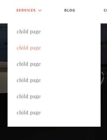
I have a submenu underneath a menu that has the property display: flex, and the list items have the property flex-grow: 1
I would like to align the submenu so that the links are aligned with the parent like so:
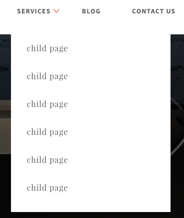
This is working because I gave the submenu the property left: 19px. This works but the problem is that since the menu and its items are displayed flex, when the browser shrinks the width of the list item shrinks with it, so the submenu does not get aligned. Below is a screenshot when the browser shrunk 200px:
Is there a css class or anything I can do to have the submenu links align with the parent links on browser shrink? I could technically make a ton of media queries and change the left: but I thought I would ask if anyone has a better solution.
Here is my code. I stripped out alot but left the code that seemed necessary for this question.
#menu-main-menu {
  display: flex;
}
#menu-main-menu li {
  float: left;
  flex-grow: 1;
  text-align: center;
  position: relative;
}
#menu-main-menu li a {
  display: inline-block;
  padding: 40.5px 0;
}
#menu-main-menu .menu-item-has-children .sub-menu {
  position: absolute;
  left: 19px;
}
<ul id="menu-main-menu">
<li class="menu-item-has-children">
<a href="http://localhost:8888/services/" class="">Services</a>
<ul class="sub-menu">
<li><a href="#" class="">Child Page</a></li>
<li><a href="#" class="">Child Page</a></li>
<li><a href="#" class="">Child Page</a></li>
</ul>
</li>
<li><a href="#">Blog</a></li>
<li><a href="#">Contact Us</a></li>
</ul>