0

I have an issue trying to force the CSS to work the way I want it to. Below you will find a 2 pictures and a description of what the behaviour should be like. All the CSS and content is dynamically created so any form of "flexibility" is doable, though if possible, should be avoided.

The RED div has dynamical width (width:auto) and needs to be filled with a bunch of BLACK divs. The number of black divs is random, or rather depends on a case-to-case basis.

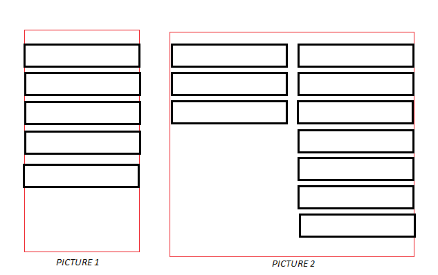
Picture1 and Picture2 show how the menu should expand in case the amount of black divs is taking more space then one height (which is fixed to 720px). In case a thrid column was to be needed, it once again should be expanded towards left.

I've searched around and found this CSS:

#redDiv {
-moz-column-count: 2; 
-moz-column-gap: 50%;
-webkit-column-count: 2;
-webkit-column-gap: 50%;
column-count: 3;
column-gap: 50%;
}

however there are three issues there:

  • First one, the amount of columns needs to be fixed this way, and I need it to dynamically suit the content that fills it.
  • Secondly, I do not think that this is meant to be done with dynamical width divs, mainly because gap and width have no meaning there.
  • Lastly, even if I do use the javascript to determin the number of columns, the table expands to the right and I need it to expand to the left, because it is docked to the right side of the screen with some controls being there.

EDIT: (js fiddle) UPDATED

HTML:

<div id="rightdocked">
  <div id="RedDiv">
    <div class="blackdivs"></div>
    <div class="blackdivs"></div>
    <div class="blackdivs"></div>
    <div class="blackdivs"></div>
    <div class="blackdivs"></div>
  </div>
</div>

CSS:

.blackdivs {
  position: relative;
  margin-top: 0px;
  margin-bottom: 20px;
  width: 300px;
  height: 40px;
  border: solid 2px black;
  background-color: white;
}

.blackdivs:first-of-type {
  background-color: green;
}

#RedDiv {
  max-height: 180px;
  width: auto;
  z-index: 9;
  background-color: lightgreen;
  position: relative;
  float: left;
  background-color: white;
  border: 2px red solid;
}

#rightdocked {
  position: relative;
  width: auto;
  height: 300px;
  float: right
}

Any suggestions?

Dellirium
  • 1,362
  • 16
  • 30
  • Hm, what about using flexbox ? – Belmin Bedak Nov 24 '16 at 12:22
  • I am not sure what that is, some framework? I cannot incorporate any extra libraries or stuff like that. Native JS, CSS. – Dellirium Nov 24 '16 at 12:27
  • Nope, It's native CSS - pretty new thing in CSS.I would like to help you out, but so far you don't provide any code so I'm afraid that I don't really understand your needs. – Belmin Bedak Nov 24 '16 at 12:29
  • 1
    I think flexbox is the way to go: https://css-tricks.com/snippets/css/a-guide-to-flexbox/ – SKeurentjes Nov 24 '16 at 12:29
  • @Belmin there updated with code, but I do not think it will mean anything, since... it is just a regular div things, unrelated to this type of behavior. Speaking of which, I also do not know why `.blackdiv:first-of-type{}` doesn't work either. – Dellirium Nov 24 '16 at 12:48

2 Answers2

0

Here is some code to get you started. I guess this is the behavior you wanted. I have kept max-height to 120px for demo, you can change it to 720px. Just keep on pressing add box button to add inner divs.

$('#addBoxButton').click(function() {
  $('.outer').append('<div class="inner">innner</div>');
});
.outer {
  border: 1px solid red;
  max-height: 120px;
  width: inherit;
  display: flex;
  flex-wrap: wrap-reverse;
  flex-direction: column;
}
.inner {
  border: 1px solid black;
  width: 50px;
  height: 20px;
  margin: 5px
}
<script src="https://ajax.googleapis.com/ajax/libs/jquery/2.0.1/jquery.min.js"></script>
<div class='outer'>
</div>
<input id="addBoxButton" type="button" value="add box" />
Anupam
  • 7,966
  • 3
  • 41
  • 63
  • This seems to be what I need. Now I only need to fiddle with it to make it look the way I want but this is the behaviour I am looking for, yes. Thank you. – Dellirium Nov 24 '16 at 13:07
  • I've made it align the divs alright, the width of the container is set to auto though, and it remains as if there is only one column, any way to fix that one? – Dellirium Nov 24 '16 at 13:12
0

.red {
  border:solid 2px red;
  text-align:center;
  float:right;
   }
.black {
  border:solid 2px #000;
  display:inline-block;
  width:200px;
  margin:4px;
  height:40px;
  }
span .black:nth-child(1) {
   width:0;
  opacity:0;
  transition:0.3s;
  }
span:hover .black:nth-child(1) {
  width:200px;
  opacity:1;
}
<div class="red">
<span>
  <div class="black"></div>
  <div class="black"></div>
</span>
</div>

Maybe this can get you started

Martin Hugo
  • 184
  • 1
  • 1
  • 10
  • I do not see the button to add multiple boxes or am i blind o.0 – Dellirium Nov 24 '16 at 12:55
  • I wanted to avoid posting the whole expand/move code in order to avoid confusion. The goal is to have the divs in as little columns as possible, taking up full height of the screen before going to the next column. If there is 1-2-3 divs, they should all be one column. If there is a lot of them (10 for example) they dont fit one column, expand to a new one, and be on the LEFT side of the old one. There is no need for any animation or transitions or anything. They just need to be formatted that way. – Dellirium Nov 24 '16 at 12:58