1

Objective

I have a custom control targeting a ToggleButton that will also work with a Button. So I want to use a common default ControlTemplate for both types.

The strategy I tried was to set TargetType="{x:Type ButtonBase}" in the template and this works fine if it is explicitly set on a Button or ToggleButton.

Implicit

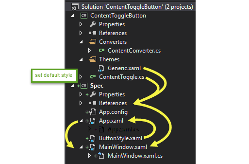
Custom Control Library

In a resource dictionary called Generic.xaml in the Themes folder on the project root...

<Style TargetType="{x:Type ButtonBase}">
    <Setter Property="Template">
        <Setter.Value>
            <!--Modified Control Template-->
            <ControlTemplate TargetType="{x:Type ButtonBase}">

In the control's class I set the metadata for the user control type in it's static constructor using FrameworkElement.DefaultStyleKey...

static ContentToggle()
{
    DefaultStyleKeyProperty.OverrideMetadata(typeof(ContentToggle),
       new FrameworkPropertyMetadata(typeof(ButtonBase)));
}

Consuming WPF Application Project

App.xaml...

<Application x:Class="Spec.App"
             xmlns="http://schemas.microsoft.com/winfx/2006/xaml/presentation"
             xmlns:x="http://schemas.microsoft.com/winfx/2006/xaml"
             StartupUri="MainWindow.xaml">
    <Application.Resources>
        <ResourceDictionary>

            <!--Get a reference to the window to establish View Context-->
            <RelativeSource x:Key="View" Mode="FindAncestor" 
                        AncestorType="{x:Type Window}" />

            <ResourceDictionary.MergedDictionaries>

                <!--Local Style-->
                <ResourceDictionary Source="pack://application:,,,/ButtonStyle.xaml" />

            </ResourceDictionary.MergedDictionaries>

        </ResourceDictionary>
    </Application.Resources>
</Application>

MainWindow.xaml...

<Window x:Class="Spec.MainWindow"
        xmlns="http://schemas.microsoft.com/winfx/2006/xaml/presentation"
        xmlns:x="http://schemas.microsoft.com/winfx/2006/xaml"
        xmlns:b="clr-namespace:ContentToggleButton;assembly=ContentToggleButton"
        Title="MainWindow" Height="350" Width="525">
    <Grid>
        <b:ContentToggle Name="Toggle" Height="30" 
                         Content="{Binding options, RelativeSource={StaticResource View}}"
                         />
    </Grid>
</Window>

MainWindow.xaml.cs

public partial class MainWindow : Window
{
    public List<string> options { get; set; }
    public bool initialState { get; set; }

    public MainWindow ()
    {
        options = new List<string> { "Checked", "UnChecked" };

        initialState = false;

        InitializeComponent();
    }
}

There is also a file called ButtonStyle.xaml that defines brushes to be used by the custom control. It is exposed on the root of the app by the merged dictionary in App.xaml.

Result

The template of the ContentToggle instance is null and there is no visual for the styled control (when I snoop the control it has no child elements).

My understanding is that the automatic ButtonBase style/template will be used for my control. What am I missing?

Explicit

The custom control works as expected if the style/template is explicitly declared on the control. The following works with the style target set to ButtonBase...

Consuming WPF Application Project

In App.xaml...

<Application x:Class="Spec.App"
             xmlns="http://schemas.microsoft.com/winfx/2006/xaml/presentation"
             xmlns:x="http://schemas.microsoft.com/winfx/2006/xaml"
             StartupUri="MainWindow.xaml">
    <Application.Resources>
        <ResourceDictionary>

            <!--Get a reference to the window to establish View Context-->
            <RelativeSource x:Key="View" Mode="FindAncestor" 
                        AncestorType="{x:Type Window}" />

            <ResourceDictionary.MergedDictionaries>

                <!--custom control-->
                <ResourceDictionary Source="pack://application:,,,/ContentToggleButton;component/Themes/Generic.xaml" />

                <!--Local Style-->
                <ResourceDictionary Source="pack://application:,,,/ButtonStyle.xaml" />

            </ResourceDictionary.MergedDictionaries>

        </ResourceDictionary>
    </Application.Resources>
</Application>

In MainWindow.xaml...

<Window x:Class="Spec.MainWindow"
        xmlns="http://schemas.microsoft.com/winfx/2006/xaml/presentation"
        xmlns:x="http://schemas.microsoft.com/winfx/2006/xaml"
        xmlns:b="clr-namespace:ContentToggleButton;assembly=ContentToggleButton"
        Title="MainWindow" Height="350" Width="525">
    <Grid>
        <b:ContentToggle Name="Toggle" Height="30" 
                         Content="{Binding options, RelativeSource={StaticResource View}}"
                         Style="{DynamicResource LocalButtonStyle}"
                         />
    </Grid>
</Window>

In ButtonStyle.xaml...

<ResourceDictionary xmlns="http://schemas.microsoft.com/winfx/2006/xaml/presentation"
                    xmlns:x="http://schemas.microsoft.com/winfx/2006/xaml">

    <!--Custom Button backgrounds-->
    <LinearGradientBrush x:Key="Button.Static.Background" 
                             EndPoint="0.5,1" StartPoint="0.5,0">
        <GradientStop Color="#FF2C0606" Offset="1"/>
        <GradientStop Color="#E6ADAD"/>
    </LinearGradientBrush>
    <LinearGradientBrush x:Key="Button.MouseOver.Background" EndPoint="0.5,1" StartPoint="0.5,0">
        <GradientStop Color="#FF2C0606" Offset="1"/>
        <GradientStop  Color="#FFF2F2"/>
    </LinearGradientBrush>
    <LinearGradientBrush x:Key="Button.MouseOver.Checked.Background" EndPoint="0.5,1" StartPoint="0.5,0">
        <GradientStop Color="#FF2C0606" Offset="1"/>
        <GradientStop  Color="#F2FFF3"/>
    </LinearGradientBrush>
    <LinearGradientBrush x:Key="Button.Checked.Background" EndPoint="0.5,1" StartPoint="0.5,0">
        <GradientStop Color="#FF2C0606" Offset="1"/>
        <GradientStop x:Name="GradientStop" Color="#ADE6B1"/>
    </LinearGradientBrush>

    <!--Establish the style colours-->
    <SolidColorBrush x:Key="Button.Static.Border" Color="#FF707070" />
    <SolidColorBrush x:Key="Button.MouseOver.Border" Color="#FF3C7FB1" />
    <SolidColorBrush x:Key="Button.Pressed.Background" Color="#C4F6CE" />
    <SolidColorBrush x:Key="Button.Pressed.Border" Color="#FF2C628B" />
    <SolidColorBrush x:Key="Button.Disabled.Background" Color="#FFF4F4F4" />
    <SolidColorBrush x:Key="Button.Disabled.Border" Color="#FFADB2B5" />
    <SolidColorBrush x:Key="Button.Disabled.Foreground" Color="#FF838383" />

    <!--Custom Style-->
    <Style x:Key="LocalButtonStyle" TargetType="{x:Type ButtonBase}" BasedOn="{StaticResource ButtonStyle}">
        <Setter Property="HorizontalAlignment" Value="Stretch" />
        <Setter Property="VerticalAlignment" Value="Center" />
        <Setter Property="HorizontalContentAlignment" Value="Center" />
        <Setter Property="VerticalContentAlignment" Value="Center" />
        <Setter Property="Background" 
                    Value="{StaticResource Button.Static.Background}"/>
        <Setter Property="BorderBrush" 
                    Value="{StaticResource Button.Static.Border}"/>
    </Style>

</ResourceDictionary>

Solution Structure (common to both cases)

enter image description here

Cool Blue
  • 6,438
  • 6
  • 29
  • 68
  • Where u r using `ContentToggle` control ? – AnjumSKhan Nov 26 '16 at 05:45
  • Your `ContentToggle` control derives from `ButtonBase` ? – AnjumSKhan Nov 26 '16 at 07:40
  • @AnjumSKhan: yes it does, the base class is `ToggleButton` – Cool Blue Nov 26 '16 at 07:42
  • This will help you : http://stackoverflow.com/questions/32956005/why-doesnt-defaultstylekey-change-the-default-style-for-my-subclasses – AnjumSKhan Nov 26 '16 at 08:06
  • @AnjumSKhan: thanks for the link, unfortunately it doesn't help me. As you can see from the pic I added, the style is already in /Themes/Generic.xaml, so I already have the recommended structure. The difference from the linked case and mine is that they are creating subclasses inside the control library and exporting them. I am exporting the base and subclassing in the consuming app, hence there is no resource that could be placed in a Generic.xaml file. – Cool Blue Nov 26 '16 at 08:40
  • This will not work, you have to use this : `new FrameworkPropertyMetadata(typeof(ContentToggle))` – AnjumSKhan Nov 26 '16 at 15:51
  • @AnjumSKhan: ok, thanks. If you have time please post an answer explaining _why_. I can see that your suggestion works but I'm hoping to gain some better understanding by knowing why the advertised way does not work – Cool Blue Nov 26 '16 at 16:26

2 Answers2

0

I don't exactly know why, but for ButtonBase theme search does not work at all (probably related to it being abstract). Even if you try to find a style for ButtonBase with for example FindResource or similar methods - you won't find anything, even if you define it yourself in Generic.xaml (for other controls like Button you will find a style).

Now, to solve your particular problem easiest way I see is define style for ContentTogger but define template for ButtonBase (you can move it out in separate resource and reuse):

<Style TargetType="{x:Type c:ContentToggle}">
    <Setter Property="Template">
        <Setter.Value>
            <!-- move this template out to separate resource -->
            <ControlTemplate TargetType="{x:Type ButtonBase}">
                <Border Background="{TemplateBinding Background}"
                        BorderBrush="{TemplateBinding BorderBrush}"
                        BorderThickness="{TemplateBinding BorderThickness}">
                </Border>
            </ControlTemplate>
        </Setter.Value>
    </Setter>
</Style>
Evk
  • 98,527
  • 8
  • 141
  • 191
  • In point 1, what do you mean by the "current theme resource dictionary"? – Cool Blue Nov 27 '16 at 03:45
  • Styles of default controls depends on current theme (theme is basically just a resource dictionary like your Generic.xaml) - https://msdn.microsoft.com/en-us/library/aa970773(v=vs.110).aspx – Evk Nov 27 '16 at 07:57
  • Sorry, I was unclear: what do you mean by the "**_current_** theme resource dictionary"? I understand what they are, I just don't understand what you mean by the current theme: as far as I can tell the current theme is the one set in generic.xaml in the referenced custom control dll, because there are no styles in the control, window or application resource dictionaries so, I'm asking which **_current_** style are you saying is overriding this? – Cool Blue Nov 27 '16 at 08:12
  • I think this answer explains it good - http://stackoverflow.com/a/1232333/5311735. Note "If the style is not found in the theme dictionary, it looks in Generic.xaml". – Evk Nov 27 '16 at 08:16
  • Yes and that is my point. In your first point above, you are saying that there is an issue with style precedence and I'm saying there is no competing precedence as far as I can tell. So, that's why I'm asking you what you mean by the current theme when you say "_it won't work, because Button has already defined style in current theme._" – Cool Blue Nov 27 '16 at 08:29
  • My first point does not apply specifically to ButtonBase, just to general approach. If that were not ButtonBase but for example Button, style from default theme will have effect and style from Generic.xaml would be ignored. – Evk Nov 27 '16 at 08:57
  • OK, then it seems that your first point does not apply to my question either, so, if you agree then delete it and I will accept your answer. I'm clear on your second point (nobody knows why it doesn't work because wpf is a badly documented, lexical cluster f@#k...) and your insight about having different targets for the style and the template gave me a good solution. – Cool Blue Nov 27 '16 at 09:10
  • Well I thought first point will explain why its not a good idea to do that in general but you are right in that it does not answer your question, so I deleted it. – Evk Nov 27 '16 at 09:13
0

After reading the introduction of your problem at the start, I suggest following approach. This is just a sample giving a basic idea.

Generic.xaml

<Style x:Key="CommonStyle" TargetType="{x:Type Button}">
    <Setter Property="Background" Value="Yellow"/>
    <Setter Property="FontSize" Value="25"/>
</Style>

<Style TargetType="{x:Type local:CustomButton}">
    <Setter Property="Template">
        <Setter.Value>
            <ControlTemplate TargetType="{x:Type local:CustomButton}">
                <Border Background="{TemplateBinding Background}" CornerRadius="10"
                        BorderBrush="{TemplateBinding BorderBrush}"
                        BorderThickness="{TemplateBinding BorderThickness}">
                    <Button Style="{StaticResource CommonStyle}" Content="{TemplateBinding Content}" />
                </Border>
            </ControlTemplate>
        </Setter.Value>
    </Setter>
</Style>

CustomButton.cs

public class CustomButton : ToggleButton
{
    static CustomButton()
    {
        DefaultStyleKeyProperty.OverrideMetadata(typeof(CustomButton), new FrameworkPropertyMetadata(typeof(CustomButton)));
    }           
}

See if this solves your problem, else I will try to evolve this answer.

AnjumSKhan
  • 9,647
  • 1
  • 26
  • 38