7

This is the third time I have faced this problem.

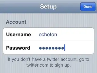
I don't know what is wrong. Here are two pictures of how it looks like:

On desktops:

On mobile devices:

As you can see on mobile devices text is not aligned center vertically.

Again this problem is only visible on mobile devices.

What is the problem? What did I miss? This problem is also visible in inputs.

I am using the following code for the buttons:

.button
  font-family: 'Gotham Pro', sans-serif
  font-size: 14px
  color: $color-text--button
  padding: 10px 15px
  text-transform: uppercase
  background: $color-button--default
  border: 1px solid $color-transparent

Please note, I use padding for setting height of buttons

UPDATE

I have just tested in mobile android Firefox browser, everything works just fine the issue only with Chrome
  • I just tried that CSS of yours and have no issues on mobile. Please post a code snippet that reproduces the issue, or else we have nothing to work with. – Asons Nov 28 '16 at 16:29
  • Try reset the `line-height` to somewhere between 1 and 1.2. When not set/reset the browsers default can differ, so Chrome might give it something else by default – Asons Nov 28 '16 at 17:43

5 Answers5

1

There is no line-height specified in your code.

Try setting a specific line-height. In addition I suggest, that you center your text via line-height and not via padding. Set a line-height with the same height the button has.

CSS

.button {
    height: 40px;
    line-height: 40px;
}

This works of course only for single line texts. Also have a look at this SO question

Community
  • 1
  • 1
chillwalker
  • 88
  • 1
  • 8
  • but why does this work on desktops, and I don't want to set static height of the button, using padding is more flexible –  Nov 28 '16 at 15:53
  • With the given information it is hard to guess. Maybe there is an user-agent style in chrome causing the issue. Did you try setting a fixed line-height? – chillwalker Nov 28 '16 at 18:03
  • Using line height property with static height it works, but I cannot do this, I have buttons dynamically height according to padding –  Nov 28 '16 at 19:04
  • 1
    @gzbuaapzroyn As I already commented, we need a code snippet reproducing the issue to be able to give you a proper answer. – Asons Nov 28 '16 at 19:42
0

Did you specify a media query SPECIFICALLY for mobile? You may need to add

// you can use any other value of screen width mobiles use like 640, 768
@media (max-width:480px){
    line-height: 15px;  // The line height you want to show on mobile
}
Ojanti
  • 36
  • 3
0

Not all browsers have a default. Almost always I make a habit of setting styles on the body element

body{
 font-size: 100%;
 line-height: 1.333%;
}

to take care of things like this.

jjeining
  • 61
  • 1
  • 8
0

I had to work with a fancy font today and I noticed that it has different line-height rendering on chrome mobile device and chrome desktop mobile emulator (devtools). Which is apparently a bug to be reported for either dekstop either mobile chrome. Changing line-heights is the option to fix but cumbersome if you have many elements. After some digging I figured out this properties

ascent-override: 92%; /* play with values */
descent-override: 10%; /* one might not be needed */

Futhermore as I needed font change for mobile chrome only I tried media query and it worked.

@media (max-width: 1000px) {
  @font-face{
    font-family:'FancyFont';
    src:url('fonts/FancyFont.ttf');
    font-weight:400;
    ascent-override: 92%;
  }
}
Hebe
  • 661
  • 1
  • 7
  • 13
0

This works like a charm:

  descent-override: 0%;
  ascent-override: 72%;
  line-gap-override: 3%;

Reference: https://codepen.io/web-dot-dev/pen/poeLebG

user771417
  • 11
  • 2