I recently realized that we can't align multiple divs inside container horizontally - without a space between them and without using float.
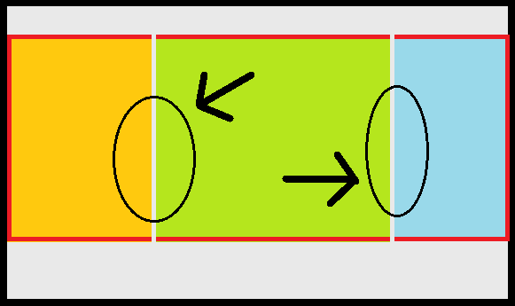
I applied inline-block to the divs inside the container element and gave them width in %. but there appears to be some extra space. I know it's because of the hidden characters. Refer below image - Red line is container's
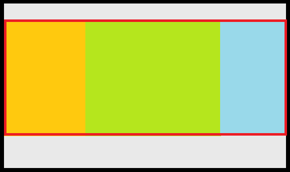
I want to make it like the below image using inline-block and take up the entire width of the container. I can't use flexbox to parent since I want to make it responsive and hide/reposition some elements after breakpoints. I also don't want to use floats since it pulls out the divs outside and make the container element useless. Also, it is meaningless to remove the spaces and tabs to make it work... it would be a mess to type the code in there.
Now come on CSS, there has to be something. It shouldn't be this frustrating and CSS shouldn't be this dumb.
Here's my code,
.container{
 width: 100%;
 height: auto;
}

.section{
 display: inline-block;
}

.homebar{
 width: 24%;
 height: 600px;
 background-color: #222;
}
.content{
 width: 50%;
 min-width: 500px;
 height: 600px;
 background-color: #fbfbfb;
}
.sidebar{
 width: 24%;
 height: 600px;
 background-color: #158;
}
<div class="container">
<!-- Home/Menu Bar-->
<div class="section homebar">
</div>
<!-- Content Area -->
<div class="section content">
</div>
<!-- Sidebar Area -->
<div class="section sidebar">
</div>
</div>