6

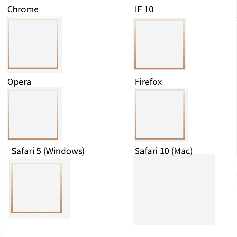
I ran into an issue with Safari 10 and CSS border image gradients. It works in all other browsers, and even in Safari 9. It even shows up in Safari 10 in online simulators. Please see images below:

enter image description here

(I guess that's IE 11, not IE 10. Thanks for the correction!)

I assumed it was just my CSS so I really simplfied it and made a fiddle. You can see it at https://jsfiddle.net/tgbuxkee/

It's also generated below too.

div {
  width: 200px;
  height: 200px;
  border: 6px solid transparent;
    -moz-border-image: -moz-linear-gradient(top, #f0e2d0 0%, #c08b62 100%);
    -webkit-border-image: -webkit-linear-gradient(top, #f0e2d0 0%, #c08b62 100%);
    border-image: linear-gradient(to bottom, #f0e2d0 0%, #c08b62 100%); 
    -webkit-border-image-slice: 2;
    border-image-slice: 2;
  
}
<div>

</div>

Does anybody have any idea why this could be happening? I know there is a bug with some image borders in Safari but I don't think that is the case here (maybe it is).

And guidance is helpful.

Thank you.

Kenton de Jong
  • 1,001
  • 4
  • 17
  • 37
  • I have seen this in the past but I am not 100% sure it works still (and so not posting an answer yet). Instead of `border: 6px solid transparent`; just try setting `border-width: 6px; border-style: solid;` (no `border-color`) and that used to work. It will work for other browsers also because the image would overwrite the color. – Harry Dec 01 '16 at 06:11

2 Answers2

13

I have run into this issue in the past and remember reading somewhere on the web that avoiding the border-color: transparent setting would solve the problem. I don't remember where I read about it.

It seems like Safari 10 on Mac gives preference to the transparent border color over the border image and so displays nothing. Just setting the border-width and border-style alone would solve it. This solution works on other supported browsers also.

Tested on Chrome v56 (dev), Safari 10 (Mac), Safari 5 (Windows), Safari (iOS), IE11, Edge, Firefox 47.0.1, Opera 41.

Note: You've quoted IE10 in the question but as far as I know border-image doesn't work in it and so the given solution also doesn't.

div {
  width: 200px;
  height: 200px;
  border-width: 6px;
  border-style: solid;
  -moz-border-image: -moz-linear-gradient(top, #f0e2d0 0%, #c08b62 100%);
  -webkit-border-image: -webkit-linear-gradient(top, #f0e2d0 0%, #c08b62 100%);
  border-image: linear-gradient(to bottom, #f0e2d0 0%, #c08b62 100%);
  -webkit-border-image-slice: 2;
  border-image-slice: 2;
}
<div>

</div>
Harry
  • 87,580
  • 25
  • 202
  • 214
  • 1
    That's the solution! What a strange "feature". Thanks a lot! And thanks for the edit for IE 10. I guess I was using IE 11. – Kenton de Jong Dec 01 '16 at 16:10
1

The following may be helpful supplemental information. The accepted answer is still true for Safari 11 (as of posting), but for the record, I have also found that with, border-image:url, Safari(v11) will accept the shorthand border, with transparent, if you list the -webkit- vendor prefix last, like this:

div {
  border:1px solid transparent;
  border-image:url([some-border-image]) 1 0 1 repeat;
  -webkit-border-image:url([some-border-image]) 1 0 1 repeat;
}

Since it is non-standard to list the vendor prefix last, I prefer the accepted answer as most web standards friendly.

user16119
  • 11
  • 1