0

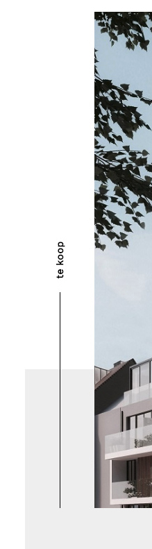
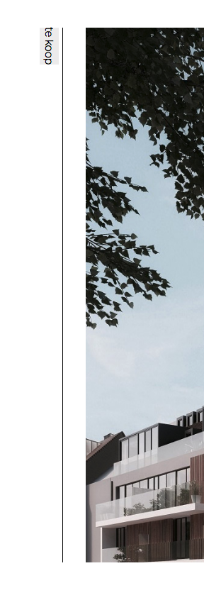
I'm trying achieve the following; Rotating the text is not the problem however the line under it is. It is supposed to change according to how long the text is. Meaning if the text changes in length the line shrinks or expands accordingly. The top of the text should remain at the same location.

Any ideas ?

Example Image

EDIT:

what i've tried so far (disregard the flex):

<section class="slideshow">

    <div class="forsale">
        <a href="#">te koop</a>
        <span></span>
    </div>

  <img src="./img/project_1.jpg" alt="">

</section>


  .forsale {

position: relative;
a {
  position: absolute;
  transform: rotate(-90deg) translate(0 ,100%;
  transform-origin:0% 0%;
  background-color: #eee;
  display: block;
  text-decoration: none;
  color: black;
  width: 385px;
}
span {
  display: block;
  width: 1px;
  height: 100%;
  background-color: black;
  position: absolute;
  left: 50%;
  bottom: 0;
}

}

where I'm at now enter image description here

Rob
  • 14,746
  • 28
  • 47
  • 65
Jannes V
  • 67
  • 1
  • 9

1 Answers1

4

How is this - I have added comments to show you what is happening

html,
body {
  margin: 0;
  padding: 0;
}
.slideshow {
  position: relative;
}
.forsale {
  width: 500px;   /*this width = height of image */
  position: absolute;  /* the following styles move this div to the middle of the slideshow div*/
  left: 50px;
  top: 50%;
  transform: translateY(-50%);
  z-index: 1;
}
img {
  margin-left: 100px; /* this is just making space for the text */
  display: block; /* removes any space below the image */
}
.forsale a {
  /* this rotates the anchor so it is dow the side of the image and moves it to the left of the forsale div */
  transform-origin: center;
  transform: translate(-50%, 0) rotate(270deg);
  display: block;
  width: 100%;
  width text-decoration: none;
  color: black;
}
.half {
  display:block;
  width: 50%;
  position: relative;
  text-align: right;
}
.half:after {
  /* this is the black line */
  content: '';
  display: block;
  width: 100%;
  position: absolute;
  left: 0;
  top: 50%;
  border-top: 1px solid #000000;
  z-index: 1;
}
.line-hide {
  /* this is to cover the black line under the text*/
  position: relative;
  display: inline-block;
  padding-left: 10px; /* however much space you want before the line */
  background-color: #ffffff; /* bacground colour of the page - hides the line */
  z-index: 2;
}
<section class="slideshow">
  <div class="forsale">
    <a href="#"><span class="half"><span class="line-hide">te koop</span></span></a>
  </div>

  <img src="http://lorempixel.com/100/500/sports/1" alt="">
</section>
Pete
  • 57,112
  • 28
  • 117
  • 166
  • Plussss from me :) – Asons Dec 05 '16 at 17:06
  • Works like charm, however how would you go about this if you didn't know the height of the image (Ie it scales with the windows) – Jannes V Dec 05 '16 at 17:47
  • @JannesV Don't think you'd be able to do that as you need to know the width to know how long your text can be. The only other option would be to do it with javascript so that you could calculate the height of the image on the fly – Pete Dec 06 '16 at 08:56