First of all, this is my code for the web page
@import url("reset.css");
@import url('https://fonts.googleapis.com/css?family=Raleway');
*
{
  box-sizing:border-box;
}

body
{
  background-color: #9E9E9E;
}

#wrapper
{
  width:95%;
  max-width:980px;
  margin: 0 auto;
  font-family: 'Raleway', sans-serif;
  line-height: 2rem;
}


.header
{
  padding:18px;
  background-color: #757575;

  border-radius:5px;
  width:100%;
  margin-top:5px;
  margin-bottom:5px;
}

.column_left
{
  float:left;
  padding:18px;
  width:70%   ;
  background-color:#607D8B;
  border-top-left-radius: 5px;
  border-bottom-left-radius:5px;
}

.column_right
{
  float:right;
  padding:18px;
  width:29.99%;
  background-color:#455A64;
  border-top-right-radius: 5px;
  border-bottom-right-radius: 5px;


}

/*For Screens 750 PX or less (width)*/
@media screen and (max-width:750px)
{
  .header
  {
    text-align:center;
  }

  .column_right
  {
    display:none;
  }

  .column_left
  {
    width:100%;
    border-radius:5px;
  }
}

h1
{
  font-size:1.8rem;
}

h2
{
  font-size: 1.4rem;

}

p
{

}

nav
{}
nav ul
{}
nav ul li
{
  width:100%;
  background-color:#607D8B;
  text-align:center;
  padding:2.5px;
  border-radius:5px;
  margin-bottom:5px;
}
nav ul li a
{
  color:#455A64;
}


footer
{
  padding:18px;
  background-color: #757575;
  border-radius:5px;
  width:100%;
  margin-top:5px;
  margin-bottom:5px;
  float:none;
  display:flex;
}
<meta name="viewport" content="width=device-width, user-scalable=no">
<div id="wrapper">
<h1 class="header">Lorem Ipsum</h1>
<div class="column_left">
<h2>Welcome to Lorem Ipsum</h2>
<p>Aenean nec vestibulum justo, ut aliquet ante. </p>
<p>Lorem ipsum dolor sit amet, consectetur adipiscing elit.</p>
<p>Etiam viverra interdum neque, sed sagittis lectus sodales sit amet.</p>
<p>Maecenas posuere laoreet auctor. Integer vel nulla ut magna interdum consectetur.</p>
<p>Vestibulum non ligula sed diam luctus tincidunt in sit amet metus.</p>
</div>
<div class="column_right">
<h2>Navigation</h2>
<nav>
<ul>
<li><a class="button" href="#">Link</a></li>
<li><a class="button" href="#">Link</a></li>
<li><a class="button" href="#">Link</a></li>
</ul>
</nav>
</div>
<footer>
© 2016 Ipsum Lorem
</footer>
</div>Basically I would like to have the column_left and column_right classes the same height, without using height=100%. The website will have more than one page, and the length on the others may not be the same as the example page. Here is an image of what I got so far:
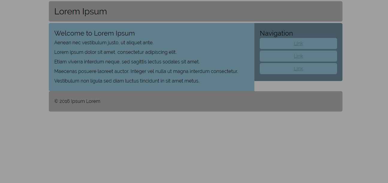
Basically, I want the navigation div to be as tall as the one beside it.