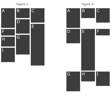
I like the MaterializeCSS more than for example Bootstrap because they support the Google Material Design. I really like it so far, it has many useful components even in the javascript section. But what I am missing the most is a dynamic grid layout with different heights. If you don't get my english, take a look at the image. I would like to have it like in the Figure 1. Is there a way to do it without to use another javascript framework/library?
Asked
Active
Viewed 3,787 times
3
-
I think there is no way to get that layout in pure css as wrapping algorithms, even for flexbox, don't take empty space into consideration and just wrap into next row. Your example is even more complicated as the order of items depends on minimum height taken by already placed items in the grid. – Przemysław Zalewski Dec 07 '16 at 14:28
-
You can use [this algorithm](https://jsfiddle.net/4e32zLna/) which will result in a n-dimensional array of columns with items placed in each. Lay out those columns using Flexbox or percentage width and let the default layout stack items in a column vertically. You can then render it using any view library, for example React. [See React solution here](https://jsfiddle.net/4e32zLna/) – Przemysław Zalewski Dec 07 '16 at 14:34
1 Answers
1
A pure CSS solution would be making use of the column
property.
But notice that this will only work if the inner divs have the same width.
HTML
<section>
<img src="path" />
<img src="path" />
<img src="path" />
<img src="path" />
</section>
CSS
body{
margin: 0;
}
section{
column-width: 300px;
column-gap: 5px;
padding: 5px;
}
section img{
width: 100%;
}
Demo

SvenL
- 1,904
- 8
- 10