1

Suppose I have the following data frame:

df <- data.frame(A1 = c(0,3.5,0,2.1), A2  =c(0.9,0,0,0.6), A3 =      c(0,0.3,0,0.3),A4= c(0,1.9,0,0))
rownames(df) <- names(df)

every element df(i,j) is the strength of relation between ith column and jth row (they are mutually connected, meaning strength between 1 to j is different from strength between j to i). A "0" entry means there is no relation.

Now I would like to draw a circle, with the variables on the perimeter of the circle, and an arrow that shows which variables are connected to each other, and hopefully show the strength of the connection based on the width of the arrow.

So, the final product I wish to be something like this: enter image description here

Is it even possible to do something like that with ggplot2?

Thanks in advance.

H_A
  • 667
  • 2
  • 6
  • 13
  • Yes, it's possible. Perhaps you can share with us what you have tried already? This will allow us to help you with specific problems you have in drawing your plot. – Weihuang Wong Dec 08 '16 at 03:11
  • @WeihuangWong I really have no idea how to proceed. The only helpful information I found on the net is from this link: http://stackoverflow.com/questions/6862742/draw-a-circle-with-ggplot2. It just shows how to draw a circle. Thanks – H_A Dec 08 '16 at 04:27

2 Answers2

1

I wrote a little package that does this kind of thing. Here's a small demo vignette https://github.com/mkearney/lavplot/blob/master/vignettes/demo.Rmd. Image of plot provided below.

enter image description here

mkearney
  • 1,266
  • 10
  • 18
  • Thanks Mike. This is useful, but not exactly what I need. It requires a lot of effort when the number of nodes/arrows is large. – H_A Dec 08 '16 at 05:14
  • You can try the semplot package. Lots more options and useful for larger models. – mkearney Dec 08 '16 at 05:31
1

igraph

We start by making a graph from your adjacency matrix:

df <- t(df)
ga  <- graph.adjacency(as.matrix(df), weighted = TRUE, mode = "directed")

Then, plot a circle:

par(mar = rep(0.25, 4))
pts <- seq(0, 2*pi, l = 100)
plot(cbind(sin(pts), cos(pts)), type = "l", frame = F, xaxt = "n", yaxt = "n")

Finally, plot the graph:

plot.igraph(ga,
  vertex.label = V(ga)$name,
  edge.width = E(ga)$weight,
  edge.curved = TRUE,
  edge.label = E(ga)$weight,
  layout = layout_in_circle(ga, order = V(ga)), 
  add = T)

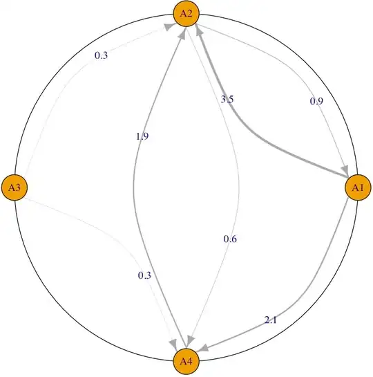
Output below. You can customize your graph (e.g. curvature and colors of edges, shapes of vertices) as desired. enter image description here


ggplot2

The main idea is to set up three sets of geoms: the circle, the nodes (vertices), and the lines (edges). First, we load some packages, and prep the circle and nodes:

library(ggplot2)
library(tidyr)
library(dplyr)

# For circle
pts <- seq(0, 2*pi, l = 100)

# For nodes
theta <- seq(0, 2*pi, l = nrow(df) + 1)[1:nrow(df)]
l <- data.frame(x = sin(theta), y = cos(theta), v = names(df), 
  stringsAsFactors = FALSE)

The edges are a little bit more involved. I make a function to make coordinates for the lines, given an origin and destination:

make_edge <- function(origin, dest, l, shrink = .9) {
  # l is the layout matrix for the nodes that we made previously
  data.frame(
    x0 = l$x[l$v == origin],
    y0 = l$y[l$v == origin],
    x1 = l$x[l$v == dest],
    y1 = l$y[l$v == dest]
  ) * shrink
}

Then, we make an adjacency graph, and bind the edge coordinates to it:

gr <- gather(mutate(df, dest = names(df)), origin, wt, -dest)
gr <- gr[gr$wt != 0, ]
edges <- do.call(rbind, 
  mapply(make_edge, gr$origin, gr$dest, list(l), shrink = .94, SIMPLIFY = F)
  )
ga <- cbind(gr, edges)

Finally, we plot:

ggplot() +
  geom_path(data = data.frame(x = sin(pts), y = cos(pts)), aes(x, y)) +
  geom_label(data = l, aes(x, y, label = v)) +
  geom_curve(data = ga, 
    aes(x = x0, y = y0, xend = x1, yend = y1, size = wt, colour = origin),
    alpha = 0.8,
    curvature = 0.1,
    arrow = arrow(length = unit(2, "mm"))) +
  scale_size_continuous(range=c(.25,2), guide = FALSE) +
  theme_void()

Output: enter image description here

Weihuang Wong
  • 12,868
  • 2
  • 27
  • 48
  • Pretty neat work specially on how you used ggplot. Thanks a lot. – H_A Dec 08 '16 at 15:38
  • Is it possible to show the weights on the arrows as it is shown on the graph generated by igraph? – H_A Dec 08 '16 at 16:58
  • Yes, but perhaps it may be better for you to open a separate question. The basic idea is the same as that used to draw the lines. You simply have to augment the `ga` dataframe with the coordinates for the labels (the weights) and use a `geom_text` to plot them. – Weihuang Wong Dec 08 '16 at 23:59