14

Let's say we have the following test.htm:

<html>
<head>
  <meta http-equiv="Content-Type" content="text/html; charset=utf-8"/>
  <style type="text/css">
.testdiv, .testdivB, .testdivC {
  width: 50%;
  height: 30%;
  margin: 6px;
  border: 2px solid gray;
  font-size: 4em;
}
.testdivB {
  font-size: 12px;
}
.testdivC {
  font-size: 30pt;
}
  </style>
</head>

<body>

  <div class="testdiv">Test one writing</div>
  <div class="testdivB">Test another writing</div>
  <div class="testdivC">Test three writing</div>

</body>
</html>

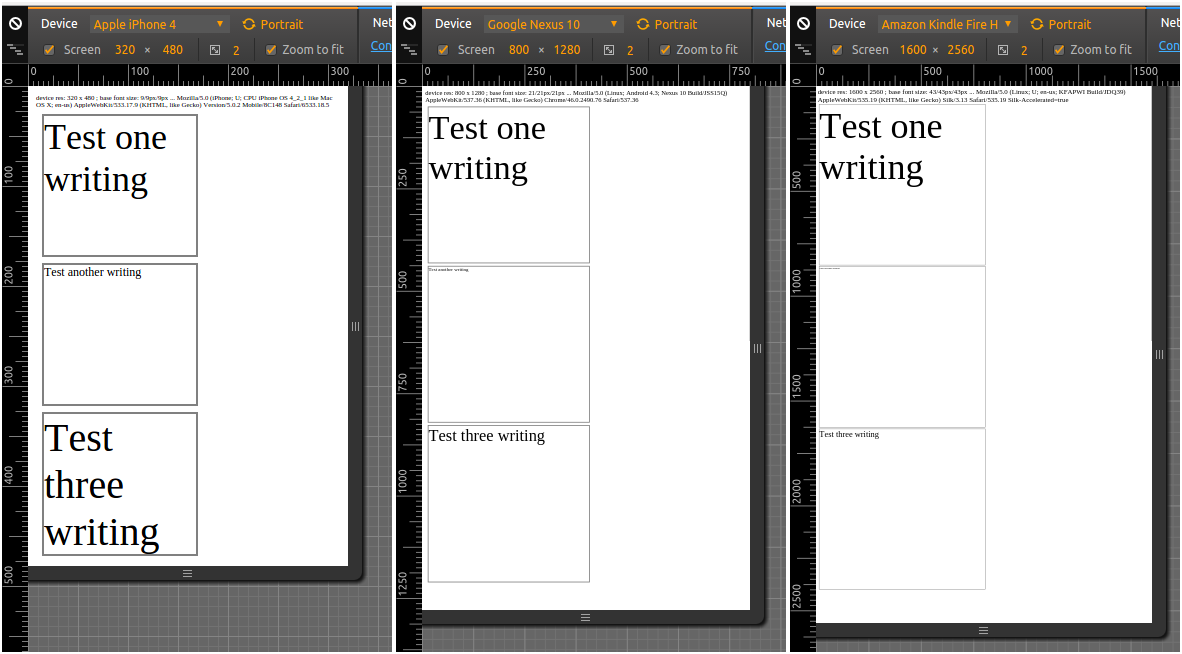
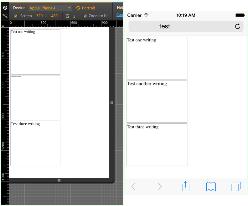
I've tried testing this in Chromium, with the Developer Tools, which allows me to emulate different devices; here:

* Apple iPhone 4        : device resolution  320 x  480 , a/r 0.666667
* Google Nexus 10       : device resolution  800 x 1280 , a/r 0.625
* Amazon Kindle Fire HDX: device resolution 1600 x 2560 , a/r 0.625

the outcome is this:

chrome-test

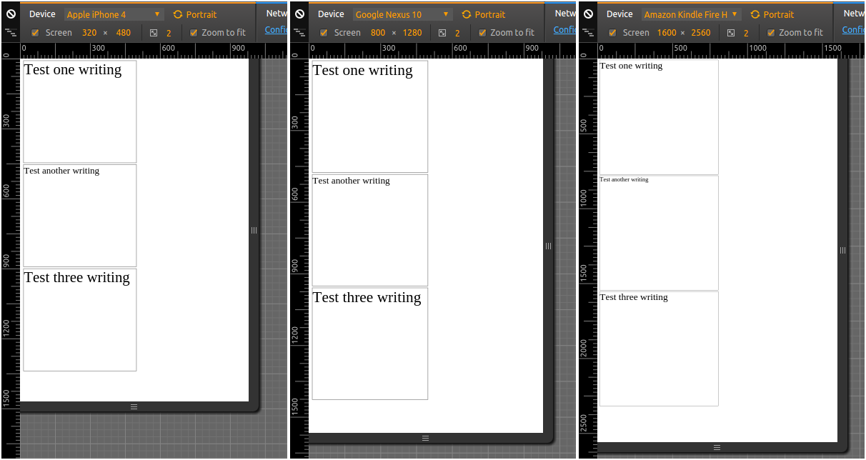
In this example, all the devices are portrait, and have "nearly" the same aspect ratio (~ 0.6+), even if they have wildly differing resolutions.

So, in the two first cases, I'm getting approximately the same font sizes, as relative to the device screen size, which is what I want to achieve (even though, I'm confused how can testdivB also show as nearly the same size, when it should be smaller) - so that's all good.

But, in the third example, which is on a device with the largest resolution, testdivB unsurprisingly (as it is defined in px) is much smaller relative to the device screen size; testdivA is also not really surprising, since em is relative to the "computed font-size" of the browser - and that one, if I remember correctly, is also expressed in pixels.

However, I thought that pt would have taken the device screen resolution into account, but it looks like it doesn't:

http://www.w3.org/Style/Examples/007/units.en.html

In the past, CSS required that implementations display absolute units correctly even on computer screens. But as the number of incorrect implementations outnumbered correct ones and the situation didn't seem to improve, CSS abandoned that requirement in 2011. Currently, absolute units must work correctly only on printed output and on high-resolution devices.

Ok, so what options do I have, to achieve approximately the same font sizes (as relative to device screen sizes) in all three cases:

  • If I don't want to use JavaScript (only HTML + CSS)?
  • If I do want to use JavaScript (I'd guess there's a way to query for device screen - not viewport - resolution, but I'm not sure if there really is one)?
sdbbs
  • 4,270
  • 5
  • 32
  • 87
  • 2
    I believe a media query would work here with Roberrrt's answer and using a class rather than ID's and using the same class name but different sizes as per Roberrrt's code so you'd end up with something like `.responsive_size` inside different media queries and `font-size: calc(Xem + Xvmin);` type of thing. This is just my *"2 cents"* though. – Funk Forty Niner Dec 09 '16 at 14:28
  • 1
    I'm quite curious, did one of my solutions actually help/work :)? – roberrrt-s Dec 09 '16 at 14:38
  • indeed, @Teepeemm, it should have been `.testdivC` - I corrected it, but now I'm not sure whether the screenshot was taken with the erroneous `.testdivB`, or the correct `.testdivC` (but it looks like it was taken with the correct one) – sdbbs Dec 12 '16 at 11:19
  • 1
    Hi @Roberrrt, I had already [posted a comment](http://stackoverflow.com/questions/41062123/css-font-size-responsive-relative-to-device-resolution/41100838#comment69331324_41062190) at your answer, but it seemingly got lost there; I have now also [posted my own answer](http://stackoverflow.com/a/41100838/6197439) based on JavaScript, which should explain in more detail what I was looking for; in brief, my problem was that `vmin` is expressed in terms of the viewport, not the device resolution, which might give wrong results if used on desktop and the browser is not "fullscreen". – sdbbs Dec 12 '16 at 12:24

3 Answers3

29

I've written a small tutorial / example on how to achieve this with pure HTML/CSS a while ago:

Responsive units (vmin/vmax)

#small {
    font-size: calc(1em + 1vmin);
}

#medium {
    font-size: calc(1em + 2vmin);
}

#large {
    font-size: calc(1em + 3vmin);
}
<div id="small">Small text</div>
<div id="medium">Medium text</div>
<div id="large">Large text</div>

The rule vmin is quite useful in your context. It takes vmin: 1/100th of the smallest side of your screen. Regardless of orientation. Combining it with the basic 1em in a calc() gives us a great way of applying a small custom responsive aspect on the font-size.

Alternative approach (vw/vh)

#small {
    font-size: calc(1em + 1vw);
}

#medium {
    font-size: calc(1em + 2vw);
}

#large {
    font-size: calc(1em + 3vw);
}
<div id="small">Small text</div>
<div id="medium">Medium text</div>
<div id="large">Large text</div>

If you wish to apply more control regarding the actual aspect ratio, I'd advise going with vw over vmin. Viewport width (vw) takes 1/100th of the width of your viewport.

Responsive units based on viewport aspect ratio (both vmin and vmax):

#test1 {
    font-size: calc((.4em + 1vmin) + (.4em + 1vmax));
}

#test2 {
    font-size: calc((.4em + 2vmin) + (.4em + 2vmax));
}

#test3 {
    font-size: calc((.4em + 3vmin) + (.4em + 3vmax));
}
<div id="test1">Small text</div>
<div id="test2">Medium text</div>
<div id="test3">Large text</div>

I'm quite happy with this solution, this way allows us to take both the viewports width, and it's length into account. We divide the base font size in two (.4em in this case) and multiply it with both 1vmin and 1vmax, after that- we add both values to establish the font size.

roberrrt-s
  • 7,914
  • 2
  • 46
  • 57
  • 2
    Coincidentally enough, I too was going through a few articles on the same subject some time ago. Just thinking outloud here; wouldn't it also make sense if a class was used instead and then applying it to a media query depending on screen size? Since id's are unique. – Funk Forty Niner Dec 09 '16 at 14:08
  • 1
    I merely used an `id` for the example here. I once created a media-query based combination of these factors too. I think that should work around, could you show me a fiddle with what you exactly mean? – roberrrt-s Dec 09 '16 at 14:10
  • Thanks for that, @Roberrrt - it makes sense, and I've been trying to use `vw`, `vh` or `vmin` as well, but even with say `calc(1em + 3vw)`, the "Kindle" rendering shows much smaller fonts (relative to device size) compared to the other two cases. That could of course be due to how Chromium renders the page - but it also could be realistic. Any way to address that? – sdbbs Dec 09 '16 at 14:11
  • 2
    Sorry, I can't provide a fiddle but I'm pretty sure you know what I mean ;-) In the end, I ended up using media queries with different font sizes. @Roberrrt but I definitely will try your method :-) – Funk Forty Niner Dec 09 '16 at 14:11
  • 2
    Combining that would make sense, let me wrap up my own website to test something. – roberrrt-s Dec 09 '16 at 14:13
  • 2
    @Fred-ii- I usually go for a 20em/40em/80em media query breakpoint, and 'enhance' the basic font size on that, <20em `calc(1em + 1vw)`. <40em `calc(1.2em + 1vw)`. `calc(1.5em + 1vw)`. – roberrrt-s Dec 09 '16 at 14:14
  • @Roberrrt interesting – Funk Forty Niner Dec 09 '16 at 14:15
  • @Fred-ii- I've been drilled in readabillity by my teachers, so I use quite large font sizes https://the-pastry-box-project.net/anne-gibson/2014-july-31 – roberrrt-s Dec 09 '16 at 14:17
  • 1
    @Roberrrt hehe, I know what you mean. I worked in the graphic arts industry for a very long time and was first taught about using negative space to our advantage as well as (font) kerning etc. etc. ;-) thanks for the link btw. I then moved on to coding in php/mysql afterwards so I've been a bit out of touch with css. – Funk Forty Niner Dec 09 '16 at 14:19
  • I've updated my answer with what I think is a quite ingenious solution that I'm quite happy with myself – roberrrt-s Dec 09 '16 at 14:29
  • 2
    I think you could change `(.4em + 1vmin) + (.4em + 1vmax)` to `(.8em + 1vw + 1vh)`. It amazes me that there's not a convenient way to say "make this a normal size" and have something readable on all devices. – Teepeemm Dec 09 '16 at 15:26
  • @Teepeemm Ah yeah, this type of formula was merely here because I experimented with multiply instead of adding – roberrrt-s Dec 09 '16 at 15:49
5

Ok, I think I came to a solution which I can use, which uses JavaScript. With the code pasted below, I now get this when testing in different devices in Chromium Developer Tools:

devtools-test-2

As one can see, the relative size for the first div, .testdiv with a specification in em now is preserved across device sizes (which is what I wanted); px in the second div, as expected doesn't preserve relative size -- and neither does the third case with pt specification.

The first problem I had, was how to get the device resolution. Note that vw, vh - and thus vmin and vmax - are in respect to the viewport size, that is, the window size. This is not so much of a problem in mobile, as the browsers on mobile typically start in "fullscreen" (I'm not even sure it is possible to resize the browser/app window on mobile, iOS or Android) - but it might be a problem if using a browser on the desktop, where the browser might end up not being in full screen.

Thankfully, one can get the device resolution using JavaScript, ( How to detect the screen resolution with JavaScript? ), and in this case, I get the device width and height in pixels - and from them, I calculate devicemin as the smaller of the two (similar to vmin). Then I set a "base font size", font size of the <html> element, to 2.67% of devicemin (this was my own arbitrary choice) in pixels. That would, hopefully, make sure that I have the same font size, relative to device resolution, across devices with different resolution.

Second issue, somewhat unexpected for me, was that you must have a <meta name="viewport" content="width=device-width, initial-scale=1.0"/> entry/directive in the head! Otherwise, without it, iOS browser will just apply their own font-sizes/scaling, and thus we'd get an unexpected result like:

devtools-ios-no-viewport

I was in fact so surprised at this result in Chromium Developer Tools, that I had to try the test in an Xcode iOS simulator - and surprisingly enough, the Chromium Developer Tools, actually did simulate this behavior the same as the iOS simulator did (left image is the code below in Developer Tools, right one is OP code in iOS simulator). For more on this, see Some font-size's rendered larger on Safari (iPhone) ...

Anyways, now that I have the "base" font size like this, I can proceed and implement responsive design based on say width <20em, <40em etc - and be sure that these sizes will refer to approximately the same relative area on any screen device...

<html>
<head>
  <meta http-equiv="Content-Type" content="text/html; charset=utf-8"/>
  <meta name="viewport" content="width=device-width, initial-scale=1.0"/> <!-- MUST have, so iPhone doesn't autozoom and change the fontsize! -->
  <script type="text/javascript">
  // https://stackoverflow.com/questions/2242086/how-to-detect-the-screen-resolution-with-javascript
  var devicewidth = window.screen.width;
  var deviceheight = window.screen.height;
  var devicemin = Math.min(devicewidth, deviceheight);
  // say we want base font size: 16px @ 600px (min of 800x600); 16/600 = 0.0266667
  var basefontsize = Math.round(0.0267*devicemin);
  // apply:
  var rootElement = document.documentElement;
  rootElement.style.fontSize = basefontsize;
  // report:
  console.log(navigator.userAgent);
  var report = "device res: " + devicewidth + " x " + deviceheight + " ; base font size: " + basefontsize + "/" + rootElement.style.fontSize;
  console.log(report);
  function reporter() {
    document.getElementById("dreport").innerHTML = report + "/" + document.documentElement.style.fontSize + " ... " + navigator.userAgent;
  }
  window.onload = reporter;
  </script>
  <style type="text/css">
body {
  /* https://stackoverflow.com/questions/3226001 ; no real need/effect in this case, though */
  -webkit-text-size-adjust: none;
}
.testdiv, .testdivB, .testdivC {
  width: 50%;
  height: 30%;
  margin: 6px;
  border: 2px solid gray;
  font-size: 4em;
}
.testdivB {
  font-size: 12px;
}
.testdivC {
  font-size: 30pt;
}
#dreport {
  font-size: 0.76em;
}
  </style>
</head>

<body>
  <div id="dreport"></div>
  <div class="testdiv">Test one writing</div>
  <div class="testdivB">Test another writing</div>
  <div class="testdivC">Test three writing</div>

</body>
</html>
Community
  • 1
  • 1
sdbbs
  • 4,270
  • 5
  • 32
  • 87
0

Also, you can use % sign. Just like below:

div.wrapper {
   font-size: 28px;
}
div.small {
   font-size: 80%;
}
div.big {
   font-size: 150%;
}
<div class="wrapper">
    <div class="small">Small text</div>
    <div class="normal">Normal text</div>
    <div class="big">Big text</div>
</div>
Naman
  • 1,519
  • 18
  • 32
  • 2
    Thanks @nmnsud - but as far as I can tell, the % is relative to the font-size of the parent, and ultimately the root has a "computed font-size" again specified in pixels, so I'd expect again (and that is what I get in Chromium developer tools) that the fonts on a Kindle HDX are smaller (relative to device size) than the other two cases; any way to address that? – sdbbs Dec 09 '16 at 14:13
  • 2
    Thanks @nmnsud - but I guess I wasn't clear; I meant that even if you specify an amount in pixels as a starting font size, say 28 px, the ratio of it to the screen width for say Nexus 10 (28/800) is always going to be much smaller than the same ratio for a device with larger resolution like Kindle HDX (28/1600), and so you have a smaller relative font size on that device, and that will be propagated throughout all relative units thereafter (%, em, rem...) One could fix this, if one could query the *device* screen size, but vw, vh only query viewport size. – sdbbs Dec 09 '16 at 14:21