How do I change md-input-container placeholder color using css in Angular Material? As screenshot below I have phone no. and password textfield. Phone no. textfield has Phone No. and password has Password placeholder name.
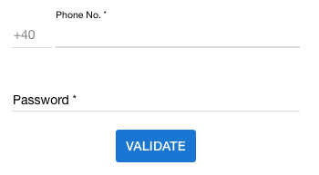
How do I change md-input-container placeholder color using css in Angular Material? As screenshot below I have phone no. and password textfield. Phone no. textfield has Phone No. and password has Password placeholder name.
in the last version of angular you can remove the placeholder in the input and add a mat-placeholder in the mat-form-field and custom the css with a class
html :
<mat-form-field>
    <input matInput type="text">
    <mat-placeholder class="placeholder">Search</mat-placeholder>
</mat-form-field>
css:
.mat-focused .placeholder {
    color: #00D318;
}
Placeholder is depicted as a <label> in Angular Material. So you actually need to style the label not the placeholder.
As soon as you click (focus) on the input this <label> which is looking as a placeholder slides up and converted into a form <label>.
So you just need to apply this CSS:
/* When the input is not focused */
md-input-container label {
  color: red;
}

/* When the input is focused */
md-input-container.md-input-focused label {
  color: blue;
}
Have a look at this Plunkr Demo.
In Angular 4+
First you will need to turn ViewEncapsulation off to style Material Elements. Be warned this is subverting the Angular emulated-shadow DOM default and you should proceed with caution (https://blog.thoughtram.io/angular/2015/06/29/shadow-dom-strategies-in-angular2.html).
In dummy.component.ts:
@Component({
 ...,
 encapsulation: ViewEncapsulation.None,
})
Then give your < mat-form-field > element a unique class in dummy.component.html:
<mat-form-field class="dummy-input-field" floatPlaceholder="always">
  <input placeholder="Dummy"/>
</mat-form-field>
Finally in dummy.component.css apply the styling:
.dummy-input-field .mat-input-placeholder {
  color: red;
}
Similarly, if you'd like to dynamically change color if the field is focused:
.dummy-input-field.mat-focused .mat-input-placeholder {
  color: red;
}
.container {
  .mat-form-field-outline,
  .mat-form-field-empty.mat-form-field-label,
  .mat-form-field-label,
  .mat-form-field-underline,
  .mat-input-element,
  ::placeholder {
    color: $white !important;
  }
}
The code above gives me the results below. I am overriding the form-field outline, label-empty, label, underline, input element, placeholder text.
I'm using Angular 8.2.2 and Angular Material 8.2.2
For the newer versions of material which have a mat prefix instead of md prefix, you can do this in 2 ways:
way 1: using view encapsulation set to none and then writing the styles in the components css file, like @user2245995 pointed out in the answer above. Although this is the way angular suggests, please be advised that the styles you write here will propagate to all the child/parent components and effect other elements there.
way 2: We can use the shadow piercing descendant combinators i.e. /deep/ or ::ng-deep or >>> Below is an example
/deep/ label.mat-input-placeholder {
  color: #fff;   // choose the color you want
}
Although this method is specified in the angular docs as of now, they have mentioned that this method will soon be deprecated. read more: https://angular.io/guide/component-styles#!#-deep-
I tried to be as deterministic as possible for the color of a mat input and I dare to share the result here, hoping it will help some others (the placeholder color customization need is handled, as asked in the question):
Note: The colors are considered different when the focus is here or not, that is why we have 2 blocs in the following:
    --clear-button-color: lightblue;
    --asterisk-color: lightgreen;
    --label-color: springgreen;
    --underline-color: blue;
    --input-color: lightgray;

    --clear-button-focused-color: blue;
    --asterisk-focused-color: green;
    --label-focused-color: pink;
    --underline-focused-color: yellow;
    --input-focused-color: gray;
    --placeholder-focused-color: magenta;
    --caret-focused-color: blue;
    .mat-form-field {
        &.mat-focused {
            > .mat-form-field-wrapper {
                > .mat-form-field-flex {
                    > .mat-form-field-infix {
                        > .mat-input-element {
                            color: var(--input-focused-color);
                            caret-color: var(--caret-focused-color);

                            &::placeholder {
                                color: var(--placeholder-focused-color);
                            }
                        }
                        > .mat-form-field-label-wrapper {
                            > .mat-form-field-label {
                                > mat-label {
                                    color: var(--label-focused-color);
                                }

                                > .mat-placeholder-required {
                                    color: var(--asterisk-focused-color);
                                }
                            }
                        }
                    }
                    > .mat-form-field-suffix {
                        > .mat-focus-indicator {
                            > .mat-button-wrapper {
                                > .mat-icon {
                                    color: var(--clear-button-focused-color);
                                }
                            }
                        }
                    }
                }
                > .mat-form-field-underline {
                    > .mat-form-field-ripple {
                        background-color: var(--underline-focused-color);
                    }

                    background-color: var(--underline-focused-color);
                }
            }
        }

        > .mat-form-field-wrapper {
            > .mat-form-field-flex {
                > .mat-form-field-infix {
                    > .mat-input-element {
                        color: var(--input-color);

                        &::placeholder {
                            color: var(--placeholder-color);
                        }
                    }
                    > .mat-form-field-label-wrapper {
                        > .mat-form-field-label {
                            > mat-label {
                                color: var(--label-color);
                            }

                            > .mat-placeholder-required {
                                color: var(--asterisk-color);
                            }
                        }
                    }
                }
                > .mat-form-field-suffix {
                    > .mat-focus-indicator {
                        > .mat-button-wrapper {
                            > .mat-icon {
                                color: var(--clear-button-color);
                            }
                        }
                    }
                }
            }
            > .mat-form-field-underline {
                > .mat-form-field-ripple {
                    background-color: var(--underline-color);
                }

                background-color: var(--underline-color);
            }
        }
    }
.mat-input-element::-webkit-input-placeholder {
    color: red;
  }
this is if you use a structure similar with this one:
 <input
  matInput
  [placeholder]="placeholder"
/>