Generating shadows for a circle, react native, android
Based on the answers here, and on text that I found in github (react-native-shadow), I made few tests and thought that some people may find the following helpful.
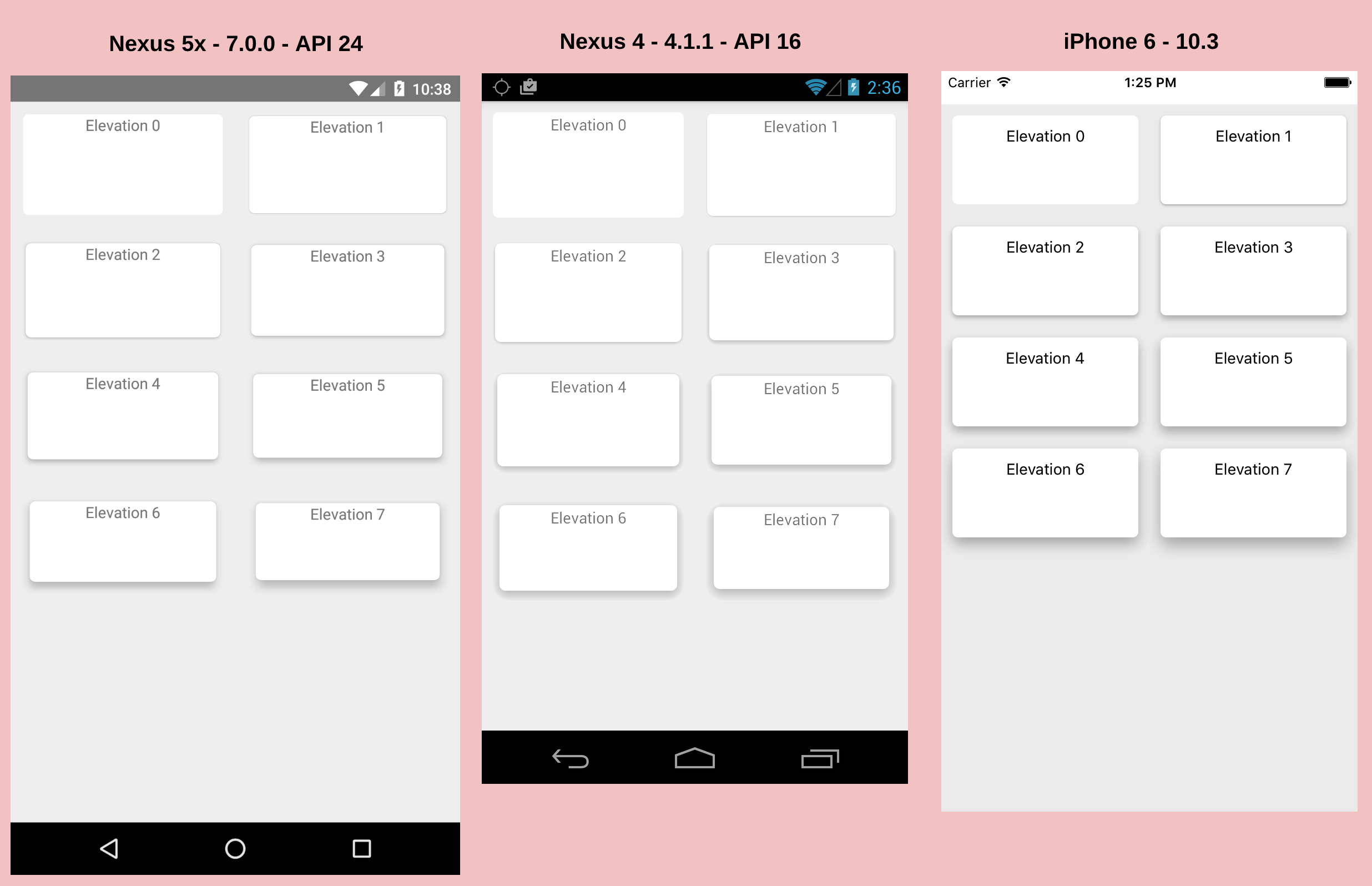
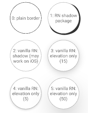
Here is how the screen looks like:

Code:
import React, { Component } from 'react';
import { View, TouchableHighlight, Text } from 'react-native';
import { BoxShadow } from 'react-native-shadow'

export default class ShadowsTest extends Component {

  render() {
    const shadowOpt = {
      width: 100,
      height: 100,
      color: "#000",
      border: 2,
      radius: 50,
      opacity: 0.8,
      x: 3,
      y: 3,
      //style: { marginVertical: 5 }
    }

    return (
      <View style={{ flex: 1 }}>
        <Header
          text={"Shadows Test"} />

        <View style={{ flexDirection: 'row', justifyContent: 'center' }}>
          <View style={{ margin: 10, alignItems: 'center',
              justifyContent: 'center' }}>
            <TouchableHighlight style={{
              position: 'relative',
              width: 100,
              height: 100,
              backgroundColor: "#fff",
              borderRadius: 50,
              borderWidth: 0.8,
              borderColor: '#000',
              // marginVertical:5,
              alignItems: 'center',
              justifyContent: 'center',
              overflow: "hidden" }}>
              <Text style={{ textAlign: 'center' }}>
                0: plain border
              </Text>
            </TouchableHighlight>
          </View>

          <View style={{ margin: 10, alignItems: 'center',
              justifyContent: 'center' }}>
            <BoxShadow setting={ shadowOpt }>
              <TouchableHighlight style={{
                position: 'relative',
                width: 100,
                height: 100,
                backgroundColor: "#fff",
                borderRadius: 50,
                borderWidth: 1,
                borderColor: '#aaa',
                // marginVertical:5,
                alignItems: 'center',
                justifyContent: 'center',
                overflow: "hidden" }}>
                <Text style={{ textAlign: 'center' }}>
                  1: RN shadow package
                </Text>
              </TouchableHighlight>
            </BoxShadow>
          </View>
        </View>

        <View style={{ flexDirection: 'row', justifyContent: 'center' }}>
          <View style={{ margin: 10, alignItems: 'center',
              justifyContent: 'center' }}>
              <TouchableHighlight style={{
                position: 'relative',
                width: 100,
                height: 100,
                backgroundColor: "#fff",
                borderRadius: 50,
                borderWidth: 1,
                borderColor: '#aaa',
                // marginVertical:5,
                alignItems: 'center',
                justifyContent: 'center',
                overflow: "hidden",
                shadowOffset: { width: 15, height: 15 },
                shadowColor: "black",
                shadowOpacity: 0.9,
                shadowRadius: 10,
               }}>
                <Text style={{ textAlign: 'center' }}>
                  2: vanilla RN: shadow (may work on iOS)
                </Text>
              </TouchableHighlight>
          </View>
          <View style={{ margin: 10, alignItems: 'center',
              justifyContent: 'center' }}>
              <TouchableHighlight style={{
                position: 'relative',
                width: 100,
                height: 100,
                backgroundColor: "#fff",
                borderRadius: 50,
                borderWidth: 1,
                borderColor: '#aaa',
                // marginVertical:5,
                alignItems: 'center',
                justifyContent: 'center',
                overflow: "hidden",
                elevation: 15,
               }}>
                <Text style={{ textAlign: 'center' }}>
                  3: vanilla RN: elevation only (15)
                </Text>
              </TouchableHighlight>
          </View>
        </View>

        <View style={{ flexDirection: 'row', justifyContent: 'center', marginBottom: 30 }}>
          <View style={{ margin: 10, alignItems: 'center',
              justifyContent: 'center' }}>
              <TouchableHighlight style={{
                position: 'relative',
                width: 100,
                height: 100,
                backgroundColor: "#fff",
                borderRadius: 50,
                borderWidth: 1,
                borderColor: '#aaa',
                // marginVertical:5,
                alignItems: 'center',
                justifyContent: 'center',
                overflow: "hidden",
                elevation: 5,
               }}>
                <Text style={{ textAlign: 'center' }}>
                  4: vanilla RN: elevation only (5)
                </Text>
              </TouchableHighlight>
          </View>
          <View style={{ margin: 10, alignItems: 'center',
              justifyContent: 'center' }}>
              <TouchableHighlight style={{
                position: 'relative',
                width: 100,
                height: 100,
                backgroundColor: "#fff",
                borderRadius: 50,
                borderWidth: 1,
                borderColor: '#aaa',
                // marginVertical:5,
                alignItems: 'center',
                justifyContent: 'center',
                overflow: "hidden",
                elevation: 50,
               }}>
                <Text style={{ textAlign: 'center' }}>
                  5: vanilla RN: elevation only (50)
                </Text>
              </TouchableHighlight>
          </View>
        </View>
      </View>
    )
  }
}

