I am trying to make a text slider with flexbox.
I want all the child element under the question div to be collapsed like the one you seeing in the chrome.
In the real code, inactive element will be set to translateX(100%) and active index element to 0%.
The reason why I want to use flexbox is that Ques*: should be aligned with first line of the question text and text-container div should be center of the question div no matter what length is the q-text div. ( Tried without flex but I could not align Quest* and first line of text )
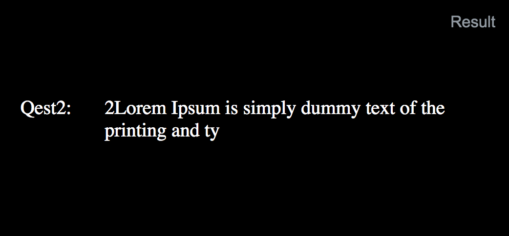
Like the sample code, it has different center position due to text length difference.
In the Chrome it works fine. However, it is not centered in Safari ( using latest version of Safari ).
If there is better way to achieve this, I am happy to see !
#container {
  width: 100%;
  height: 200px;
  background: black;
}

.question {
  display: -webkit-flex;
  display: flex;
  height: 100%;
  width: 100%;
  overflow: hidden;
  justify-content: center;
  align-items: center;
  -webkit-justify-content: center;
  -webkit-align-items: center;
}

.text-container {
  display: -webkit-flex;
  display: flex;
  width: 100%;
  position: absolute;
  color: white
}

.q {
  width: 25%;
  display: flex;
  justify-content: center;
  align-items: center;
  -webkit-justify-content: center;
  -webkit-align-items: center;
  align-self: baseline;
}
.q-text {
  width: 75%;
  padding-right: 12%;
}
<html>
<body>
<div id="container">
<div class="question">
<div class="text-container">
<div class="q">
Qest1:
</div>
<div class="q-text">
1Lorem Ipsum is simply dummy text of the printing and typesetting industry. Lorem Ipsum has been the industry's standard dummy text ever since the 1500s, when an unknown printer took a galley of type an
</div>
</div>
<div class="text-container">
<div class="q">
Qest2:
</div>
<div class="q-text">
2Lorem Ipsum is simply dummy text of the printing and ty
</div>
</div>
<div class="text-container">
<div class="q">
Qest3:
</div>
<div class="q-text">
3Lorem Ipsum is simply dummy text of the printing and typesetting industry. Lorem Ipsum has been the industry's standard dummy text ever since the 1500s, when
</div>
</div>
</div>
</div>
</body>
</html>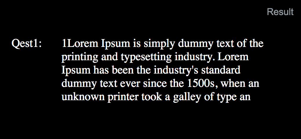