0

In Device Mode of Google Chrome, the font-size of an element (p, h1, h2, ...) changes as the number of characters change.

This does not happen when Device Mode is off, but it does happen on my mobile device.

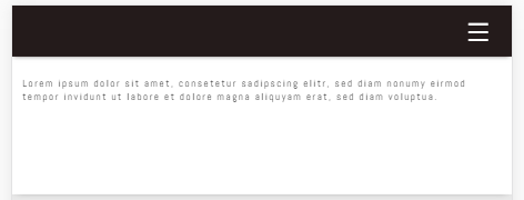
The following picture shows the correct size:

This the correct size

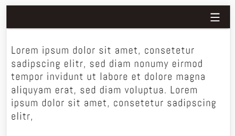
If I add more characters, font-size increases. This is the wrong size:

This is the wrong size

I don't want font-size to change with the number of characters. How can I fix this?

Edit: including CSS:

body * { font-size: 20px; }
p { font-size: 1em; }
h1 { font-size: 2em; }

Edit2: What I,ve forgotten to say is, that this problem only exists when I work with a joomla template in joomla. It doesn't matter if I use css or not.

Smoothi
  • 283
  • 1
  • 3
  • 15
  • There's no way anyone can give a definitive answer without looking at your code or being able to replicate it. Please share your code. – Sean Mishra Jan 01 '17 at 15:06
  • Without knowing what your code looks like, all I can suggest is to try defining all your fonts as `px` instead of a mixture of units (according to your comment). If you want real help, you're going to need to supply code. Try putting your code on [fiddlesalad](http://fiddlesalad.com/) or [jsfiddle](https://jsfiddle.net/). – Travis Heeter Jan 01 '17 at 15:20

2 Answers2

2

I'm not sure about desktop viewing, but this appears to be a known problem on the Android edition of Google Chrome. Here are some possible solutions you may want to try:

  1. See Chrome on android resizes font which explains how to prevent this from happening.

  2. Rather that implementing the fix on that question, I would suggest that it is much better practice to make your website fully responsive for all screen sizes.

    You can do using CSS media queries, see https://developer.mozilla.org/en-US/docs/Web/CSS/Media_Queries/Using_media_queries for how to write them.

  3. Alternatively, if you're up for using jQuery to achieve this, FlowType.JS may help. It basically creates responsive text for you by automatically detecting the screensize and resizing the text.

    It also apparently optimises the number of characters on each line for easy reading. Its website is at http://simplefocus.com/flowtype/ if you're interested.

Community
  • 1
  • 1
Zak
  • 1,910
  • 3
  • 16
  • 31
  • That sounds interessting. I forgot to say that I use Joomla and I believe that Joomla uses JQuery. Maybe Joomla already uses Flowtype with some configurations? – Smoothi Jan 01 '17 at 17:12
  • Unlikely as it's quite a small project. If you create your own theme you could include though. Also, if you found my answer useful, would you consider accepting it please? – Zak Jan 01 '17 at 17:14
0

I solved the problem by adjusting the viewport metadata.

<meta name="viewport" content="width=device-width, maximum-scale=1.0" />
Smoothi
  • 283
  • 1
  • 3
  • 15