7

I have a problem with flex.

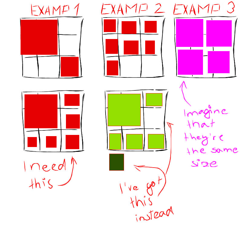
I have a wrapper where a minimum of 1 and maximum of 9 squares can be shown. Squares can have multiple sizes, based on the number of squares in grid. I've got all required cases working except for one, as seen in this picture: enter image description here

My styles are:

.grid {
    display: flex;
    flex-wrap: wrap;
    justify-content: flex-start;
    align-content: space-between;
    width: 300px;
    height: 300px;
    position: relative;
}

Plus. the images have sized based on the overall number of them and their position in a list.

So the problem is in situation when I have 1 big square (takes position of 4 small squares) and 5 small squares around him from right and bottom.

The big one is first as he should be.

Next to him (top right corner) is second one, that's also correct.

The third one is in bottom left corner, and it should be in the second line and on the far right. Because of this one, all the others are in wrong position, so the last one is overflowing.

I've tried a lot of value combinations for justify-content, align-content, align-items and align-self but nothing have worked.

I'll go back to ton of classes and position absolute solution, if there is no flex solution for this. But I don't like it. It's too much styles and it doesn't look good.

Any advice would be greatly appreciated.

michaPau
  • 1,598
  • 18
  • 24
Laker
  • 1,622
  • 4
  • 20
  • 32

2 Answers2

6

I think float is a better option for you, check out this snippet:

.grid {
  width: 300px;
}

.box {
  background: orange;
  width: 90px;
  height: 90px;
  margin: 5px;
  float: left;
}

.wide {
  width: 190px;
}

.tall {
  height: 190px;
}

.empty {
  background: transparent
}


/* you can ignore everything after this comment - it's all for illustration */
body {
  background: #334;
  color: white;
  font-family: sans-serif;
}

.example {
  display: inline-block;
  margin: 5px;
  border: 1px solid #445;
  padding: 10px;

  width: 300px;
}

h3 {
  margin: 0 0 5px 0;
}
<div class="example">
  <h3>Example 1</h3>
  <div class="grid">
    <div class="box wide tall"></div>
    <div class="box tall empty"></div>
    <div class="box wide empty"></div>
    <div class="box"></div>
  </div>
</div>

<div class="example">
  <h3>Example 2</h3>
  <div class="grid">
    <div class="box"></div>
    <div class="box"></div>
    <div class="box"></div>
    <div class="box"></div>
    <div class="box"></div>
    <div class="box"></div>
    <div class="box"></div>
  </div>
</div>

<div class="example">
  <h3>Example 4</h3>
  <div class="grid">
    <div class="box wide tall"></div>
    <div class="box"></div>
    <div class="box"></div>
    <div class="box"></div>
    <div class="box"></div>
    <div class="box"></div>
  </div>
</div>

Flex is still trying to make complete rows of elements, so your big square and your little square are part of one row; there's no support for stacking beyond that.

Float on the other hand tries to stuff elements wherever it can fit them.

EDIT

I've updated this answer with examples on how to reproduce most of the images above (I've purposefully left out the 2 by 2 example - didn't want to cloud the answer with classes for boxes of 1.5 height/width).

Use of an empty class to remove color from blocks, as well as classes tall and wide to fill in spots of all sizes should help you customize your layout however you see fit. One note - here empty sets the background color to transparent. Your empty class may do more or less than this. You may not even need an empty class if all it is is a div without content.

Sandy Gifford
  • 7,219
  • 3
  • 35
  • 65
  • Thanks but in this case I would have to micromanage a lot of cases. In my case, it's not always about stacking them one after the other. – Laker Jan 03 '17 at 16:05
  • @Laker Could you expand on that? Which case does flex work well for that float doesn't? – Sandy Gifford Jan 03 '17 at 19:16
  • I thought about it and there are only two instances, one is in the picture in my original question, the first example. Second instance would be where there are 3 squares (one big, two small) one to the right of the big square, second one after the big square. But if it's only two cases (I thought it would be more) then it's and OK solution. But I don't like floats:P Your explanation about why my solution didn't work may actually help me make it work with one "hack". I'll try that first. – Laker Jan 04 '17 at 08:29
  • @Laker yeah - there's never a perfect solution, just one that requires the least exceptions. – Sandy Gifford Jan 04 '17 at 20:01
  • 1
    @Sandy Gifford thanaks a lot for the answer, it saved my day. In my scenario really float is the only solution, i have a dynamic boxed grid layout as seen in this sketch (https://imgur.com/M3WL3sx) cause boxes need to be dynamic sized and go one after another which with flex i couldnt achieve. – Ana DEV Jan 28 '21 at 19:25
0

There is no way to handle this layout with flex in a single container.

You need to do a little trick to achieve it.

The easier one would be to take the third item out of the flex layout, positioning it absolute:

.grid {
    display: flex;
    flex-wrap: wrap;
    justify-content: flex-start;
    align-content: space-between;
    width: 300px;
    height: 300px;
    position: relative;
}

.item {
    background-color: lightblue;
    width: 100px;
    height: 100px;
    margin: 0px;
    border: transparent solid 5px;
    box-sizing: border-box;
    background-clip: content-box;
}

.item:first-child {
    width: 200px;
    height: 200px;
}

.item:nth-child(2) {
    background-color: blue;
    position: absolute;
    top: 100px;
    right: 0px;
}
<div class="grid">
<div class="item"></div>
</div>

Another posibility, may be more in the flex idea, but also tricky

Set the big element with a margin-bottom negative, that makes it occupy only 1 row (being the height of a row the size of the small boxes).

Now be have a layout with 3 rows. The problem will be that the 3rd box will be under the first, big box. To solve this, we are setting a pseudo element (I have styled the snippet to make it visible, in production just set it to height 0 and it will disappear) with the same properties of width and margin of the first element.

.grid {
    display: flex;
    flex-wrap: wrap;
    justify-content: flex-start;
    align-content: space-between;
    width: 300px;
    height: 300px;
    position: relative;
}

.grid:after {
   content: "";
  order: 3;
  background-color: red;
  width: 190px;
  height: 10px;
  margin: 5px;
}

.item {
    background-color: lightblue;
    width: 90px;
    height: 90px;
    margin: 5px;
}

.item:first-child {
    width: 190px;
    height: 190px;
  margin-bottom: -100px;
  order: 1;
  opacity: 0.5;
}

.item:nth-child(2) {
  order: 2;
}

.item:nth-child(n+3) {
  order: 4;  
}
<div class="grid">
<div class="item">1</div>
<div class="item">2</div>
<div class="item">3</div>
<div class="item">4</div>
<div class="item">5</div>
<div class="item">6</div>
</div>
vals
  • 61,425
  • 11
  • 89
  • 138