4

I have been trying to make a tabstyle that looks like this. But so far it doesn't work Can someone help me with this..

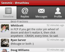
http://www.technobuzz.net/wp-content/uploads/2010/02/seesmic-android-260-208.png

The style shows only the colors When selected. When I use a white icon is the text (text setindicator) white. This also applies to the gray icon.

When the icon color is white the text from the setindicator is then also white.. How can I fix this.

Thanks in advance!

Main.java

intent = new Intent().setClass(this, Settings.class);
         spec = tabHost.newTabSpec("settings").setIndicator("Settings",
                res.getDrawable(R.drawable.tab_settings))
                .setContent(intent);
                tabHost.addTab(spec);


                TabWidget tw = getTabWidget(); 
                for (int i = 0; i < tw.getChildCount(); i++) { 
                        View v = tw.getChildAt(i); 
                        v.setBackgroundDrawable(getResources().getDrawable 
                        (R.drawable.custom_tab)); 
                } 

tab_settings

  <selector xmlns:android="http://schemas.android.com/apk/res/android">
    <!-- PRESSED TAB -->
    <item 
        android:state_pressed="true"
        android:drawable="@drawable/artists_on"
        android:color="#bfbfbf"
        />
    <!-- INACTIVE TABS -->
    <item 
        android:state_selected="false"
        android:state_focused="false"
        android:state_pressed="false"
        android:drawable="@drawable/artists_of"
        />
    <!-- ACTIVE TAB -->
    <item 
        android:state_selected="true"
        android:state_focused="false"
        android:state_pressed="false"
        android:drawable="@drawable/artists_of"
        />
    <!-- SELECTED TAB -->
    <item 
        android:state_focused="true"
        android:state_selected="true"
        android:state_pressed="false"
        android:drawable="@drawable/artists_on"
        />

custom_tab.xml the tab style...

<item android:state_pressed="true" >
    <shape>
        <gradient
            android:startColor="#ea9d32"
            android:endColor="#ffcc50"
            android:angle="270" />
    </shape>
</item>

<!-- WHEN SELECTED --> <!-- HOW CAN I SAID WHEN NOT SELECTED? --> 
    <item android:state_focused="true" >
        <shape>
            <gradient
                android:endColor="#ffcc50"
                android:startColor="#ffcc50"
                android:angle="270" />
        </shape>
    </item>

       <item android:state_focused="false" >
        <shape>
            <gradient
                android:endColor="#ffffff"
                android:startColor="#AAAAAA"
                android:angle="270" />
            <stroke
                android:width="1px"
                android:color="#000000" />
        </shape>
    </item>
</selector>
anddevelop
  • 163
  • 1
  • 3
  • 15
  • 2
    Paste what you have tried.... that way we can see what's going wrong. – Cristian Nov 10 '10 at 15:30
  • In your tab settings XML, the "artists_on" drawable needs to be in the active tab selector (the third one in your list), all other sections should be "artists_of". Right now, you have the "artists_on" drawable showing only when the tab is selected and not active. – Josh Clemm Nov 11 '10 at 16:20

1 Answers1

2

There's four states for the background of your tabs - you have almost all of them:

<selector xmlns:android="http://schemas.android.com/apk/res/android">
    <item <!-- PRESSED TAB -->
        android:state_pressed="true"
        android:drawable="@drawable/minitab_pressed"
        />
    <item <!-- INACTIVE TABS -->
        android:state_selected="false"
        android:state_focused="false"
        android:state_pressed="false"
        android:drawable="@drawable/minitab_unselected"
        />
    <item <!-- ACTIVE TAB -->
        android:state_selected="true"
        android:state_focused="false"
        android:state_pressed="false"
        android:drawable="@drawable/minitab_default"
        />
    <item <!-- SELECTED TAB -->
        android:state_focused="true"
        android:state_selected="true"
        android:state_pressed="false"
        android:drawable="@drawable/minitab_selected"
        />
</selector>

For text color, you need to create a selector as well and assign this drawable as the textColor:

<selector xmlns:android="http://schemas.android.com/apk/res/android">
    <item android:state_selected="true" android:color="@color/white" />
    <item android:state_focused="true" android:color="@color/white" />
    <item android:state_pressed="true" android:color="@color/white" />
    <item android:color="#bfbfbf" />
</selector>
Josh Clemm
  • 2,966
  • 20
  • 21
  • Thanks!!.. So I create one (image) tab for selected, unselected and default... I was thinking that I can change my background? but it's not possible what I want, I think..? How can I assign the textColor selector in my code.. Many thanks in advance! – anddevelop Nov 10 '10 at 22:13
  • It's possible to have a selector for the icon, the background, and the text. I'm not sure off hand how to assign the textColor programmatically, so I'll get back to you. In the meantime, I would suggest looking at the foursquare app and its source code: http://code.google.com/p/foursquared/source/browse/ – Josh Clemm Nov 11 '10 at 16:26
  • Yeah no problem, I'll throw together a small project and post it by tomorrow. – Josh Clemm Nov 11 '10 at 22:44
  • @JoshClemm where should i create the selector color file ? do i need to include with tab selector? – Hunt Apr 24 '12 at 10:52