I'm not a web/CSS programmer, but I needed a box-shadow algorithm that looked like CSS's, and decided to find out how it works.
I used CSSmatic's online box-shadow tool for the comparisons below.
The algorithm seems to have 2 steps.
Step 1: Vectorized scale and shift

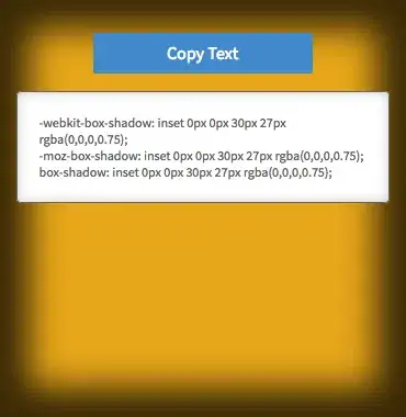
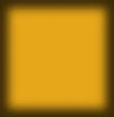
As shown, a 27px CSS spread inset means the shape is scaled to have dimensions 27*2 pixels smaller. This is inverted for outline box-shadows (e.g. 27*2 pixels larger).
The horizontal/vertical offsets are self-explanatory.
Step 2: Gaussian blur
History
Mozilla developer David Baron wrote a detailed article on CSS box-shadow implementations here.
Up until 2011, there was no standard meaning for the CSS blur radius. It could correspond to different algorithms and parameters in different web browsers:
Different browsers ... have historically done different things
for the same blur radius, both in terms of blurring algorithm and what
the radius means for that algorithm (i.e., how blurry a given radius
makes things). .... Over the past year, the CSS and HTML specifications
have changed (for CSS) to define what this blur radius means or (for
HTML) so that they agree with each other on this definition.
Those historic differences could explain the purpose of the moz- prefix (which you mentioned) and webkit- prefix. These likely specify alternative box-shadow parameters for Mozilla and WebKit-based browsers to use.
I expect these prefixed versions are now deprecated, due to standardization, but may be used for compatibility with older browsers.
Standardization
According to Baron there is now a precise, standard definition of the box-shadow blur radius:
The blur effect is now defined by css3-background and by HTML to be a
Gaussian blur with the standard deviation (σ) equal to half the given blur radius, with allowance for reasonable approximation error.
A mathematician could expand that into an exact formula.
Visual approximation
With some trial-and-error in GIMP, I found that a Gaussian blur radius obtained by multiplying the CSS blur parameter by 5/3 (1.6666...), then rounding up to the nearest integer, produces a very close visual approximation (to CSS in Firefox 50):
7px CSS blur (Firefox 50) ~~ ceil(7 * 5/3.0) = 12.0 Gaussian radius in GIMP


30px CSS blur (Firefox 50) ~~ ceil(30 * 5/3.0) = 50.0 Gaussian radius in GIMP


75px CSS blur (Firefox 50) ~~ ceil(75 * 5/3.0) = 125.0 Gaussian radius in GIMP


Implementation
Ivan Kuckir shares some fast Gaussian blur algorithms.
