0

How can I align all but one items in a navbar left, starting at the left margin and with a fixed combined minimum and maximum width, say 300px and 400px, but with the last item sent over to the right margin?

I need the result to look like this:

enter image description here

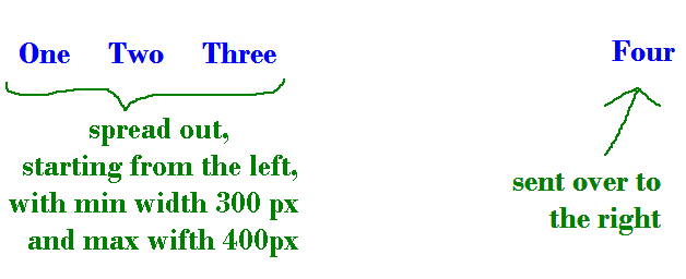
At the moment I've got four items and HTML and CSS as follows:

HTML

<div id="nav">
        <ul>
            <li><a href="/">One</a></li>
            <li><a href="/">Two</a></li>
            <li><a href="/">Three</a></li>
            <li><a href="/">Four</a></li>
        </ul>
</div>

CSS

#nav span {
        display: inline-block;
        position: relative;
    }
    #nav ul {
        text-align: justify;
        max-width: 400px;
    }
    #nav ul:after {
        margin-left: 100%;
        content: "";
    }
    #nav ul li {
        display: inline;
    }

Please note that I am justifying the elements within the 400px maximum width using the technique given in the accepted answer to this question. At the moment there are four elements within the 400px, but I need to take the fourth one out and send it over to the right.

Community
  • 1
  • 1

4 Answers4

2

You can use display: flex on ul and put margin-left: auto and text-align: right; on the last li element. I put size restrictions on the li elements to meet your size requirements, making the minimum 100px (one third of 300) and maximum 133px (~ one third of 400px):

#nav ul {
      width: 100%;
      padding: 0;
      background: #ccc;
      display: flex;
    }
    #nav ul li {
      display: inline;
      box-sizing: border-box;
      min-width: 100px;
      max-width: 133px;
      padding: 5px 10px; /* only to make it look better */
    }
    #nav ul li:last-child {
      margin-left: auto;
      text-align: right;
    }
<div id="nav">
        <ul>
            <li><a href="/">One</a></li>
            <li><a href="/">Two</a></li>
            <li><a href="/">Three</a></li>
            <li><a href="/">Four</a></li>
        </ul>
</div>

Alternative solution with floats (after comment asking for a non-CSS3 solution):

#nav ul {
  width: 100%;
  padding: 0;
  background-color: #ccc;
  overflow: hidden;
}
#nav ul li {
  float: left;
  list-style: none;
  box-sizing: border-box;
  min-width: 100px;
  max-width: 133px;
  padding: 5px 10px;
  /* only to make it look better */
}
#nav ul li:last-child {
  float: right;
  text-align: right;
}
<div id="nav">
  <ul>
    <li><a href="/">One</a>
    </li>
    <li><a href="/">Two</a>
    </li>
    <li><a href="/">Three</a>
    </li>
    <li><a href="/">Four</a>
    </li>
  </ul>
</div>
Johannes
  • 64,305
  • 18
  • 73
  • 130
  • This works beautifully - thank you! - and I have upvoted. But is there a way to do it without using CSS3? –  Jan 10 '17 at 14:39
  • I added a second solution that uses float and no flexbox. – Johannes Jan 10 '17 at 16:25
  • Thanks again. That is almost perfect, but the elements other than the last one aren't resizing in width from 100px to 133px when I resize the window. They are fixed, taking up 100px each. (FF50, IE11.) That's acceptable for my purposes, but I'm making this comment for the good of others who may read this answer. –  Jan 10 '17 at 19:20
  • but then you'd have to define how the relation between those and the overall width should be, i.e. in which situation they'd reach 133px and in which (width) they would be compressed to 100px. Something like that should be achievable using percentage widths combined wit the existsting min/max pixel widths. – Johannes Jan 10 '17 at 19:55
0

Hope it can help u

<html lang="en">
<head>
  <title>Bootstrap Case</title>
  <meta charset="utf-8">
  <meta name="viewport" content="width=device-width, initial-scale=1">
  <link rel="stylesheet" href="https://maxcdn.bootstrapcdn.com/bootstrap/3.3.7/css/bootstrap.min.css">
  <script src="https://ajax.googleapis.com/ajax/libs/jquery/3.1.1/jquery.min.js"></script>
  <script src="https://maxcdn.bootstrapcdn.com/bootstrap/3.3.7/js/bootstrap.min.js"></script>
</head>
<body>
<nav class="navbar navbar-inverse">
  <div class="container-fluid">
    <div class="navbar-header">
      <a class="navbar-brand" href="#">Test</a>
    </div>
    <ul class="nav navbar-nav">
      <li class="active"><a href="#">One</a></li>
      <li class="dropdown"><a class="dropdown-toggle" data-toggle="dropdown" href="#">Two<span class="caret"></span></a>
        <ul class="dropdown-menu">
          <li><a href="#">Two 1-1</a></li>
          <li><a href="#">Two 1-2</a></li>
          <li><a href="#">Two 1-3</a></li>
        </ul>
      </li>
      <li><a href="#">Three</a></li>
    </ul>
    <ul class="nav navbar-nav navbar-right">
      <li><a href="#"><span class="glyphicon glyphicon-user"></span> Four</a></li>      
    </ul>
  </div>
</nav>
  </body>
  </html>
  

Note: Click full page to see

ThinhLe
  • 409
  • 1
  • 3
  • 12
  • Thank you, but I am not using Bootstrap. I need the first three items spread out with a fixed combined width of 400px, floated left. That works fine with the code I posted, except that all four items are spread out within that width, whereas I need the fourth taken out and pushed along to the right, leaving the first three with a combined width of 400px. –  Jan 10 '17 at 02:48
0

#nav {
  background: #F9F9F9;
}
#nav ul {
  list-style: none;
  margin: 0;
  padding: 0;
  display: table;
  table-layout: fixed;
  width: 100%;
}
#nav li {
  display: table-cell;
  width: 60px;
  text-align: center;
  border: 1px solid #CCC;
}
#nav li:last-child {
  width: auto;
  text-align: right;
}
#nav a {
  display: inline-block;
  padding: 7px;
}
<div id="nav">
  <ul>
    <li><a href="/">One</a></li>
    <li><a href="/">Two</a></li>
    <li><a href="/">Three</a></li>
    <li><a href="/">Four</a></li>
  </ul>
</div>
rafaelfndev
  • 679
  • 2
  • 9
  • 27
  • Thank you, but I need a fixed combined width of 400px for all items taken together without the one sent to the right. –  Jan 10 '17 at 03:23
  • Thanks again, but that doesn't send the fourth item over to the right hand side. It keeps it within the 400px. –  Jan 10 '17 at 12:41
0

Codepen

Did you mean something like this?

Try this code, just keep your markup same.

    #nav ul {
        text-align: justify;
        max-width: 400px;
      float:left;
      display:block;
      position:relative;
    }
#nav ul li 
{
  display:inline-block;
  float:left;
}
#nav ul li a 
{
  text-decoration:none;
  color:#242424;
}
    #nav ul li:last-of-type {
        position:absolute;
      right:-1200px;
    }


     #nav ul {
            text-align: justify;
            max-width: 400px;
          float:left;
          display:block;
          position:relative;
        }
    #nav ul li 
    {
      display:inline-block;
      float:left;
    }
    #nav ul li a 
    {
      text-decoration:none;
      color:#242424;
    }
        #nav ul li:last-of-type {
            position:absolute;
          right:-1200px;
        }
  • At Codepen, that squeezes the first three items together. In my own CSS, if I replace the fragment I posted with this it wreaks havoc! I have edited the question to try to make it clearer. –  Jan 10 '17 at 03:32