14

I'm using Bootstrap 4 (now I'm on alpha-6).

I have this situation:

<body>

  <!-- HERE I HAVE one div automatically generated with randomly ID and class -->

  <div class="bigone">

    <div class="container-fluid">

      <div class="header">
        My header
      </div>

    </div>

    <div class="mybar">
      Nav bar
    </div>

    <div class="main">
      <div class="container-fluid">
        <div class="row">

          <div class="col-6">
            <div class="card">
              <div class="card-header">
                Card Header
              </div>
              <div class="list-group list-group-flush">
                <a href="#" class="list-group-item list-group-item-action"><b>FIRST LINK</b></a>
                <a href="#" class="list-group-item list-group-item-action">Dapibus ac facilisis in</a>                    
                <a href="#" class="list-group-item list-group-item-action">Dapibus ac facilisis in</a>
                <a href="#" class="list-group-item list-group-item-action">Morbi leo risus</a>

                <a href="#" class="list-group-item list-group-item-action disabled"><b>LAST LINK</b></a>
              </div>
              <div class="card-footer">
                Card Footer
              </div>
            </div>
          </div>

          <div class="col-6">
            <h1>FIRST LINE</h1> So many words, so many words. So many words, so many words. So many words, so many words.
            <br> So many words, so many words. So many words, so many words. So many words, so many words.
            <br> So many words, so many words. So many words, so many words. So many words, so many words.
            <br>
            <h1>LAST LINE</h1>
          </div>

        </div>
      </div>
    </div>

    <div class="footer">
      Footer
    </div>

  </div>

  <!-- HERE THAT DIV CLOSED -->

</body>

This is the css:

.bigone {
  display: flex;
  min-height: 100vh;
  flex-direction: column;
}

.main {
  flex: 1;
}

There is a DEMO on plnkr: https://plnkr.co/edit/Q9PQIj8uDFY80bxJGks3

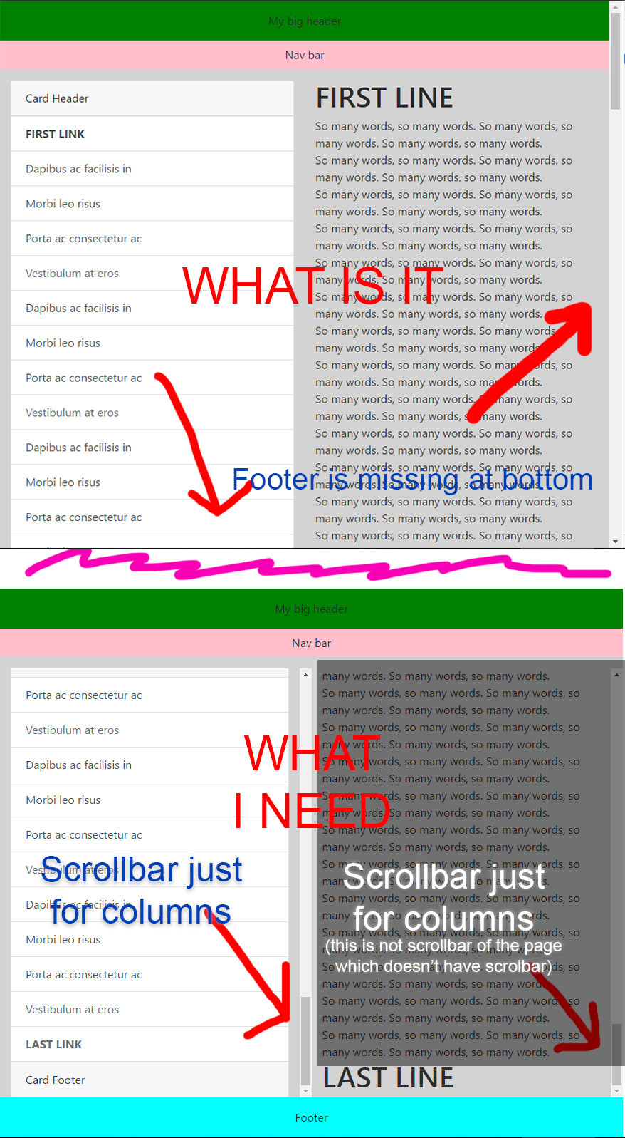
I need footer to be on bottom when the page content is empty, for this reason I'm using: .bigone { height: 100vh; } and Bootstrap Flexbox align utilities like: <div class="bigone d-flex flex-column">

Now I need the list-group in card and the col-6 with "so many words" to be scrollable, so to have an height for both max to the bottom where the footer is.

In a nutshell: BODY must not have the scroll bar.

My header and footer height are not fixed, they change.

How to? I'm not a flexbox expert.

I don't need IE, just Chrome.

IMPORTANT:

I can't make my card height fixed with something like this:

height: calc(100vh - header.height - footer.height - etc...);

because my header, footer, etc. heights change dynamically.

Picture of the problem:

WHAT I NEED

3 Answers3

11

According to the spec, the setting flex: 1 (on the .main element) is equivalent to flex: 1 1 0, shorthand for:

  • flex-grow: 1
  • flex-shrink: 1
  • flex-basis: 0

However, for some reason, flex: 1 is not working as expected in your code. (I'm only checking in Chrome, per your question).

However, if you give .main the full shorthand – and make it a flex container and add overflow – your layout appears to work.

.main {
    flex: 1 1 0; /* flex: 1, which you had before, is equivalent but doesn't work */
    display: flex;
    flex-direction: column;
    overflow-y: scroll;
}

revised plunkr

Reference:


EDIT (based on changes to the question)

My answer above removes scrollbars from the body and provides a vertical scrollbar for the .main section.

To make vertical scroll bars available for each column in the .main section, make this adjustment:

.main {
    flex: 1 1 0;
    display: flex;
}
.container-fluid {
    display: flex;
}
.col-6 {
    overflow-y: auto;
}

revised plunkr

Michael Benjamin
  • 346,931
  • 104
  • 581
  • 701
  • Maybe my question isn't clear enough. I need the `card` in `col-6` to be scrollable, without using `height: calc(100vh - [header and footer height])`. How to do that? You answer for what is? It doesn't change scrollable feature of the two `col-6` to my own plnkr. –  Jan 12 '17 at 16:57
  • My demo is different than yours. The scrollbar works as you request. And there is no `height` or `calc`. – Michael Benjamin Jan 12 '17 at 16:59
  • Ok, dear @Michael_B, I misunderstood your answer, but still it isn't what I need. I need to show `Footer` at bottom, but ONLY when both `col-6` columns have scrollbar and their height is (100% of the page minus height of header, navbar and footer). All this dinamically, because my header and footer height changes and so I can't use `calc()`. This is my question. I updated plnkr. I will update my question with screenshots. –  Jan 12 '17 at 17:20
  • In your question you say: *I need footer to be on bottom even if the page content is empty*. – Michael Benjamin Jan 12 '17 at 17:28
  • Yes, but not when there is content. I updated question. Sorry. –  Jan 12 '17 at 17:38
  • Ok, we almost are... I updated my plunker: https://plnkr.co/edit/Q9PQIj8uDFY80bxJGks3: I need scroll on `list-group`, not `col-6`. How to? –  Jan 12 '17 at 18:00
  • Ok, really last doubt: I updated my plunker with your css translated in Bootstrap utility (it's the same and it works good!), but now there is a little problem: my Angular project creates some divs with randomly classes and IDs every time, in my plunker I called it `somethingRandomlyEveryTime`. If I not put the class `d-flex` or the same css `display: flex` on every div who contains my cards it doesn't works. This is the real problem of my tests. –  Jan 12 '17 at 18:37
  • That sounds like an Angular issue. This question was about CSS. You may want to post another question focusing on Angular. – Michael Benjamin Jan 12 '17 at 18:42
  • Yes, but the css question is: is it really necessary `display: flex` on every upper divs? –  Jan 12 '17 at 18:46
  • 1
    When you make an element a flex container (`display: flex` or `inline-flex`) it automatically gives the children full height (`align-items: stretch`). That's the reason: you get dynamic full height; no `calc` or `height` necessary. – Michael Benjamin Jan 12 '17 at 18:48
  • Ok, I understand. This problem is mine, but only now I realized that enlarging the window columns no longer complies with the responsiveness. Look at it: https://run.plnkr.co/iUqgmpIMvFUEaerk/, this is the plnkr: https://plnkr.co/edit/Awoof7KfACHXlPpQYNLo –  Jan 12 '17 at 21:09
  • Your demo doesn't have any of the code from my answers. You're missing the `overflow-y`, etc. – Michael Benjamin Jan 12 '17 at 21:31
  • Unfortunately also in your plnkr there is the problem: https://plnkr.co/edit/gMbgxvUqHNDsQVe4P7ny (big page: https://run.plnkr.co/lLz9uWiw7SDsfxTO/) the only difference is your columns are centered. –  Jan 12 '17 at 21:35
  • You're on the wrong plunkr. My answer works in both the small and large screen: https://run.plnkr.co/HtUpdYmIACNEDkHI/ – Michael Benjamin Jan 12 '17 at 21:37
  • At link you posted now (https://run.plnkr.co/HtUpdYmIACNEDkHI) I see the two columns centered, even if they are `col-6`. This is the problem. Enlarge the window, please. –  Jan 12 '17 at 21:40
  • We're not seeing the same thing. My link worked when I sent it to you. When you sent it back it doesn't. Now it doesn't work at all (Page Not Found). Something strange going on. – Michael Benjamin Jan 12 '17 at 21:44
  • Make sure the code from my revised answer is included in your layout. It works. Maybe try in another IDE (like jsfiddle.net or codepen.io). – Michael Benjamin Jan 12 '17 at 21:45
  • Let us [continue this discussion in chat](http://chat.stackoverflow.com/rooms/133036/discussion-between-john-sam-and-michael-b). –  Jan 12 '17 at 21:47
  • if I have a long page and I don't need the footer in front, how can I put the scroll in bottom like no flexbox? In this fork (https://plnkr.co/edit/DdrXhlxWPY015OLmZTm6) when I scroll the page the footer remains there. –  Feb 24 '17 at 00:58
  • Works fine on Edge. – Michael Benjamin Feb 24 '17 at 01:01
  • For Chrome try `.main { flex: 1 1 auto }` instead of `flex: 1 1 0`. – Michael Benjamin Feb 24 '17 at 01:04
  • It doesn't work on Chrome because the scroll in page where I need to scroll doesn't work anymore, just disappear. –  Feb 24 '17 at 09:48
  • Dear Michael_b, I opened this question: http://stackoverflow.com/questions/43175481/different-behaviour-of-flexbox-with-overflow-y-scroll-on-safari-firefox-and-e. Why this behavior? –  Apr 03 '17 at 07:20
  • @Michael_B would you be willing to make the solution a little more general for folks being directed here by google? I have two bootstrap columns, I'd like them both to scroll independently and occupy the full vertical space.. what do I do? – Alex Lenail Oct 07 '17 at 18:08
  • @AlexLenail, consider posting a new question, with all your details and requirements. That may bring in answers more suitable to your needs. – Michael Benjamin Oct 07 '17 at 21:24
3

I have

<div class="fixed-top collapse show wrapper">
 <ul class="list-group bg-white menu">
 </ul>
</div>

I fixed it by

.wrapper {
    margin-top: 48px; /* place it under navbar */
    height: 100vh;
    overflow: scroll;
    padding-bottom: 48px; /* compensate margin top */
}
luky
  • 2,263
  • 3
  • 22
  • 40
0

Created a new Plunker to showcase what you're looking for.

To keep the footer on the bottom use Bootstrap Flexbox Auto Margins.

If you want to keep your main content within the initial viewport height, use the flex-grow:1 property with overflow-y:scroll. Its height will adopt responsively based on the space the other elements use.

Hope this helped.

Community
  • 1
  • 1
Cooleronie
  • 1,225
  • 1
  • 9
  • 9
  • 1
    I need all this in `list-group` of the `card` component. Not the simple header, main and footer, unfortunately. –  Jan 10 '17 at 20:32