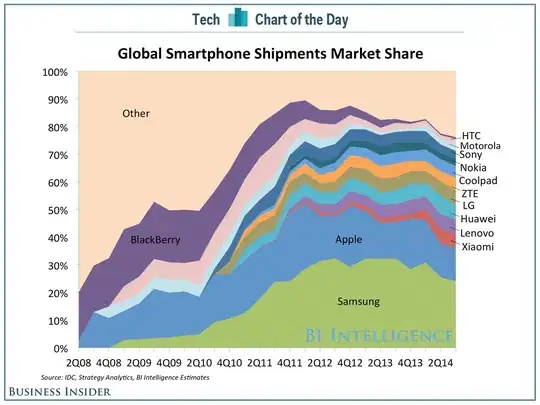
I've looked around, and I haven't been able to find what this kind of chart is called, or how to make it in ggplot2. I have similar share over time data, and I would like to visualize it with a chart like this. Does anybody have any ideas?
I've looked around, and I haven't been able to find what this kind of chart is called, or how to make it in ggplot2. I have similar share over time data, and I would like to visualize it with a chart like this. Does anybody have any ideas?