I'm trying to create some CSS for a list of rectangles, with wrapping, that is responsive. The rectangles can contain a variable amount of text. The rectangles should have a minimum width of 300px, but can grow if there is more space available. It should work no matter the number of rectangles.
This is an image of what I want it to look like, in a wide desktop screen, a normal desktop screen and a phone, roughly:
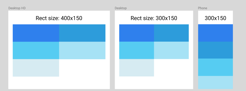
(I realise that most phone and desktops are wider than that in pixels, but these numbers are easier to work with when it comes to SO's code snippets.)
I'm trying three techniques, and none of them do what I want:
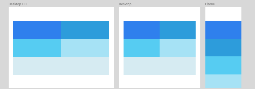
1. Flexbox doesn't work:
Flexbox would seem ideal for this job. The trouble with the flexbox implementation is that I can't find a way to make sure the last rectangle stays the same size as the rest, while also allowing the rectangles to grow in very wide screens. Here's an image of the best flexbox result that I could come up with, which has the problem with the last line:
Here's the code of the flexbox implementation:
.container {
  display: flex;
  flex-wrap: wrap;
}
.rect {
  flex: 1 0 300px;
  height: 150px;
}
<div class="container">
<div class="rect" style="background-color: #2F80ED"></div>
<div class="rect" style="background-color: #2D9CDB"></div>
<div class="rect" style="background-color: #56CCF2"></div>
<div class="rect" style="background-color: #A6E2F5"></div>
<div class="rect" style="background-color: #D6EBF2"></div>
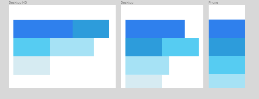
</div>2. float: left technique doesn't work:
Another responsive technique is to use floats, but I can't find a way to keep the rectangles the same width (with varying text content), while also allowing them to grow in the widest screens. Here's an image of what I ended up with:
Here's the code of the float: left implementation:
.container:after {
  content: "";
  clear: both;
}
.rect {
  float: left;
  min-width: 300px;
  height: 150px;
  overflow-y: hidden;
}
<div class="container">
<div class="rect" style="background-color: #2F80ED">Lorem ipsum dolor sit amet, consectetur adipiscing elit, sed do eiusmod</div>
<div class="rect" style="background-color: #2D9CDB"></div>
<div class="rect" style="background-color: #56CCF2">Lorem ipsum dolor sit amet, consectetur</div>
<div class="rect" style="background-color: #A6E2F5">Lorem ipsum dolor sit amet, consectetur adipiscing elit, sed</div>
<div class="rect" style="background-color: #D6EBF2"></div>
</div>3. Why not media queries?
I'm looking for a solution that doesn't involve media queries, as media queries only let you put conditions on the screen width, and not on the .container width.