No, there are no inset or inverse border-radius in CSS as of now. But there are very many ways to create this shape. I've answered your radial-gradient question in the other thread but think this is a good enough shapes question to stand on its own and hence giving a detailed answer here with all the different possible methods to create this shape.
Using Radial Gradient:
Just adding here for the benefit of others. It's a repeat but makes the answer complete. We can use four ellipses (or circles) created using radial-gradient background images and place them at their appropriate position to create this effect. The output shape is responsive but it cannot be used when the shape should have :hover effects restricted to the shape boundaries or have anything other than a solid color as the fill/background. It also needs a square shaped container (not a rectangle).
div {
  width: 300px;
  height: 300px;
}
.radial-grad {
  background: radial-gradient(circle at 0 100%, rgba(204, 0, 0, 0) 70%, #c00 71%), radial-gradient(circle at 100% 100%, rgba(204, 0, 0, 0) 70%, #c00 71%), radial-gradient(circle at 100% 0, rgba(204, 0, 0, 0) 70%, #c00 71%), radial-gradient(circle at 0 0, rgba(204, 0, 0, 0) 70%, #c00 71%);
  background-position: bottom left, bottom right, top right, top left;
  background-size: 50% 50%;
  background-repeat: no-repeat;
  transform: rotate(45deg);
  backface-visibility: hidden;
}

/* just for demo */

div {
  transition: all 1s ease;
}
div:hover {
  width: 350px;
  height: 350px;
}
<div class='radial-grad'></div>
Using SVG:
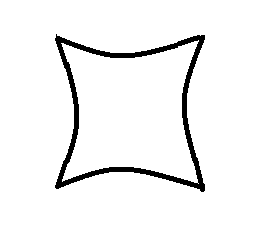
SVG is the recommended tool for creating such complex shapes. We can easily create the required shape using path element and its various commands. SVG is scalable (responsive), is very easy to create and maintain, allows greater control over the shape like its slope etc. It can support gradient or image backgrounds too. Unlike radial-gradient, this works well with rectangular containers too.
By modifying the control point of the quadratic curve (first coordinate provided after the Q command), we can control the slope/curve of the cut-off area. The d attribute of the path element can be set or modified via JS just like we do for any other HTML attributes.
But we have to remember that SVG is a graphic (image). We can't control a HTML element that you're adding to the page through pure SVG alone. That would need clip-paths or something like that.
svg {
  height: 300px;
  width: 300px;
}

/* just for demo */

svg {
  transition: all 1s;
}
svg:hover {
  height: 200px;
  width: 250px;
}
<svg viewBox='0 0 200 200'>
  <defs>
    <pattern id='bg' width='200' height='200' patternUnits='userSpaceOnUse'>
      <image xlink:href='https://placeimg.com/200/200/nature' height='200' width='200' />
    </pattern>
  </defs>
  <path d='M0,0 Q100,60 200,0 Q140,100 200,200 Q100,140 0,200 Q60,100 0,0z' fill='url(#bg)'/>
</svg>
Using Clip-path:
This is similar to the pure SVG version but unlike that one where the shape is created and then placed behind or inside the container, here we cut the container element itself into the required shape.
Pure CSS method (without SVG) is available but it doesn't support complex paths yet. It supports only basic shapes and so we have to use clip-path along with a SVG definition. Moreover, Firefox supports it only when used with SVG (like url(#id)). IE still doesn't support clip-path and that's one reason why this is not yet good for production implementations.
This is good when the shape has background as an image or a gradient instead of a solid color and it can also work well when :hover effects are needed because we are cutting out the required paths.
This is more like an inset border-radius because the element doesn't exist outside the clipped area.
div {
  height: 300px;
  width: 300px;
  background-image: url(https://placeimg.com/200/200/nature);
}
.clip-path {
  -webkit-clip-path: url(#clipper);
  clip-path: url(#clipper);
}

/* just for demo */

div {
  transition: all 1s ease;
}
div:hover {
  height: 350px;
  width: 325px;
}
<svg width='0' height='0'>
  <defs>
    <clipPath id='clipper' clipPathUnits='objectBoundingBox'>
      <path d='M0,0 Q0.5,0.3 1,0 Q0.7,0.5 1,1 Q0.5,0.7 0,1 Q0.3,0.5 0,0z' />
    </clipPath>
  </defs>
</svg>
<div class='clip-path'></div>
Using Masks:
This feature is currently supported only by WebKit powered browsers and hence isn't recommended now but it is a very good option for the future. This approach is especially useful when the shape's background would be an image or a gradient and not just a solid color.
The working of masks is very similar to the radial-gradient approach but the difference lies in the fact that unlike radial-gradient which fills the remaining space with solid color, this would just mask out the unwanted portions and not add any fill of its own. So, the background image that is assigned to the element originally will be preserved.
This method is not good if we want to have :hover effects that is restricted to the boundaries of the shape as it doesn't cut out the unwanted portions, it just masks them out or make it transparent.
Similar to the radial-gradient approach, this also needs a square shaped container to work but it is otherwise responsive.
div {
  height: 300px;
  width: 300px;
  background-image: url(https://placeimg.com/200/200/nature);
}
.mask {
  -webkit-mask-image: radial-gradient(circle at 0 100%, rgba(204, 0, 0, 0) 70%, #c00 71%), radial-gradient(circle at 100% 100%, rgba(204, 0, 0, 0) 70%, #c00 71%), radial-gradient(circle at 100% 0, rgba(204, 0, 0, 0) 70%, #c00 71%), radial-gradient(circle at 0 0, rgba(204, 0, 0, 0) 70%, #c00 71%);
  -webkit-mask-position: bottom left, bottom right, top right, top left;
  -webkit-mask-size: 50% 50%;
  -webkit-mask-repeat: no-repeat;
  transform: rotate(45deg);
  backface-visibility: hidden;
}

/* just for demo */

div {
  transition: all 1s ease;
}
div:hover {
  height: 350px;
  width: 350px;
}
<div class='mask'></div>
Using Pseudo element and Box shadows:
I don't recommend this approach as it has a lot of drawbacks but is still an option. If we just need to create the shape, don't require :hover effects, don't require the cut off areas to be transparent (that's the cut-off areas can be a solid color, like white in this snippet) then we can try this approach.
It involves placing 2 elliptical pseudo-elements on the top, left side and then getting their shadows to do the work on their opposite sides.
div {
  position: relative;
  height: 300px;
  width: 300px;
  background: #c00;
}
div:before {
  position: absolute;
  content: '';
  height: 50%;
  width: 110%;
  top: -35%;
  left: -5%;
  background: white;
  border-radius: 50%;
  box-shadow: 0px 360px 0px 0px white;
}
div:after {
  position: absolute;
  content: '';
  width: 50%;
  height: 110%;
  left: -35%;
  top: -5%;
  background: white;
  border-radius: 50%;
  box-shadow: 360px 0px 0px 0px white;
}
<div></div>
 ..
..