1

Source:

<div id="box">
   <div id="wrap">
      <img>
   </div>
</div>

And CSS:

#box {
   width: 500px;
   min-height: 400px;
   max-height: 600px;
}

How to autofit img with constant aspect ratio using only CSS? Here is an example of image properly fitting:

example

hungerstar
  • 21,206
  • 6
  • 50
  • 59
Kesantielu Dasefern
  • 266
  • 1
  • 3
  • 12
  • 1
    http://stackoverflow.com/questions/12991351/css-force-image-resize-and-keep-aspect-ratio – linktoahref Jan 31 '17 at 14:06
  • 1
    I don’t think that can be done using pure CSS, if you want the container to obey a min- and max-height as well. – CBroe Jan 31 '17 at 14:06
  • explain your question, you can do images responsive and they the will resize demo - https://jsfiddle.net/yc32n7ud/ – grinmax Jan 31 '17 at 14:14
  • @grinmax it's clear what the OP is asking. They need a solution beyond a simple responsive image. Depending on the aspect ratio they need an image to always fill the width and/or height of the container element if possible. – hungerstar Jan 31 '17 at 14:18
  • this can do only if image leave in background and add property background-size: cover; https://jsfiddle.net/31h9vax6/ – grinmax Jan 31 '17 at 15:11

5 Answers5

2
#box {
   width:100%;
   height:100%;
}

#box img {
width :100%;
}

try this to fix the image ratio.

Muhammad Shaharyar
  • 1,044
  • 1
  • 8
  • 23
1

Another solution would be to use object-fit. It specifies how an image or video element should be resized to fit its container.

If you use object-fit: cover; it will cut off the sides of the image, preserving the aspect ratio, and also filling in the space:

#wrap img {
   width: 100%;
   height: 100%;
   object-fit: cover;
}

About the browser support:

enter image description here

More informations about this css property: object-fit CSS property

Note:

object-fit works for <img> and <video> elements only.

Mooncake
  • 1,477
  • 1
  • 22
  • 26
0

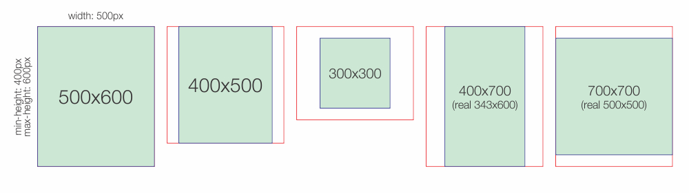
Here is what I was after... and I think what the OP wanted:

  1. If image is tall fit height (potentially letterboxing on left/right)
  2. If image is wide fit width (potentially letterboxing on top/bottom)

enter image description here

Here is the CSS...

.Image_Container {
  position: absolute;
  top: 0;
  width: 100vw;
  height: 100vh;
}
.Image {
  width: 100%;
  height: 100%;
  object-fit: contain;
}
body {
  background: orange;
  margin:0;
}

Here is the HTML...

    <div class="Image_Container">
      <img class="Image" src="https://picsum.photos/400/800" />
    </div>
    
    <div class="Image_Container">
      <img class="Image" src="https://picsum.photos/800/301" />
    </div>

Here is the Code...

https://stackblitz.com/edit/web-platform-9s6clh?file=styles.css

Disclaimer:

I am sure this can be simplified, hopefully not with some weird specs like -moz-moz, -webkit POLUTION, forget those none sense units like px,em,... viewport units all the way :)

I am no CSS guru, just hacking myself away into all this garbage languages/frameworks that fail to provide the obvious for the average human.

Meryan
  • 1,285
  • 12
  • 25
-1

Css for the parent container - min-height: 400px; max-height: 600px;

And then for the image itself:

#box {
   width: 100%;
   height: auto;

}
andrey
  • 1,867
  • 3
  • 21
  • 34
-3

You could try this in your css

img {
     width:auto;
     height:auto;
    }

Or good old HTML

<img src="http://imageurl.jpg" style="width: auto; height: auto;">