9

I have a monitor with 1920x1080 resolution for my laptop and a Surface Pro 3 with 1920x1280 resolution. I am developing a web page designed for full-screen viewing on 1920x1080 and 1920x1280 displays.

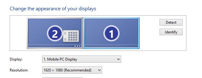
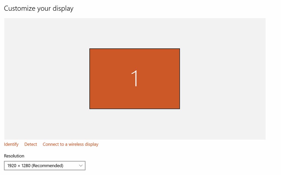
I have confirmed the settings for each display (see below).

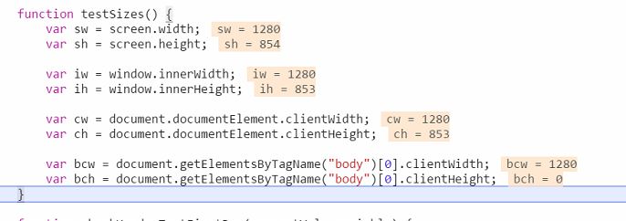
Why am I getting 8xx instead of 1280? How can I obtain a value of 1280 to match the resolution height of the Surface Pro 3?


1920x1080 monitor (on Windows 8):

monitor screen resolution

1920x1280 (Surface Pro 3) display (on Windows 10):

Surface Pro 3 display


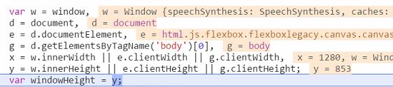
Using $(window).height() on my 1920x1080 monitor, I get the following:

1080

That works for me.


However, using suggestions from this question for my 1920x1280 (Surface Pro 3) display...

Using $(window).height():

window

Using $(document).height():

document

Using screen.height:
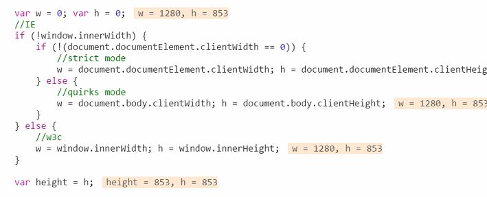
screen.height

innerHeight/clientHeight

document.clientHeight

availHeight

innerHeight

winsize

  • This suggestion is a self-recommendation of a plugin. I will pass on this for now.

  • This suggestion uses a Coffee solution. I'll stick to JavaScript and jQuery for now.

  • Using this suggestion from this answer (which regurgitates a few other answers):

testSizes

scrollHeight


Community
  • 1
  • 1
  • Possible duplicate of [Get the size of the screen, current web page and browser window](http://stackoverflow.com/questions/3437786/get-the-size-of-the-screen-current-web-page-and-browser-window) – Heretic Monkey Feb 01 '17 at 15:54
  • @MikeMcCaughan I have tried every suggestion from the [accepted answer](http://stackoverflow.com/a/3437825) to no avail. I'll update question with results from each said suggestion. –  Feb 01 '17 at 15:56
  • There are 14 answers on that question. A duplicate does not mean only the accepted answer will work. – Heretic Monkey Feb 01 '17 at 15:58
  • 1
    @MikeMcCaughan I have incorporated a majority of those 14 answers (those that didn't require using a different script or an external plugin/library outside of JavaScript/jQuery). None of those suggestions answers why I get 8xx instead of 1280 on the Surface Pro 3. –  Feb 01 '17 at 16:38
  • Please consider replacing the screenshots with correctly formatted code – hiy Feb 05 '17 at 11:27
  • @hiy Replacing the screenshots would remove the problem I am trying to demonstrate. If "correctly formatted code" is of utmost importance to you, feel free to suggest those edits. –  Feb 06 '17 at 13:13
  • My gut feeling is that the visual height of the window is indeed 853 _CSS pixels_. Unfortunately, I don't have access to a Surface for testing, so I'm flying blind here. Have you measured the height, in CSS pixels, e.g. with `html` and `body` margins and padding set to 0, and a div set to height 850px? Does the div extend all the way down to the bottom of the window? – hashchange Feb 06 '17 at 15:00

4 Answers4

2

1) How can I obtain a value of 1280 to match the resolution height of the Surface Pro 3?

Have you tried

 window.outerHeight 

yet?

All I see in your test cases is the innerHeight. That's only showing you what the browser will render(pixels will be zoomed, etc.. decreasing the available width you actually have)

2) Why am i getting 8xx instead of 1280?

Basically, browsers will zoom text/images/ etc.. to give a consistent experience across several resolutions. Even though you are building it for a 1280 screen, you might only have 8xx pixels to your availability.

For more information about the pixeling I advice you read:

http://www.quirksmode.org/blog/archives/2010/04/a_pixel_is_not.html

Tschallacka
  • 27,901
  • 14
  • 88
  • 133
  • My test cases were contrived from the "duplicate question," in which none of those suggestions used `outerHeight`. `outerHeight` gives me 814. The second part of your answer is helpful...the reason I am trying to identify the height (in pixels) is to choose the appropriate css file based on the display. This looks to be more complicated than just finding the height (in pixels). –  Feb 06 '17 at 14:19
  • Basically. Forget about the exact height. Go with what the browser tells you it is, because that is what the user experiences it as because the browser "zooms" it as per settings of users. Users who have set their global desktop to zoom will break your app otherwise: http://www.windowscentral.com/how-make-text-apps-bigger-windows-10 – Tschallacka Feb 06 '17 at 14:22
  • Right. That means I'll have to find a way to determine the display being used in a different manner (and try to accommodate for these zoomed in cases). Thanks! –  Feb 06 '17 at 14:24
  • You might want to use `window.devicePixelRatio` to figure out what the ratio of pixels is the website uses. – Tschallacka Feb 06 '17 at 14:33
  • Would you suggest multiplying the `devicePixelRatio` with `height` to get the "actual" resolution height of the display? I get `1` for my monitor and `1.5` for the Surface Pro 3. This would be a solution toward detecting which css files to use based on which display. –  Feb 06 '17 at 14:48
  • Ish. I would only use it to determine which resolution images to use. with a ratio of 1.5 you need instead of a 100px image a 150px image to show sharp on 100px. – Tschallacka Feb 06 '17 at 15:32
2

It seems that your Surface Pro 3 uses an operating system wide zoom factor of 150%. Due to this the browser returns width 1280 and height 853 (as 1280 * 1.5 = 1920 and 853 * 1.5 = 1280). Switch Windows' zoom factor to 100% in Control Panel and your browser will return width and height as expected.

sb9
  • 1,082
  • 7
  • 18
1

Here is a solution that worked for me in Firefox, Chrome, IE11, and Edge. I don't have a Mac to test on but this should work there too. You need to factor in the device pixel ratio. Here is an example (JSBin):

var screenHeight = window.devicePixelRatio * screen.height;

This will give you the screen dimensions regardless of DPI of the device.

An important thing to note is that innerHeight (size of window without browser UI) and outerHeight (size of window with browser UI) are relative to the browser window. You should use those instead of screen.height if you want to know the size of the browser window.

pseudosavant
  • 7,056
  • 2
  • 36
  • 41
  • Thanks for the confirmation. This is something I was led to with [Tschallacka's comment](https://stackoverflow.com/questions/41984029/get-height-of-surface-pro-3-on-web-page/42100480#comment71311711_42069610). The note is also useful. –  Feb 08 '17 at 12:34
0

In the browser, you deal with the abstraction of CSS pixels, not with physical pixels. The size reported to you is most likely correct (unless there is a weird browser bug at play), so the height of the window is 853 CSS pixels.

My advice would be to work with that size. Adjust your layout with media queries etc. Don't try to second-guess the browser; don't optimize for hardware specifics which browser vendors, and web standards, are actively trying to hide from you.

(I'll try to expand this answer later on, if I have the time. A proper explanation of the concepts is the length of a blog post.)

hashchange
  • 7,029
  • 1
  • 45
  • 41
  • Yeah, if I have the time, I'll undertake your suggestion and see what that does, but I suspect you're correct. My concern about this approach is that if there is a "true" 1280 display that reports a height of 1280...that would throw off adjusting my stylesheets based on the display. –  Feb 07 '17 at 13:04
  • 1
    Actually, you don't have to worry about that. It is the browser vendors who decide on the device pixel ratio (the number of device pixels corresponding to a virtual CSS pixel). That decision is based on stuff way beyond your control: physical screen dimensions, expected viewing distance, pixel density, and perhaps OS-wide user settings. You are _meant_ to work with the size reported in JS. Scaling the result to a physical environment is the joint responsibility of hardware manufacturers, the OS, and the browser. You are no longer involved at that point. – hashchange Feb 07 '17 at 14:03