9

I am interested in plotting a legend in my scatterplot. My current code looks like this

x=[1,2,3,4]
y=[5,6,7,8]
classes = [2,4,4,2]
plt.scatter(x, y, c=classes, label=classes)
plt.legend()

The problem is that when the plot is created, the legend is shown as an array instead of showing the unique labels and their classes.

This is how the plot looks

I am aware this is a question discussed previously in threads such as this one, however, I feel my problem is simpler, and the solution there does not fit. Also, in that example the person is specifying the colors, however, in my case, I do know beforehand how many colors I'll need. Moreover, in this example, the user is creating multiple scatters, each one with a unique color. Again, this is not what I want. My goal is to simply create the plot using an x, y array, and the labels. Is this possible?

Trenton McKinney
  • 56,955
  • 33
  • 144
  • 158
user3276768
  • 1,416
  • 3
  • 18
  • 28

3 Answers3

13

Actually both linked questions provide a way how to achieve the desired result.

The easiest method is to create as many scatter plots as unique classes exist and give each a single color and legend entry.

import matplotlib.pyplot as plt

x=[1,2,3,4]
y=[5,6,7,8]
classes = [2,4,4,2]
unique = list(set(classes))
colors = [plt.cm.jet(float(i)/max(unique)) for i in unique]
for i, u in enumerate(unique):
    xi = [x[j] for j  in range(len(x)) if classes[j] == u]
    yi = [y[j] for j  in range(len(x)) if classes[j] == u]
    plt.scatter(xi, yi, c=colors[i], label=str(u))
plt.legend()

plt.show()

enter image description here

In case the classes are string labels, the solution would look slightly different, in that you need to get the colors from their index instead of using the classes themselves.

import numpy as np
import matplotlib.pyplot as plt

x=[1,2,3,4]
y=[5,6,7,8]
classes = ['X','Y','Z','X']
unique = np.unique(classes)
colors = [plt.cm.jet(i/float(len(unique)-1)) for i in range(len(unique))]
for i, u in enumerate(unique):
    xi = [x[j] for j  in range(len(x)) if classes[j] == u]
    yi = [y[j] for j  in range(len(x)) if classes[j] == u]
    plt.scatter(xi, yi, c=colors[i], label=str(u))
plt.legend()

plt.show()

enter image description here

ImportanceOfBeingErnest
  • 321,279
  • 53
  • 665
  • 712
5

Maybe manually filling a table could be useful here. Another idea is using colorbar if your classes are contiguous numbers. I'm showing both approaches in one.

import matplotlib.pyplot as plt
import numpy as np

x=[1,2,3,4,5,6,7]
y=[1,2,3,4,5,6,7]
classes = [2,4,4,2,1,3,5]
cmap = plt.cm.get_cmap("viridis",5)
plt.scatter(x, y, c=classes, label=classes,cmap=cmap,vmin=0.5,vmax=5.5)
plt.colorbar()
unique_classes = list(set(classes))
plt.table(cellText=[[x] for x in unique_classes], loc='lower right',
          colWidths=[0.2],rowColours=cmap(np.array(unique_classes)-1),
         rowLabels=['label%d'%x for x in unique_classes],
          colLabels=['classes'])

enter image description here

Pablo Reyes
  • 3,073
  • 1
  • 20
  • 30
0
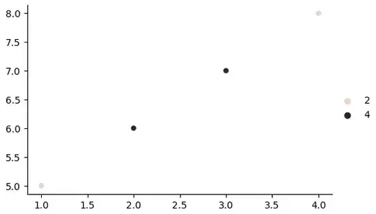
  • The easiest solution is to use seaborn, a high-level API for matplotlib, which separates groups by color, using the hue parameter.
  • legend='full': ensures every group will get an entry in the legend, which is important when the when the hue category is numeric.
  • If using the Anaconda distribution, seaborn will already be installed in the (base) environment. Otherwise use pip to install for non-Anaconda environments.
import seaborn as sns
import matplotlib.pyplot as plt

fig, ax = plt.subplots(figsize=(6.5, 3.5))

sns.scatterplot(x=x, y=y, hue=classes, legend='full', ax=ax)

enter image description here

g = sns.relplot(kind='scatter', x=x, y=y, hue=classes, legend='full', height=3.5, aspect=1.5)

enter image description here


  • Optionally, create a pandas.DataFrame from the lists of data, and then plot with seaborn.
import pandas as pd

# create the dataframe
df = pd.DataFrame({'x': x, 'y': y, 'classes': classes})

# axes level plot
ax = sns.scatterplot(data=df, x='x', y='y', hue='classes', legend='full')

# figure level plot
g = sns.relplot(kind='scatter', data=df, x='x', y='y', hue='classes', legend='full')
Trenton McKinney
  • 56,955
  • 33
  • 144
  • 158