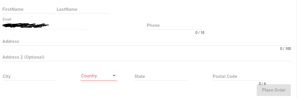
I Want to change the md-input color red (same as Country Dropdown in Image) when it is dirty and invalid . I have gone through many articles but didn't find any helpful ..
I Want to change the md-input color red (same as Country Dropdown in Image) when it is dirty and invalid . I have gone through many articles but didn't find any helpful ..
You need to include below css
 .mat-input-invalid .mat-input-placeholder {
    color: red;
}

.mat-input-invalid .mat-input-ripple {
    background-color: red;
}
It can be solved by css, but needs a preparation regarding encapsulation to avoid deprecated variants like ::ng-deep. A solution is given here:
https://stackoverflow.com/a/46042645/2692283
Here is a short description for your case:
Set encapsulation: ViewEncapsulation.None in your component:
import { ViewEncapsulation } from '@angular/core';

@Component({
    ...
    encapsulation: ViewEncapsulation.None
})
A more detailed explanation is given here:
Now just use css to make it red for your case:
/* Sets the underline to red if dirty and invalid */
.mat-form-field.ng-dirty.ng-invalid .mat-form-field-underline {
  background-color: red;
}
/* Sets the label to red if dirty and invalid */
.mat-form-field.ng-dirty.ng-invalid .mat-form-field-label {
  color: red;
}
It should work for Angular 4 and 5.
Error color is set to your warn color in the theme.
https://material.angular.io/guide/theming
@import '~@angular/material/theming';
// Plus imports for other components in your app.

// Include the common styles for Angular Material. We include this here so that you only
// have to load a single css file for Angular Material in your app.
// Be sure that you only ever include this mixin once!
@include mat-core();

// Define the palettes for your theme using the Material Design palettes available in palette.scss
// (imported above). For each palette, you can optionally specify a default, lighter, and darker
// hue. Available color palettes: https://material.io/design/color/
$candy-app-primary: mat-palette($mat-indigo);
$candy-app-accent:  mat-palette($mat-pink, A200, A100, A400);

// The warn palette is optional (defaults to red).
$candy-app-warn:    mat-palette($mat-red);

// Create the theme object (a Sass map containing all of the palettes).
$candy-app-theme: mat-light-theme($candy-app-primary, $candy-app-accent, $candy-app-warn);

// Include theme styles for core and each component used in your app.
// Alternatively, you can import and @include the theme mixins for each component
// that you are using.
@include angular-material-theme($candy-app-theme);