0

Still learning R, and have been struggling with plotting. Below is part of my data, and I will try to explain the type of plot:

> head(bees.net.counts)
  Month Block Treatment Flower Bee_Richness Bee_Abundance
1   May     1        UB   POSI            1             1
2   May     2        DS   ERST            4            38
3   May     2        UB   RUBU            2             2
4   May     3        DS   ERST            3             4
5   May     3        DS   TROH            1            10
6   May     3        GS   ERST            1             1

I want to make a plot where Flower is on the x-axis (there are 54 different ones), Bee_Richness or Bee_Abundance is on the y-axis, different colored symbols for Block (n=4) and amount of shading in each of those symbols for Treatment (n=3) (ie Block 1 Treatment UB is a red circle unfilled, Block 1 Treatment DS is a circle with half shaded red, and Block 1 Treatment GS is fully shaded red).

The problem I have is that each line is plotted instead of putting every point above a specific flower spp (there are multiple rows that have, say, CHFA, but those represent different Blocks and Treatments).

I have also tried this by month, where I separated the four months to make different graphs (to limit the length of the x-axis). There are 10 records in May, with 4 different flower species. I still can't figure out a way to do this.

Thank you for your help!!

Edit: Here is what I hope to get = plot idea
Brenna
  • 3
  • 3
  • `plot(x = as.numeric(as.factor(df$Flower)), df$Bee_Richness, pch = as.numeric(as.factor(df$Block))+5, col = as.numeric(as.factor(df$Treatment)))` that `+5` is optional – d.b Feb 09 '17 at 21:07
  • 1
    Perhaps you can sketch what you think this plot will look like? I can't see it from your description. It sounds like many points will end up on top of each other. I'm not sure what you want to connect the lines between. A more complete [minimal, reproducible example](http://stackoverflow.com/questions/5963269/how-to-make-a-great-r-reproducible-example) would be helpful. Show your attempts and describe ehere you fall shoer. – MrFlick Feb 09 '17 at 21:10
  • I included a sketch in the edited post now! – Brenna Feb 10 '17 at 00:53

1 Answers1

0

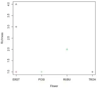
This uses the idea of @d.b 's solution, but improves the axis labels.

plot(x = as.numeric(as.factor(df$Flower)), df$Bee_Richness, 
    pch = as.numeric(as.factor(df$Block)), 
    col = as.numeric(as.factor(df$Treatment)), 
    xaxt="n", xlab="Flower", ylab="Richness")
axis(1, at=1:length(levels(df$Flower)), 
    labels=levels(df$Flower))

Flower Plot

Some added explanation

As you requested, the character is based on the Block. The color is based on the Treatment. Let's look at the color/Treatment. The trick is that when you make Treatment a factor, each value is internally represented as an integer, so you can use as.numeric on the factor and it translates DS to 1, GS to 2 and UB to 3. That makes the argument
col = as.numeric(as.factor(df$Treatment)) give DS color 1 and so on. R uses the numbers 1-8 as some easy-to-access colors. Since you only need 3, this works fine. Similarly,
pch = as.numeric(as.factor(df$Block)) picks characters 1 through 3 for the three Block values in the small test data.

G5W
  • 36,531
  • 10
  • 47
  • 80