28

Intuitively I'm looking for something like: facet_(scales="free_color")

I do something like

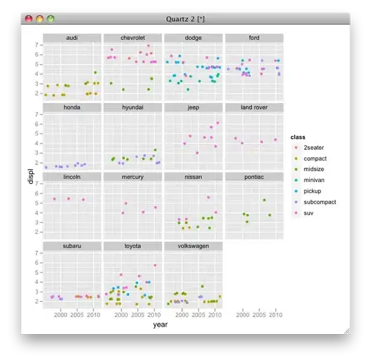
p <- ggplot(mpg, aes(year, displ, color=model)) + facet_wrap(~manufacturer)
p + geom_jitter()

That is: plot 2d measurements from individuals(model) belonging to different species(manufacturer) faceted by a species, indicating the individual by color. The problem is that all individuals share the same color scale - so that the points in a facet have very similar colors.

Using the group aesthetic with geom_line would solve the problem, but lines tell different story than dots.

Another obvious solution would be to drop the faceting and draw a separate plot for each subset. (If this should be the only solution: are there any quick, smart or proven ways to do that?)

ian
  • 674
  • 1
  • 6
  • 11

2 Answers2

6

I'm not sure that this is an available option when you're colouring by a factor. However, a quick way to produce the individual plots would be something like this:

d_ply(mpg, .(manufacturer), function(df) {
jpeg(paste(df$manufacturer[[1]], ".jpeg", sep=""))
plots <- ggplot(df, aes(year, displ, color=factor(model))) + geom_jitter()
print(plots)
dev.off()
})

Related Answers: Different legends and fill colours for facetted ggplot?

Community
  • 1
  • 1
Brandon Bertelsen
  • 43,807
  • 34
  • 160
  • 255
  • As hadley mentioned (in the answer you linked) "it's easy to work around by drawing separate plots" - this shows how. Thanks! But I'm still struggling to combine them in a way that matches the other faceted plots I created. – ian Nov 24 '10 at 20:22
  • Could you show us what you have so far? And try to describe what is/is not matching? – Brandon Bertelsen Nov 24 '10 at 20:25
  • Actually, perhaps it would be best to ask a new question showing what you currently have in terms of plot(s) and what you're actually looking for. – Brandon Bertelsen Nov 25 '10 at 01:25
5

I think you simply want to color by class, where each manufacturer makes several models, each only one or two per class:

p <- ggplot(mpg, aes(year, displ, color=class)) + facet_wrap(~ manufacturer)
p + geom_jitter()

alt text

Marcus Nunes
  • 851
  • 1
  • 18
  • 33
Alex Brown
  • 41,819
  • 10
  • 94
  • 108
  • 3
    The `mpg` dataset was just an example. I want to plot density gradients(`x` vs `y`) of tree(`color` or `group`) samples per species(`facet`). Each individual tree belongs to only one species. – ian Nov 24 '10 at 19:46