-3

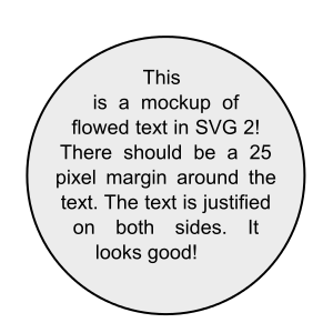
I want to have a circle around a text, so that the text take up most of the area of the circle, both vertically and horizonally, but it should be a circle, not an elipse.

This also means that if i have a long line, it would wrap inside the circle.

The text length is unknown in advanced, and if it exceeds the possible size of the circle, the circle should grow accordingly.

Something like this, but without svg:

something like this:

Is it possible using just CSS and HTML ?

web-tiki
  • 99,765
  • 32
  • 217
  • 249
cookya
  • 3,019
  • 7
  • 26
  • 37
  • 4
    Yeah, you can use `border-radius: 50%` – Andy Holmes Feb 15 '17 at 15:42
  • @AndyHolmes This could create an elipse, what I want is a circle. – cookya Feb 15 '17 at 15:48
  • Okay so use some padding or set a height and width... – Andy Holmes Feb 15 '17 at 15:50
  • 2
    Possible duplicate of [css: how to draw circle with text in middle?](http://stackoverflow.com/questions/16615403/css-how-to-draw-circle-with-text-in-middle) – Option Feb 15 '17 at 15:54
  • @Option No, it's not. read the whole question. – cookya Feb 15 '17 at 15:56
  • @cookya yes it is – Andy Holmes Feb 15 '17 at 15:57
  • @cookya, your questions are all in that topic. 1. how to make a circle in css and 2. how to add text into the circle.. – Option Feb 15 '17 at 15:58
  • @Option I modified it to be more clear and specific. I saw those questions on how to make a circle around text, bot I don't know how to wrap the text both horizonally and vertically inside the circle, so that the text fills the circle area. – cookya Feb 15 '17 at 16:01
  • Therefore my answer is redundant so i shall remove it – Option Feb 15 '17 at 16:02
  • 1
    @cookya Wait a few years for css-shapes support :) [caniuse](http://caniuse.com/#feat=css-shapes), [MDN](https://developer.mozilla.org/en-US/docs/Web/CSS/CSS_Shapes), [SO](http://stackoverflow.com/questions/16982545/paragraph-of-text-in-circle-using-css). – Matvey Andreyev Feb 15 '17 at 16:22

3 Answers3

2

There is no such CSS/HTML only solution available today, where one can tell an element to have its content grow both sideways and downwards equally, so for that to work you need a script.

A possible workaround could be like this, where a width is set and the actual circle is created using a pseudo element. With this you just have to adjust width with text length and the rest is automatic.

div {
  position: relative;
  display: inline-block;
  text-align: center;
  width: 100px;
  padding: 30px;
}
div + div {
  width: 140px;
}

div::after {
  content: '';
  position: absolute;
  width: 100%;
  left: 0;
  top: 50%;
  transform: translateY(-50%);
  border-radius: 50%;
  border: 1px solid gray;
  padding-bottom: 100%;
}
<div>Hi there, this might be an option for you to use, where the text is a sample</div>

<div>Hi there, this might be an option for you to use, where the text is a sample. Hi there, this might be an option for you to use, where the text is a sample</div>
Asons
  • 84,923
  • 12
  • 110
  • 165
1

Based on your requirements you can do something like this. Note you'll need to set a width and height. I can't think of a way of doing this with content that doesn't have a fixed height or width as it needs the values to work out the radius.

.circle {
  height: 300px;
  display: table-cell;
  text-align: center;
  vertical-align: middle;
  border-radius: 50%;
  background: rebeccapurple;
}
.circle p {
    width: 300px;
    margin: 0 auto;
    color: white;
}
<div class="circle">
    <p>Lorem ipsum dolor sit amet, consectetur adipisicing elit. Reprehenderit assumenda sapiente, sunt eveniet quibusdam quas numquam ea libero molestiae nesciunt! Molestias, illum, excepturi. Totam, aliquam. Natus ipsum, earum vero minima!</p>
</div>
Andy Holmes
  • 7,817
  • 10
  • 50
  • 83
0

like @Andy Holmes allready said, yes ist posible here some example:

.test  {
border-radius: 50%;
  width: 200px;
  height: 200px;
  border: 1px solid red;
  text-align: center;
  }

p {
  margin-top: 85px;
  }
<div class="test">
 <p>Your text</p>
</div>
MKAD
  • 447
  • 2
  • 10