1

I have data for a number of geographical regions, each of which has an associated description and time-series data. For example:

---in file "data.csv":
ID,Region,Year,Value
9,Manhattan,2010,5
9,Manhattan,2011,6
10,Brooklyn,2010,6
10,Brooklyn,2011,7
11,Bronx,2010,8
11,Bronx,2011,6
12,New Jersey,2010,7
12,New Jersey,2011,5

(This table is formed by reshaping an earlier table with one row per region, but that's not relevant here.) I'd like to plot this data with ggplot2 and include both ID and description in the legend. Here's my best attempt:

#! /usr/bin/env RSCRIPT

library(data.table)
library(ggplot2)

dt <- fread("data.csv")[,Label:=paste(ID, " (", Region, ")", sep="")]
png("plot.png")
gg <- ggplot(data=dt,aes(x=Year,y=Value,group=ID,colour=Label)) +
    geom_line() + geom_label(aes(label=ID))
print(gg)
dev.off()

The result:

sample plot

I'd like to make two changes:

  1. Assign colors by numerical, not alphabetical, value—so that "9 (Manhattan)" gets red, "10 (Bronx)" gets greenish-yellow, and so forth—while keeping the automatic color palette. I'd like to avoid manual color selection with scale_colour_manual() and its ilk. My actual data has varying numbers of regions, up to about 20 per chart.

  2. Change the colored icon in the legend from a lowercase A to the region ID (so a red 9, a greenish-yellow 10, and so on). This would let me use the Region field alone as legend text, rather than "ID (Region)".

Connor Harris
  • 421
  • 5
  • 14
  • 1
    For the first, you can set the levels of your factor in the order you want prior to plotting. – aosmith Feb 15 '17 at 17:31
  • Is there a way of doing that automatically, just by inspecting dt[,ID] or similar? – Connor Harris Feb 15 '17 at 17:40
  • if you just call `as.factor(dt$ID)` it will make the factor levels default to order in your data frame which looks like enough for this case, you might also want to looks `library(forcats)` for additional functions for easy factor leveling – Nate Feb 15 '17 at 17:45
  • http://stackoverflow.com/questions/10405823/changing-the-symbol-in-the-legend-key-in-ggplot2 – Nate Feb 15 '17 at 17:47
  • @NathanDay The Stack Overflow question you linked works for setting a new constant legend symbol, but not setting a variable one; I tried imitating it by adding `guide_legend(override.aes = list(shape=as.character(dt[,ID])))` to the plot object and only got `Error: Don't know how to add o to a plot`. – Connor Harris Feb 15 '17 at 17:53
  • I am not aware of way you can accomplish your precise goal in ggplot2, you may have to make a compromise – Nate Feb 15 '17 at 18:02
  • The answer [here](http://stackoverflow.com/a/28685563/2461552) looks like it might do what you want. Note that there is some extra code to get the letters into shapes via `utf8ToInt`. – aosmith Feb 15 '17 at 18:04

1 Answers1

2

The current labeling is because the alphabetic ordering of 9:12 is c("10", "11", "12", "9"). You can change it manually, or you can use something like mixedsort from gtools to do it, here using dplyr and magrittr instead of data.table:

dt %<>%
  mutate(Label = paste0(dt$ID, " (", dt$Region, ")") %>%
           factor(levels = mixedsort(unique(.))))

Changing the labels in the legend is a bit harder, primarily because they have two characters (instead of just one). If your labels were all a single character, you could just do something like this:

ggplot(data=dt,aes(x=Year,y=Value,group=ID,colour=Label)) +
  geom_line(show.legend = FALSE) +
  geom_point() +
  geom_label(aes(label=ID), show.legend = FALSE) +
  guides(color = guide_legend(override.aes = list(shape = c("A","B","C","D")
                                                  , size = 3)))

enter image description here

However, you cannot (to my knowledge) use multiple characters in a shape. So, I resort to my common fall back: generating the complicated legend that I want as a separate plot and stitching them together with cowplot.

First, store the plot you want to make without a legend

plotPart <-
  ggplot(data=dt,aes(x=Year,y=Value,group=ID,colour=Label)) +
  geom_line() +
  geom_label(aes(label=ID)) +
  theme(legend.position = "none")

Then, modify the original data to limit down to just one entry per region with the regions as factors in the same order as the labels are (here, using dplyr but you could modify to use data.table instead). Pass that in to ggplot and generate the layout you want. I have the regions on the left still, but you could move them to the right with scale_y_discrete(position = "right").

legendPart <-
  dt %>%
  select(ID, Region, Label) %>%
  filter(!duplicated(.)) %>%
  arrange(desc(ID)) %>%
  mutate(Region = factor(Region, levels = Region)) %>%
  ggplot(
    aes(x = 1
        , y = Region
        , color = Label
        , label = ID)) +
  geom_label() +
  theme(legend.position = "none"
        , axis.title = element_blank()
        , axis.text.x = element_blank()
        , axis.ticks.x = element_blank()
        , panel.grid = element_blank()
        )

Then, load cowplot. Note that it resets the default theme so you need to manually over ride it (unless you like the cowplot theme) with theme_set:

library(cowplot)
theme_set(theme_minimal())

Then, use plot_grid to stitch everything together. The simplest version has no arguments, but doesn't look great:

plot_grid(plotPart, legendPart)

gives

enter image description here

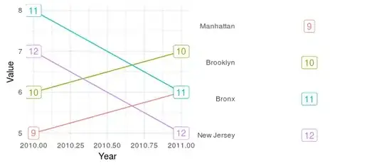
But, we can control the spacing with rel_widths (you will need to play with it to fit your actual data and aspect ratio):

plot_grid(plotPart
          , legendPart
          , rel_widths = c(0.9, 0.2)
          )

gives

enter image description here

I personally like to "squish" the legend a bit, so I usually nest the legend within another plot_grid call, here including a title for good measure:

plot_grid(
  plotPart
  , plot_grid(
    ggdraw()
    , ggdraw() + draw_label("Legend")
    , legendPart
    , ggdraw()
    , rel_heights = c(1,1,3,2)
    , ncol = 1
  )
  , rel_widths = c(0.9, 0.2)
)

gives

enter image description here

Which I believe meets the requirements from your question, though you will still likely want to tweak it to match your prefered style, etc.

Mark Peterson
  • 9,370
  • 2
  • 25
  • 48