0

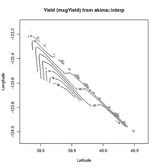
I have a dataset like this

Lat Lon mxgYield

38.96152878 -123.5578995 7.925971605

39.24150085 -123.6392975 19.6720449

39.52162933 -123.7214966 19.777747

39.80192947 -123.8044968 12.23218451

40.36297989 -123.9729004 15.00058428

40.64371872 -124.058403 1.443492322

38.74369812 -123.1184998 1.938840925

I am trying to map mxgYield as a color gradient. How should I do this in R?

Thanks

JD Long
  • 59,675
  • 58
  • 202
  • 294
didimichael
  • 71
  • 1
  • 3
  • 7
  • possible duplicate: http://stackoverflow.com/questions/1896419/plotting-a-3d-surface-plot-with-contour-map-overlay-using-r – JD Long Nov 19 '10 at 19:45

1 Answers1

1

Seems a bit weak on volume of data but will succeed using a combination of akima's interp function and the base contour plotting function:

yield <- read.table(textConnection("Lat Lon mxgYield
38.96152878 -123.5578995 7.925971605
39.24150085 -123.6392975 19.6720449
39.52162933 -123.7214966 19.777747
39.80192947 -123.8044968 12.23218451
40.36297989 -123.9729004 15.00058428
40.64371872 -124.058403 1.443492322
38.74369812 -123.1184998 1.938840925"), header=TRUE)
require(akima)
ak.yld <- with( yield, interp(x=Lat, y=Lon, z=mxgYield))
contour(ak.yld)

alt text

(Looks prettier on my screen but you should still see a contour plot for the region with data.)

IRTFM
  • 258,963
  • 21
  • 364
  • 487
  • Thanks. But what I want is a map with yield shown by a gradient of different colors. Not the contour plot. – didimichael Nov 19 '10 at 19:28
  • Now i think i can use image in MAPS package to do it. Thanks a lot – didimichael Nov 19 '10 at 19:35
  • image (the base function) also works with the interp object, but doesn't look at nice to me. Can also color the contour lines with: contour(ak.yld, col=1:10) or use: image(ak.yld, col=terrain.colors(8) ) – IRTFM Nov 19 '10 at 20:12