1

I found this codepen demo which almost does what I need (http://codepen.io/web-tiki/pen/EaKPMK).

HTML:

<div class="wrap">

    <div class="arrow"></div>
</div>

CSS:

.wrap {
  position: relative;
  height:150px;
  overflow: hidden;
  width: 70%;
  margin: 0 auto;
}
.wrap img {
  width: 100%;
  height: auto;
  display: block;
}
.arrow {
  position: absolute;
  bottom: 0;
  width: 100%;
  padding-bottom:3%;
  background-color: rgba(0, 0, 0, 0.8);
}
.arrow:before, .arrow:after {
  content:'';
  position: absolute;
  bottom: 100%;
  width: 100%;
  padding-bottom:inherit;
  background-color: inherit;
}
.arrow:before {
  right: 20%;
  -ms-transform-origin: 100% 100%;
  -webkit-transform-origin: 100% 100%;
  transform-origin: 100% 100%;
  -ms-transform: skewX(45deg);
  -webkit-transform: skewX(45deg);
  transform: skewX(75deg);
}
.arrow:after {
  left: 80%;
  -ms-transform-origin: 0 100%;
  -webkit-transform-origin: 0 100%;
  transform-origin: 0 100%;
  -ms-transform: skewX(-45deg);
  -webkit-transform: skewX(-45deg);
  transform: skewX(-75deg);  
}

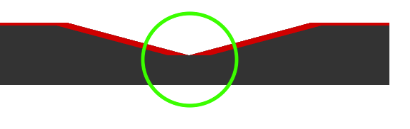
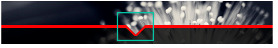
The only thing that's missing is, that I actually need a border around the box. When I add borders to the pseudo elements, the skewed part doesn't produce a closed line.

.arrow:before {
  right: 20%;
  -ms-transform-origin: 100% 100%;
  -webkit-transform-origin: 100% 100%;
  transform-origin: 100% 100%;
  -ms-transform: skewX(45deg);
  -webkit-transform: skewX(45deg);
  transform: skewX(75deg);
  border-top: 4px solid #df0000;
  border-right: 30px solid #df0000;
}
.arrow:after {
  left: 80%;
  -ms-transform-origin: 0 100%;
  -webkit-transform-origin: 0 100%;
  transform-origin: 0 100%;
  -ms-transform: skewX(-45deg);
  -webkit-transform: skewX(-45deg);
  transform: skewX(-75deg); 

  border-top: 4px solid #df0000;
  border-left: 30px solid #df0000;
}

Borders around arrow

Any Ideas how to make this work?

Swissdude
  • 3,486
  • 3
  • 35
  • 68
  • 1
    Are you sure want to Skew the Element? If yes then this may help you on this: http://www.cssarrowplease.com/ – Krunal Feb 22 '17 at 09:55
  • I've seen this page already. It just produces arrows with a 90° angle, though. My arrows need to have a flexible angle, so that's why I chose the skewed version. – Swissdude Feb 22 '17 at 10:01
  • Haven't had the time to completely check your CodePen but you may find the answers in this thread helpful - http://stackoverflow.com/questions/36782245/css-triangular-cutout-with-border-and-transparent-gap/36786984#. It might very well be possible to tweak your Pen to get what you need also. I am just giving you a link that might help. – Harry Feb 22 '17 at 10:05
  • If you can add a new element then my answer should work for you. – artemisian Feb 22 '17 at 10:51

4 Answers4

1

This is my solution, although it inserts a new element: <div class="arrow-head">

    .wrap {
      position: relative;
      height:150px;
      overflow: hidden;
      width: 70%;
      margin: 0 auto;
    }
    .wrap img {
      width: 100%;
      height: auto;
      display: block;
    }
    .arrow {
      position: absolute;
      bottom: 0;
      width: 100%;
      padding-bottom:3%;
      background-color: rgba(0, 0, 0, 0.8);
    }
    .arrow:before, .arrow:after {
      content:'';
      position: absolute;
      bottom: 100%;
      width: 100%;
      padding-bottom:inherit;
      background-color: inherit;
    }
    .arrow:before {
      right: 20%;
      -ms-transform-origin: 100% 100%;
      -webkit-transform-origin: 100% 100%;
      transform-origin: 100% 100%;
      -ms-transform: skewX(45deg);
      -webkit-transform: skewX(45deg);
      transform: skewX(75deg);
      border-top: 4px solid #df0000;
      border-right: 30px solid #df0000;
    }
    .arrow:after {
      left: 80%;
      -ms-transform-origin: 0 100%;
      -webkit-transform-origin: 0 100%;
      transform-origin: 0 100%;
      -ms-transform: skewX(-45deg);
      -webkit-transform: skewX(-45deg);
      transform: skewX(-75deg); 

      border-top: 4px solid #df0000;
      border-left: 30px solid #df0000;
    }
    .arrow-head {
        position: absolute;
        right: -moz-calc(20% - 30px);
        right: webkit-calc(20% - 30px);
        right: -o-calc(20% - 30px);
        right: calc(20% - 30px);
        width: 0;
        height: 0;
        border-left: 30px solid transparent;
        border-right: 30px solid transparent;
        border-top: 8px solid #df0000;
    }
    <div class="wrap">
        <div class="arrow">
            <div class="arrow-head">
            </div>
        </div>
    </div>
artemisian
  • 2,976
  • 1
  • 22
  • 23
0

here is one way.i think this is what you are looking for

.arrow:before {
 right: 20%;
-ms-transform-origin: 100% 100%;
-webkit-transform-origin: 100% 100%;
 transform-origin: 100% 70%;
 -ms-transform: skewX(45deg);
-webkit-transform: skewX(45deg);
 transform: skewX(75deg);
 border-top: 4px solid #df0000;
 border-right: 30px solid #df0000;
 }
.arrow:after {
 left: 80%;
-ms-transform-origin: 0 100%;
-webkit-transform-origin: 0 100%;
transform-origin: 0 100%;
-ms-transform: skewX(-45deg);
-webkit-transform: skewX(-45deg);
 transform: skewX(-75deg); 

 border-top: 4px solid #df0000;
 border-left: 30px solid #df0000;
 }
Edison Augusthy
  • 1,535
  • 17
  • 32
0

you need to decrease the value of the pseudo elements like-

.arrow:after {left:49%}

so your code will be look like-

.wrap {
  position: relative;
  height:150px;
  overflow: hidden;
  width: 70%;
  margin: 0 auto;
}
.wrap img {
  width: 100%;
  height: auto;
  display: block;
}
.arrow {
  position: absolute;
  bottom: 0;
  width: 100%;
  padding-bottom:3%;
  background-color: rgba(0, 0, 0, 0.8);
}
.arrow:before, .arrow:after {
  content:'';
  position: absolute;
  bottom: 100%;
  width: 50%;
  padding-bottom:inherit;
  background-color: inherit;
}
.arrow:before {
  right: 50%;
  -ms-transform-origin: 100% 100%;
  -webkit-transform-origin: 100% 100%;
  transform-origin: 100% 100%;
  -ms-transform: skewX(45deg);
  -webkit-transform: skewX(45deg);
  transform: skewX(45deg);
  border-right:10px solid red;
  border-top:10px solid red;
}
.arrow:after {
  left: 49%;
  -ms-transform-origin: 0 100%;
  -webkit-transform-origin: 0 100%;
  transform-origin: 0 100%;
  -ms-transform: skewX(-45deg);
  -webkit-transform: skewX(-45deg);
  transform: skewX(-45deg);
  border-left:10px solid red;
  border-top:10px solid red;
}

it will look like this -

see attached screenshot

Umang Patwa
  • 2,795
  • 3
  • 32
  • 41
Aditya Male
  • 236
  • 1
  • 3
  • I already tried that - but the arrow doesn't really join at the bottom. It's still flat... Thanks for the effort anyway... – Swissdude Mar 07 '17 at 10:07
0

I came up with this solution:

html:

<div class="bar left"></div><!--
--><div class="arrow-outer">
  <div class="square left"></div>
  <div class="square right"></div>
  <div class="border left"></div>
  <div class="border right"></div>
</div><!--
--><div class="bar right"></div>

css:

*{
  box-sizing: border-box;
}

.bar{
  position: relative;
  vertical-align: top;
  width: 200px;
  height: 35px;
  display: inline-block;
  background-color: #dfdfdf;
  border-top: 4px solid #ff0000;
}
.arrow-outer{
  display: inline-block;
  vertical-align: top;
  width: 100px;
  height: 35px;
  position: relative;
  overflow: hidden;
}

.square{
  position: absolute;
  width: 100px;
  height: 100px;
  top: 0;
  background-color: #dfdfdf;
}

.square.left{
  transform-origin:left top;
  left: 0;
  transform: rotate(30deg);

}

.square.right{
  transform-origin:right top;
  right: 0;
  transform: rotate(-30deg);
}

.border{
  width: 58px;
  height: 4px;
  background-color: #ff0000;
  position: absolute;
  top: 0;
}

.border.left{
  transform-origin:left top;
  left: 0;
  transform: rotate(30deg) skewX(30deg);
}

.border.right{
  transform-origin:right top;
  right: 0;
  transform: rotate(-30deg) skewX(-30deg);
}

Here's the codepen:

http://codepen.io/swissdoode/pen/OpzEaJ

The only problem is, that the «fake» border doesn't really line up to the other borders because of the rotate and skewX. It's barely visible, though...

Thoughts?

Swissdude
  • 3,486
  • 3
  • 35
  • 68