3

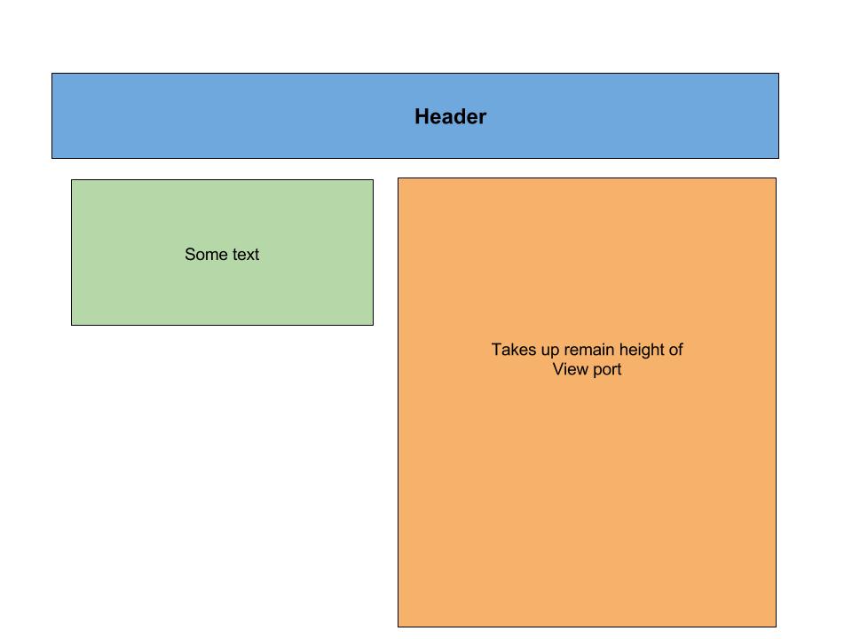
I have a header with 2 rows of 2 Foundation columns of content, as below:

<div class="wrapper">
  <div class="header row">
    <div class="large-6 columns">
        HEADER
    </div>
    <div class="large-6 columns">
        menu
    </div>
  </div>
  <div class="row">
    <div class="large-5 none show-for-medium columns info">
     Some information to the left
    </div>
    <div class="large-7 columns">
      <div class="image-container">
        <div class="image">
           image to the right
        </div>
      </div>
    </div>
  </div>
</div>

The .header height is dynamic and not set. I want the .image element to take up 100% of the remaining vertical space.

eg:

enter image description here

To that affect I have tried using flex and flex-grow, eg:

.wrapper {
  display: flex;
  flex-direction: column;
  min-height: 100vh;
  width: 100%;
}

.image-container {
  flex-grow: 1;
}

but had no luck, see fiddle: https://jsfiddle.net/9kkb2bxu/46/

Would anyone know how I could negate the dynamic height of the header from the 100vh of the image container?

.wrapper {
  display: flex;
  flex-direction: column;
  min-height: 100vh;
  width: 100%;
  border: 1px solid black;
  background-color: #ccc;
}

.row {
    width: 100%;
}

.header {
  background-color: green;
}

.info {
  background-color: yellow;
  border: 1px solid #ccc;
}

.image-container {
  border: 1px solid black;
  display: flex;
}

.image {
  background-color: red;
  flex-grow: 1;
  width: 100%;
}
<link href="https://cdnjs.cloudflare.com/ajax/libs/foundation/6.3.1/css/foundation.min.css" rel="stylesheet"/>
<div class="wrapper">
  <div class="header row">
    <div class="large-6 columns">
      <h1>
        HEADER
      </h1>
    </div>
    <div class="large-6 columns">
      <h1>
        menu
      </h1>
    </div>
  </div>

  <div class="row">
    <div class="large-5 none show-for-medium columns info">
     Some information to the left
    </div>
    <div class="large-7 columns">
      <div class="image-container">
        <div class="image">
           image to the right
        </div>
      </div>
    </div>
  </div>
</div>
Michael Benjamin
  • 346,931
  • 104
  • 581
  • 701
MeltingDog
  • 14,310
  • 43
  • 165
  • 295

3 Answers3

1

flex-grow only applies to flex children.

.image-container isn't a direct child of a display: flex element, so that property has no effect.

Plus, it affects the flex axis, which is not what you want.

Instead, you need to put those two elements in their own flex row, and use align-items (on the parent) and align-self (on either child) so that the first one aligns (on the cross axis) to flex-start (stick to top) and the second one to stretch.

You'll also want that flex row (parent) to have flex-grow: 1 so that it stretches along the vertical flex axis of its parent (.wrapper) to fill the rest of the page (otherwise, the grandchild will have nothing to stretch to).

For more information, read a good flex tutorial.

SLaks
  • 868,454
  • 176
  • 1,908
  • 1,964
1
div.wrapper > div:not(.header).row {
    flex: 1;                         /* 1 */
    display: flex;                   /* 1 */
}

div.large-7.columns {
    display: flex;                   /* 2 */
}

div.image-container {                /* 3 */
     flex: 1;
}

div.large-5.show-for-medium {        /* 4 */
     align-self: flex-start;
}

jsFiddle

Notes:

  1. flex container and items consume all remaining height of respective parents
  2. give children full height (via align-items: stretch initial setting)
  3. flex item consumes all available width
  4. yellow box does not need to expand to full height; now set to content height
Michael Benjamin
  • 346,931
  • 104
  • 581
  • 701
1

Set the second row to take up the rest of the remaining height with flex: 1 and make sure you nest that flex with display: flex:

.row.target-row {
  flex: 1;
  display: flex;
}

Set the .image-container to 100% height of its column parent.

.image-container {
  height: 100%;
}

By default both columns will expand. Stop the left column from expanding with:

.large-5 {
  align-self: flex-start;
}

(flex-start reference: https://stackoverflow.com/a/40156422/2930477)

Complete Example

.wrapper {
  display: flex;
  flex-direction: column;
  min-height: 100vh;
  width: 100%;
  border: 1px solid black;
  background-color: #ccc;
}

.row {
  width: 100%;
}

.header {
  background-color: green;
}

.info {
  background-color: yellow;
  border: 1px solid #ccc;
}

.image-container {
  height: 100%;
  background-color: red;
}

.large-5 {
  align-self: flex-start;
}

.row.target-row {
  flex: 1;
  display: flex;
}
<link href="https://cdnjs.cloudflare.com/ajax/libs/foundation/6.3.1/css/foundation.min.css" rel="stylesheet" />
<div class="wrapper">
  <div class="header row">
    <div class="large-6 columns">
      <h1>
        HEADER
      </h1>
    </div>
    <div class="large-6 columns">
      <h1>
        menu
      </h1>
    </div>
  </div>

  <div class="row target-row">
    <div class="large-5 none show-for-medium columns info">
      Some information to the left
    </div>
    <div class="large-7 columns">
      <div class="image-container">
        <div class="image">
          image to the right
        </div>
      </div>
    </div>
  </div>
</div>
Community
  • 1
  • 1
misterManSam
  • 24,303
  • 11
  • 69
  • 89
  • Hey, just curious, why does the `.row:nth-child(2) ` have to be an nth child selector? I tried targeting it with an actual class name, eg `large-7` and it wouldn't work. – MeltingDog Mar 02 '17 at 07:08
  • @MeltingDog - It doesn't :) *but* `.row:nth-child(2)` targets the second *row class*, not the column div. I'll update my example with a class to make it clear :) one sec. – misterManSam Mar 02 '17 at 07:14
  • @MeltingDog - All good! I've updated it with `.row.target-row` to eliminate confusion. – misterManSam Mar 02 '17 at 07:16