I need to fit videos inside a container, shrink the video if required, I have managed to make it work on FireFox, but I have been unable to shrink the video in chrome.
.media-player video {
  cursor     : pointer;
  max-height : 100%;
  z-index    : 0;
  display    : block;
  margin     : auto;
  max-width  : 100%;
}
in FireFox
in chrome

Notice that video is creaking out of the container, when it should just shrink. How can i force the chrome to respect max-height : 100%; for a video element?
* {
  box-sizing: border-box;
  margin: 0;
  padding: 0;
}

.video-container {
  position : absolute;
  top      : 0;
  left     : 0;
  right    : 0;
  bottom   : 0;
}

.container{height:300px;}
.col {
  display: flex;
  flex-direction: column;
  justify-content: space-between;
}
.col-center {
    align-items: center;
    justify-content: space-around;
}
.box {
  flex: auto;
  min-height: 0;
}

.box-shrink {
  flex: 0 1 auto;
  min-height: 0;
}

.media-player {
  position: relative;
  min-width: 250px;
  margin: auto;
}

video {
  cursor: pointer;
  max-height: 100%;
  z-index: 0;
  display: block;
  margin: auto;
  max-width: 100%;
}
<div class="col box container">
<div class="media-player video box">
<div class="col col-center box video-container">
<video controls poster="https://archive.org/download/WebmVp8Vorbis/webmvp8.gif">
<source src="https://archive.org/download/WebmVp8Vorbis/webmvp8.webm" type="video/webm">
</video>
</div>
</div>
<div class="media-player video box">
<div class="col col-center box video-container">
<video controls poster="https://archive.org/download/WebmVp8Vorbis/webmvp8.gif">
<source src="https://archive.org/download/WebmVp8Vorbis/webmvp8.webm" type="video/webm">
</video>
</div>
</div>
<div class="media-player video box">
<div class="col col-center box video-container">
<video controls poster="https://archive.org/download/WebmVp8Vorbis/webmvp8.gif">
<source src="https://archive.org/download/WebmVp8Vorbis/webmvp8.webm" type="video/webm">
</video>
</div>
</div>
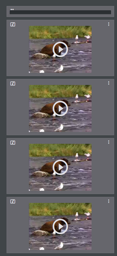
</div>Run the snipped in chrome and firefox to see the difference.
UPDATE: For now I fixed it with absolute position, updated the snippet. If any one has a better solution ...