I've been playing around with bootstrap 4 alpha version lately to create a project and after a lot of trying I can't make uploaded images of different sizes display as a square when I display them.
Remember how Instagram only displayed square images for thumbnails? I want to achieve that. I have done some research and tried a bunch of things written down by other people but the only thing that came close enough to that was this one: https://stackoverflow.com/a/23518465/1067213
but the result is not what I actually want it to do:
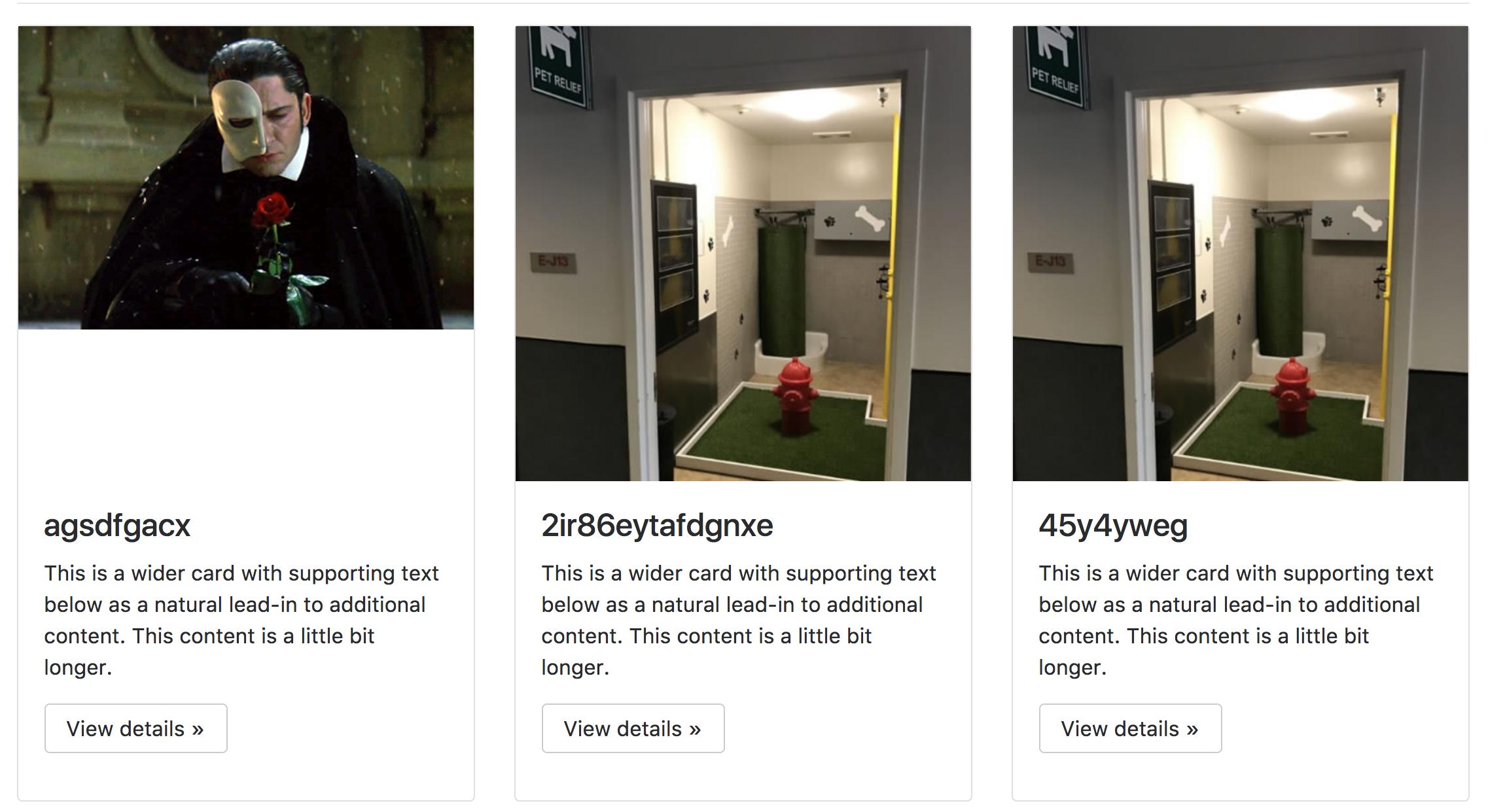
As you can see the images are not square and there is a gap underneath the first one so that it aligns with the other two columns (I do want all columns to be the same width and height).
I use Django to create the URLs to the image files.
Here is my html:
<div class="row">
    {% if competition_list %}
    {% for competition in competition_list %}

        <div class="col-md-4">
          <div class="card">
            <div class="image">
            <img class="card-image-top img-fluid" src="/{{competition.image.url}}" >
            </div>
            <div class="card-block">
              <h4 class="card-title">{{competition.name}}</h4>
              <p class="card-text">This is a wider card with supporting text below as a natural lead-in to additional content. This content is a little bit longer.</p>
              <p><a class="btn btn-secondary" href="https://v4-alpha.getbootstrap.com/examples/jumbotron/#" role="button">View details »</a></p>
            </div>
            </div>
        </div>

    {% endfor %}
    {% else %}
    <p>No competitions in this category, please try an other category</p>
    {% endif %}
    </div>
Here is my CSS:
.card {
    margin-bottom: 10px;
}

.image{
    position:relative;
    overflow:hidden;
    padding-bottom:100%;
}
.image img{
    position:absolute;
}
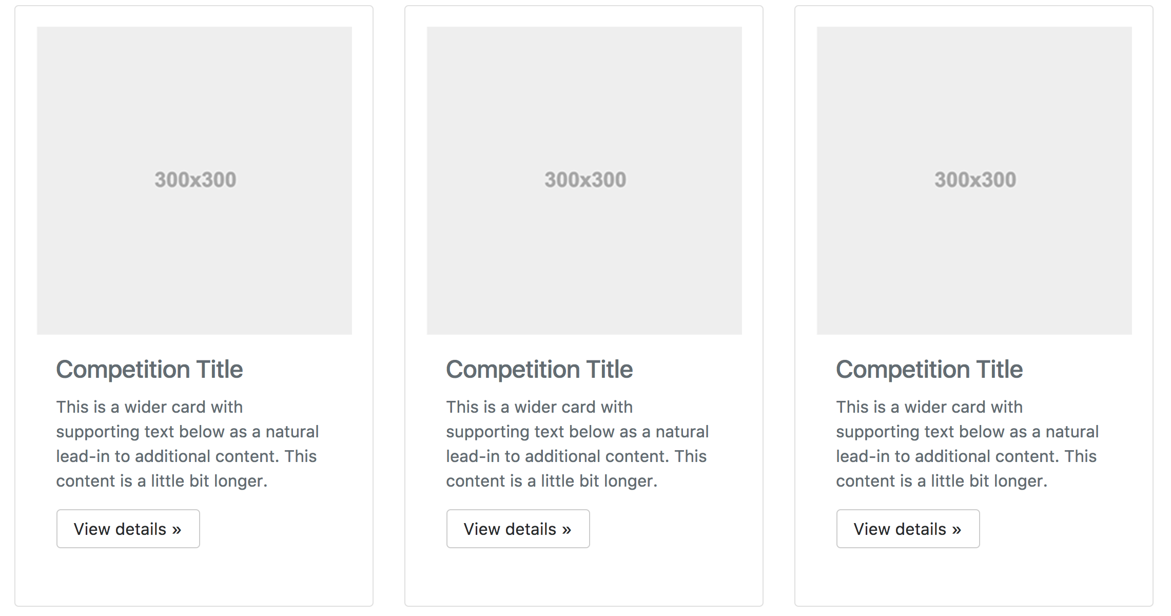
the ideal result would look a bit like this:
 Let me know if you need any more information.
Thanks in advance!