1

How to force all thumbnails to have the same height? Text is loaded from DB and there is more of it in some, and less in others. The result is shown on a PrtScr. I would like to keep them responsive and same relative size. Should I add white space/trim text or have some sort of container inside? I don't know if this makes sense and how to approach this problementer image description here

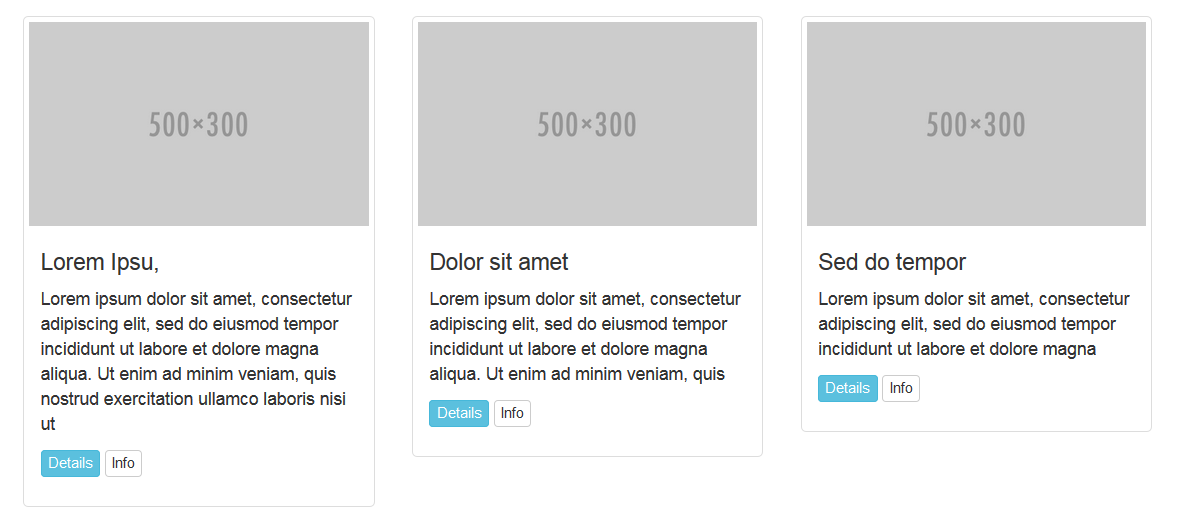
   <div class="col-xs-18 col-sm-6 col-md-3">
      <div class="thumbnail">
        <img src="http://placehold.it/500x300" alt=""/>
          <div class="caption">
            <h4 th:text="${game.title}"/>
            <p th:text="${game.shortDescription}"/>


            <a href="#" class="btn btn-info btn-xs" role="button">Details</a> 
            <a href="#" class="btn btn-default btn-xs" role="button">Info</a>

        </div>
      </div>
    </div>

I have this code from here:

http://bootsnipp.com/snippets/featured/thumbnail-with-caption-amp-buttons

jarosik
  • 4,136
  • 10
  • 36
  • 53
  • 1
    How you do it depends on your desired outcome. Do you want whitespace, or do you want truncation? Do you want to assume a max height, or do you want to use scripting to calculate the tallest element? – isherwood Mar 14 '17 at 17:04
  • Whitespace if there is not enough to strech thumbnail to desired size, and truncate if there is to much. Max height can be calculated based on min and max text width (number of characters). As I said - no idea how to do this – jarosik Mar 14 '17 at 17:11
  • This is not a duplicate - this is thumbnails and they act differently (at least as far as I have seen). – Cheesus Toast Apr 02 '19 at 00:34

1 Answers1

7

I think the best way is flexbox:

.row.display-flex {
  display: flex;
  flex-wrap: wrap;
}
.thumbnail {
  height: 100%;
}

Just add display-flex to the containing row. Also, the upcoming Bootstrap 4 will include flexbox so this extra CSS won't be necessary in the future.

Thumbnails with flexbox demo

You can also do more with the position of child elements.

Option 2

Another option (if the images are all the same size), would be to truncate potentially longer text that may wrap. This way the content is the same height in each thumbnail. Although in your case the text looks multiline so this may not work.

.thumbnail p, .thumbnail h4 {
  white-space: nowrap;
  text-overflow: ellipsis;
  overflow: hidden;
}

Thumbnails with ellipsis text


Also see, How can I make Bootstrap columns all the same height?

Community
  • 1
  • 1
Carol Skelly
  • 351,302
  • 90
  • 710
  • 624
  • Almost there. Thumbs looks same size, but they are stack on top of each other in one column, instead of horizontal alignment. – jarosik Mar 14 '17 at 18:07
  • You mean they all stack on smaller width screens? – Carol Skelly Mar 14 '17 at 18:45
  • I think your **question about same height has been answered** but you'll need to make more adjustments to get it the way you want. The stacking is no different than the `
    ` columns in your code. Also `col-xs-18` is not a standard Bootstrap class.
    – Carol Skelly Mar 14 '17 at 23:36
  • Finally!!... I believe I sometimes I exist in some alternate reality to everyone else. Option 2 worked and that is about it out of anything on this page or the page that is supposedly a duplicate. I don't actually think this is a duplicate question because this is specifically about thumbnails - there must be something about them that makes other methods not work. – Cheesus Toast Apr 02 '19 at 00:31