32

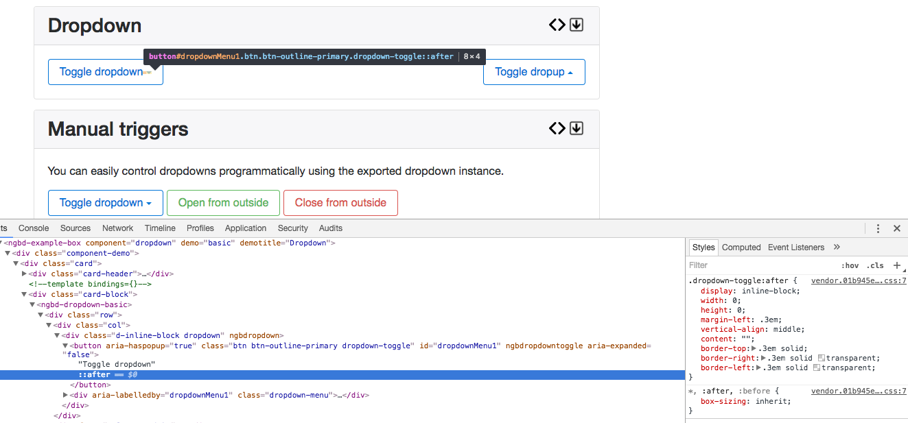
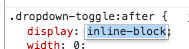
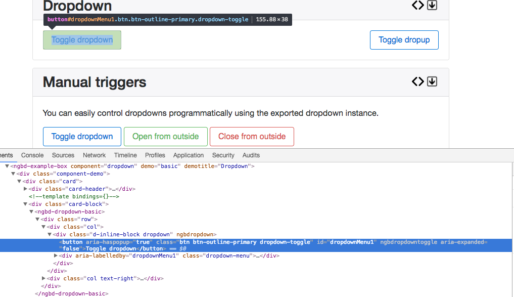
I'm using the NgbDropdown component in my Angular 2 application. It is working fine, however I want to remove the arrow that is displayed on the right side of the button.

<div class="d-inline-block" ngbDropdown #myDrop="ngbDropdown">
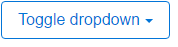
  <button class="btn btn-outline-primary" id="dropdownMenu1" ngbDropdownToggle>Toggle dropdown</button>
  <div class="dropdown-menu" aria-labelledby="dropdownMenu1">
    <button class="dropdown-item">Action - 1</button>
    <button class="dropdown-item">Another Action</button>
    <button class="dropdown-item">Something else is here</button>
  </div>
</div>

Dropdown Image

Alexander Abakumov
  • 13,617
  • 16
  • 88
  • 129
JP4
  • 1,008
  • 2
  • 15
  • 25

4 Answers4

74

Solution

Simply add the following CSS style to override the default style of the .dropdown-toggle::after pseudo-element:

.dropdown-toggle::after {
    display:none;
}

Why?

By default bootstrap adds the arrow to the dropdown component via the ::after pseudo-element.

Doing this removes it.

Here is a LIVE DEMO demonstrating it.

How do you work it out?

Using chrome dev tools you can inspect the element:

enter image description here

We can see from the above that there is a style set for a pseudo-element ::after on the .dropdown-toggle class. Let's go and change the properties of the element! For this purpose we are changing the display property to none:

enter image description here

The pseudo-element is no longer there!!:

enter image description here

cnorthfield
  • 3,384
  • 15
  • 22
  • I have to add this class too which was still visible on bottom elements of the screen: .dropup .dropdown-toggle::after { display:none; } – Raghav Oct 13 '19 at 07:10
  • @cnorthfield:sir can you how to add above css via condtionally in my case i have to hide above only if ccondtion true? – Kapil Soni Apr 14 '21 at 06:23
8

add the following style to override the default one

.dropdown-toggle::after{
    content:initial
 }

LIVE DEMO

Aravind
  • 40,391
  • 16
  • 91
  • 110
3

In Bootstrap 4, you can remove the dropdown arrow which is called caret by declaring a $enable-caret SASS variable and setting it to false:

$enable-caret: false;

This overrides the default value of true set in the Bootstrap's _variable.scss:

// Options
//
// Quickly modify global styling by enabling or disabling optional features.

$enable-caret:                                true !default;

But keep in mind that it completely removes corresponding CSS styles. So, it's the best approach if you don't need carets globally and want to decrease your CSS payload.

Alexander Abakumov
  • 13,617
  • 16
  • 88
  • 129
1

I found you can do this within your app on a conditional basis by creating a custom class in styles.css

Note that using "!important;" is required or else elements at the bottom of the screen will still have a caret that points upward:

.remove-caret::after {
    display: none !important;
}

html example with the custom class and replacing the icon with an ellipsis:

<div style="margin: auto; text-align: center">
                        <ul class="navbar-nav" [style.display]="'flex'">
                            <li class="nav-item d-inline-block" ngbDropdown>
                                <a class="nav-link dropdown-toggle remove-caret" style="color:#000; font-size: 1.1rem" ngbDropdownToggle href="#" role="button" aria-haspopup="true"
                                   aria-expanded="false"><fa-icon [icon]="faEllipsisH" class="ml-2"></fa-icon></a>
                                <div ngbDropdownMenu aria-labelled-by="menuDropDown">
                                    <a ngbDropdownItem href="#" (click)="test()">Test</a>
                                </div>
                            </li>
                        </ul>
                    </div>