I have a wrapper having a series of divs inside it in the form of boxes.
Here are some problems that I am facing.
When I resize the window, the elements appear to be left aligned. How do I centrally align them.
Also, another problem is that the size of the divs slightly vary, which misaligns them.
.left_wrapper
{
    max-width: 70%;
    margin:0 auto;
    float:left;
}


.boxa
    {
    background-color: #45e645;
    display:inline;
    position:relative;
    left:4%;
    float:left;
    margin: 1% 1%;
    padding:1%;
    font-size: 85px;
    text-align:center;
    border:1px solid green;

}


<div class="left_wrapper" id="roll_nos">
    <div id="box" class="boxa">01</div>
    <div id="box" class="boxa">02</div>
    <div id="box" class="boxa">03</div>
    <div id="box" class="boxa">04</div>
     .............
     .............
     .............
     .............

</div>
As suggested, the question is NOT a duplicate of the above mentioned question, though the problem is (only) similar to the one presented there.
The accepted and most upvoted answer is not applicable in my case because I want the elements to automatically move to next line when the window is resized.
Thanks to '@Niet the Dark Absol', The flex-wrap solution is working to center align the elements, but a slight misalignment still lies there, the red line near #13 highlights it.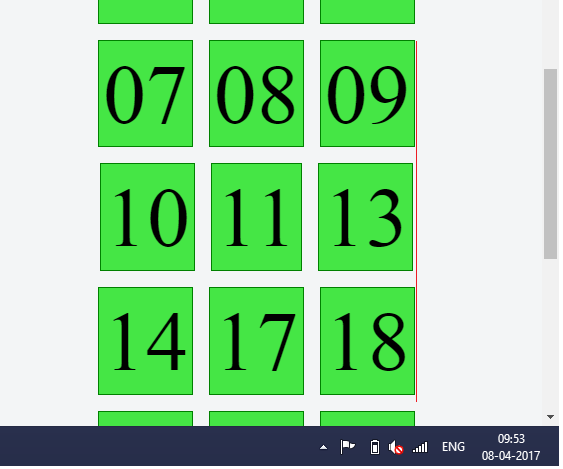