35

I try to have something like this with bootstrap 4enter image description here

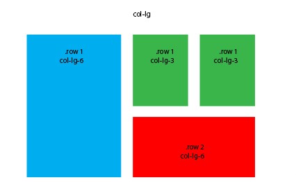
with equal size in the height of green rows and red row

<link href="https://cdnjs.cloudflare.com/ajax/libs/twitter-bootstrap/4.0.0-alpha.6/css/bootstrap.css" rel="stylesheet"/>
   <div class="container">
        <div class="row">
          <div class="col-md-8 col-lg-6 B"><div class="card card-inverse" style="background-color: #333; border-color: #333;">
    <img src="http://lorempicsum.com/rio/800/500/4" class="img-fluid" alt="Responsive image">
    
    </div></div>
      <div class="col-md-4 col-lg-3 G">
          <div class="row">
          <div class="col-md-6 col-lg-6 B"><div class="card card-inverse" style="background-color: #333; border-color: #333;">
    <img src="http://lorempicsum.com/rio/800/500/4" class="img-fluid" alt="Responsive image">
    
    </div></div>
       <div class="col-md-6 col-lg-6 B"><div class="card card-inverse" style="background-color: #333; border-color: #333;">
    <img src="http://lorempicsum.com/rio/800/500/4" class="img-fluid" alt="Responsive image">
    
    </div></div>
       <div class="col-md-12"><div class="card card-inverse" style="background-color: #333; border-color: #333;">
    <img src="http://lorempicsum.com/rio/800/500/3" class="img-fluid" alt="Responsive image">
    
    </div></div>
       </div>
    </div>   
       
        </div>
    </div>
All images have the same size and are responsive but the problem is I can't get equal size in the height of green rows and red row
Black
  • 18,150
  • 39
  • 158
  • 271
sonia maklouf
  • 2,713
  • 4
  • 18
  • 28
  • The images do not exist anymore... Please upload the images to stackoverflow next time and link them – Black Dec 20 '19 at 14:48

1 Answers1

39

Use the sizing utility classes...

  • h-50 = height 50%
  • h-100 = height 100%

http://www.codeply.com/go/Y3nG0io2uE

 <div class="container">
        <div class="row">
            <div class="col-md-8 col-lg-6 B">
                <div class="card card-inverse card-primary">
                    <img src="http://lorempicsum.com/rio/800/500/4" class="img-fluid" alt="Responsive image">
                </div>
            </div>
            <div class="col-md-4 col-lg-3 G">
                <div class="row h-100">
                    <div class="col-md-6 col-lg-6 B h-50 pb-3">
                        <div class="card card-inverse card-success h-100">

                        </div>
                    </div>
                    <div class="col-md-6 col-lg-6 B h-50 pb-3">
                        <div class="card card-inverse bg-success h-100">

                        </div>
                    </div>
                    <div class="col-md-12 h-50">
                        <div class="card card-inverse bg-danger h-100">

                        </div>
                    </div>
                </div>
            </div>
        </div>
    </div>

Or, for an unknown number of child columns, use flexbox and the cols will fill height. See the d-flex flex-column on the row, and h-100 on the child cols.

<div class="container">
    <div class="row">
        <div class="col-md-8 col-lg-6 B">
            <div class="card card-inverse card-primary">
                <img src="http://lorempicsum.com/rio/800/500/4" class="img-fluid" alt="Responsive image">
            </div>
        </div>
        <div class="col-md-4 col-lg-3 G ">
            <div class="row d-flex flex-column h-100">
                <div class="col-md-6 col-lg-6 B h-100">
                    <div class="card bg-success h-100">

                    </div>
                </div>
                <div class="col-md-6 col-lg-6 B h-100">
                    <div class="card bg-success h-100">

                    </div>
                </div>
                <div class="col-md-12 h-100">
                    <div class="card bg-danger h-100">

                    </div>
                </div>
            </div>
        </div>
    </div>
</div>

https://www.codeply.com/go/tgzFAH8vaW

Carol Skelly
  • 351,302
  • 90
  • 710
  • 624